Pictures
Configuration picture
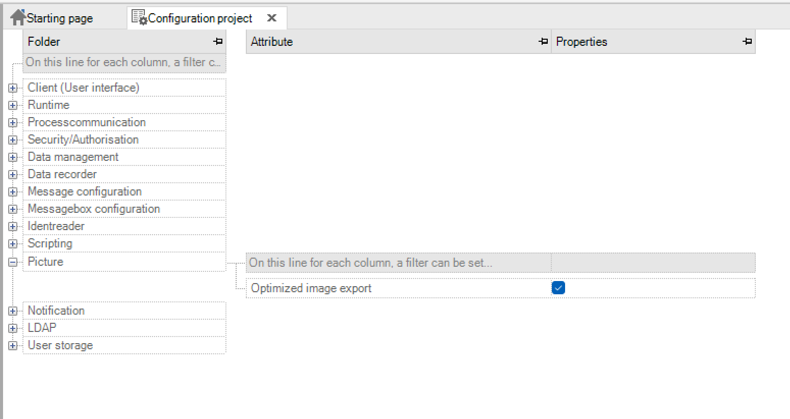
key name |
Input |
Meaning |
|---|---|---|
Optimised image export |
Default value: yes |
If active, only referenced bitmaps, i.e. bitmaps used in the project, are exported. |
Overview of the picture types in PROCON-WEB
There are four different types of pictures in PROCON-WEB:
Picture classes: Picture classes are to be regarded as a template for the later pictures. Picture classes can be created in three different forms: picture, child picture and navigation element.
Pictures. The instances of the pictures and child pictures are located under pictures.
Start / layout picture. A start, or layout picture can only be defined indirectly. A picture is a start picture if it is referenced in the navigation as a start picture. A picture is a layout picture if it contains at least one navigation container.
Navigation elements. Navigation elements are pictures that are used for navigation. This distinction is also reflected in the project tree.
Class-instance concept for pictures
In PROCON-WEB, the class-instance concept also applies to pictures. Picture classes are to be viewed like a template that applies to all instances belonging to the class. This means that global changes that are necessary for several pictures can be carried out quickly, since only one point must be changed. The changes in the picture class are automatically changed by the system in all picture instances, which saves configuration time and prevents errors
Create picture classes
To be able to create a new picture class, click with the right mouse button on the sub-item “Picture classes” from “Surface” and then on “New picture class”.

The class dialog then opens to make changes to the class immediately.
Creating picture instances
To be able to create a new picture instance, click with the right mouse button on “Picture classes” and select “New picture from picture class”.

The instance dialog then opens to make changes to the instance immediatelyThe following tables show the possible attribute options.
Attribute |
Class |
Instance value |
Meaning |
|---|---|---|---|
Mode |
picture |
Simple process picture |
|
Mode |
Child picture |
Child pictures (detail windows) are not independent windows, but belong to another picture. The child windows are also closed when the parent picture is closed. |
|
Mode |
Navigation element |
Picture should be used as a navigation element for later navigation. |
|
Picture number |
0-65535 |
Change / set picture number |
|
Background colour |
Colour selection |
Background colour of the picture, standard colour can be set in the options |
|
Select Display Name |
List do select the definition of the title line |
1.Text (if nothing is entered, the picture name is displayed) |
|
2.Process variable: Value |
|||
3.Process variable: Display name |
|||
4.Process variable: Comment of Display name |
|||
5.Structure element: Value |
|||
6.Structure element: Display name |
|||
7.Structure element: Comment of Display name |
|||
|
|||
Display Name |
Depending on the choice of display type, the name can be entered here, or the corresponding variable can be stored here |
||
Background picture |
Background bitmap selection |
Graphic that is displayed in the background of the picture |
|
Frame type |
Type |
No edge |
The picture is displayed in the runtime system without a frame |
Simple edge |
The picture is displayed in the runtime system with a line as a frame |
||
Move by gesture |
Yes / No |
Not currently implemented |
|
Always in the foreground |
Yes / No |
This means that main windows can always be in the foreground on the desktop. |
|
Title line |
Yes / No |
The picture receives a title line. |
|
System structure |
Structure element |
Assigning a structure element of the system structure as a filter option |
|
Script |
Script selection |
Assigning a cyclically picture related script |
|
Help ID |
ID for help |
Assigning a unique help ID, which can then be called in the HelpControl. |
|
Size |
X / Y |
X / Y value |
Expansion in X / Y direction without a title line |
Window origin |
X / Y |
X / Y value |
X / Y position of the picture relative to the top left corner of the screen |
Window size |
Min X / Min Y |
Min X / Min Y value |
Minimum X / Y value for window size |
The work area
The surface in “Pictures” is divided into three areasThe symbol objects in the work area are created and assembled to form a surface.
If several pictures are open at the same time, the tabs can be used to switch

For a better overview, several pictures can also be displayed next to each other by selecting the tab of the picture with the left mouse button and dragging it to the left or right into the picture area while holding the mouse button. These so-called tab groups can also be implemented as horizontal and vertical tab groups via the context menu of the tab.
The toolbox
The toolbox is used to manage all objects and controls in the PROCON-WEB project. All classes that are used in the project are listed under “Elements”.

The “Name” filter is used to filter the object name, the “Name” filter is a “Contains” filter. The “Type” filter is used to select the object types that are to be displayed in the toolbox, for example AO’s and number fields. If a library project is open, an additional tab “Library” is visible in addition to the tabs Elements and Layers.
All object classes of the library project are listed under “Library” and, like all other classes, can be instantiated in the picture with drag’n drop.
Multiple selection of the individual objects is possible in the toolbox. This can be used to clean up the project by selecting and deleting all classes. All referenced objects are not deleted.
When converting projects from 3 or 4 systems, creates a lot of duplicates. These can be accessed via the context menu are brought together. All values must be identical in order to be displayed as such to be recognized.
The merge is not automatic, but is presented as a proposal which can be changed, is only shown in a dialogue. For static (drawn) symbols, containers, or PictureAreas is this functionHowever, not available.
The property window
The property window clearly shows the properties of the symbols and pictures. If a symbol is selected, the user immediately recognizes the properties of this symbol. Furthermore, like the process variable editor, there are filter and sorting options in order to reach the required entries more quickly.

The view in the window is switched via the tabs “Standard”, “Process Variables”, Instance Values” and “Automation Objects”. In the Standard view, all input parameters and properties are displayed in a tree structure.
Under “Process Variables”, only those objects are displayed in a list whose attributes can be assigned to process variables. When assigning the variables, you have the option of making multiple changes
The “Instance Values” view contains all the attributes of the selected objects to which instance values can be assigned. The individual elements of the selected automation object are displayed in the “Automation objects” view.
The context menu in the picture editor

These terms are explained in more detail in the following table.
Attribute |
Extension |
Function |
|---|---|---|
Instance |
Opens the class-instance dialog, whereby settings can be made on the instance |
|
Class |
Class |
Opens the class instance dialog, whereby settings can be made on the class. |
Mark class |
Marks the class of the selected symbol in the toolbox |
|
Exchange class |
Opens a dialog to replace the class of the selected element with another class |
|
Show metadata |
Shows the metadata of the element. The version of the element can also be changed here. |
|
Generate AO |
Creates an automation object from several individual objects |
|
Arrange |
All the way down |
Moves the object all the way down in the Z direction |
All the way to the top |
Moves the object all the way up in the Z direction |
|
One level down |
Moves the object one level lower in the Z direction |
|
One level higher |
Moves the object one level higher in the Z direction |
|
Cut out |
Cut out the selected object |
|
Copy |
Copies the selected object into the clipboard |
|
Insert |
Inserts an object from the clipboard |
|
Delete |
Deletes the selected object |
|
Dynamise |
Dyn. symbol |
Creates a dynamic symbol object |
SlideIn |
Creates a slide-in (a picture / dialog can be dragged over the current picture by pressing or dragging the graphic object) |
|
Constant text |
Creates a text object with a static text |
|
Dynamic text |
Creates a text object with dynamic texts |
|
Dyn. logical digit |
Generates a logical digit |
|
Dyn. Num. Digit |
Generates a numeric digit |
|
Dyn. Bar |
Creates a dynamic bar object |
|
Checkbox |
Creates a checkbox |
|
Combo box |
Generates a combo box |
|
Silder |
Creates a slider |
|
Layout instance-> class |
With this function, instance values, for example position or size, can be transferred to the class. The function can be used for status lines, function keys, diagrams and automation objects. |
|
To edit |
Opens the drawing mode to edit the selected element |
|
Take over |
Take over |
Applies the changes to the current symbol |
Apply as |
Applies the changes, saved as a new symbol |
|
Copy elements as |
Saves the selected elements as a new symbol |
|
Layout |
Add a layout variant |
Creates a new, empty layout variant |
Copy layout variant |
Copies the selected layout variant |
|
Delete layout variant |
Deletes the selected layout variant |
|
Add container to layout |
Adds the selected container to an existing layout variant |
|
Move container to layout |
Deletes a container from all other layout variants and moves it to the selected layout variant |
|
Delete container from layout |
Deletes a container from a layout variant |
|
Reflect |
Horizontal |
Mirrors the selected element horizontally in drawing mode |
Vertical |
Mirrors the selected element vertically in drawing mode |
|
Bitmap |
Show bitmap |
Opens the picture selection dialog and marks the bitmap there |
Bitmap transparent |
Changes the background colour of the selected bitmap to transparent |
|
Close |
Closes the currently open drawing mode |
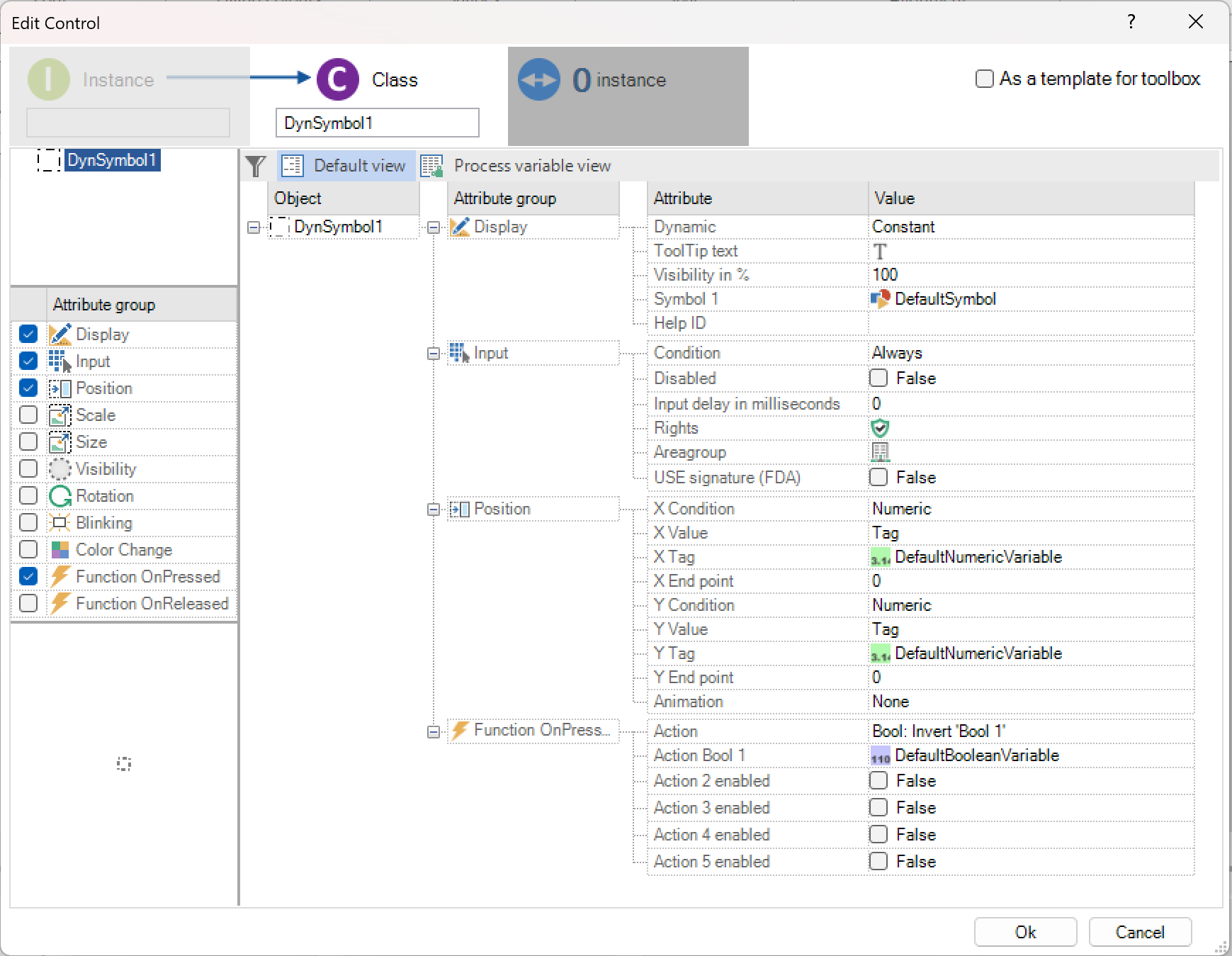
The class-instance dialog
The class-instance dialog is one of the central places in picture assembly for editing elements and pictures. The dialog also gives an overview of the references used by the object.

The class-instance dialog reflects the class-instance concept of PROCON-WEB. The dialog is divided into different areas as shown in the figure above.
The class-instance dialog has 3 “tabs” in the upper area of the display (area 1). The active tab has the background colour of the dialog. An inactive tab is dark gray, a deactivated tab is light gray. To illustrate the relationship between class and instance, an arrow can be seen from the instance tab to the class tab. The element name can be changed directly in the instance and class tab. Furthermore, an arrow is shown in the class tab for up to 5 instances. The number of instances is displayed directly in the reference tab.
In the left part (area 2) the selected elements are displayed in the upper area, in the class view in the middle area the possible attribute groups and in the lower part a preview of the element (s).The parameterisation of the element is carried out in the right part (area 3).
Status information and a legend are displayed in the lower part on the left of the dialog (area 4).
The class view: In the class view, on the one hand, values that should apply to all instances of this class can be set and attribute groups can be activated and deactivated.
All attribute groups available for the selected element are shown in the middle area on the left. These attribute groups can be added to or removed from the element by checking and unchecking it.
The parameters of the individual attributes can now be adjusted in the right area. If values have already been overwritten in an instance and new values are to apply to all instances, you can write these values to all instances via the context menu.

In the class view there is also a checkbox “As a template for toolbox”. This allows the user to determine whether the element is to be marked as a “template”. There is now another filter option in the toolbox to only display elements that are marked as “template”. If the checkbox is checked, the text field for editing the element name in the tab lights up briefly. This is intended to make the user aware of the need to assign a “usable” name.

Furthermore, the user receives a message in the lower area if he changes a value and the picture element has more than one instance.
The instance view: The instance view is intended to overwrite certain values for the instance. These values are mainly texts or process variables.
The possible attribute groups are not shown in this view, as these can only be changed in the classes. If values in the instance are overwritten, they are displayed in bold on the right in the attribute grid. These values can be reset to the class values via the context menu.

In the instance view there is also a legend in the lower area that explains the status in the value column.
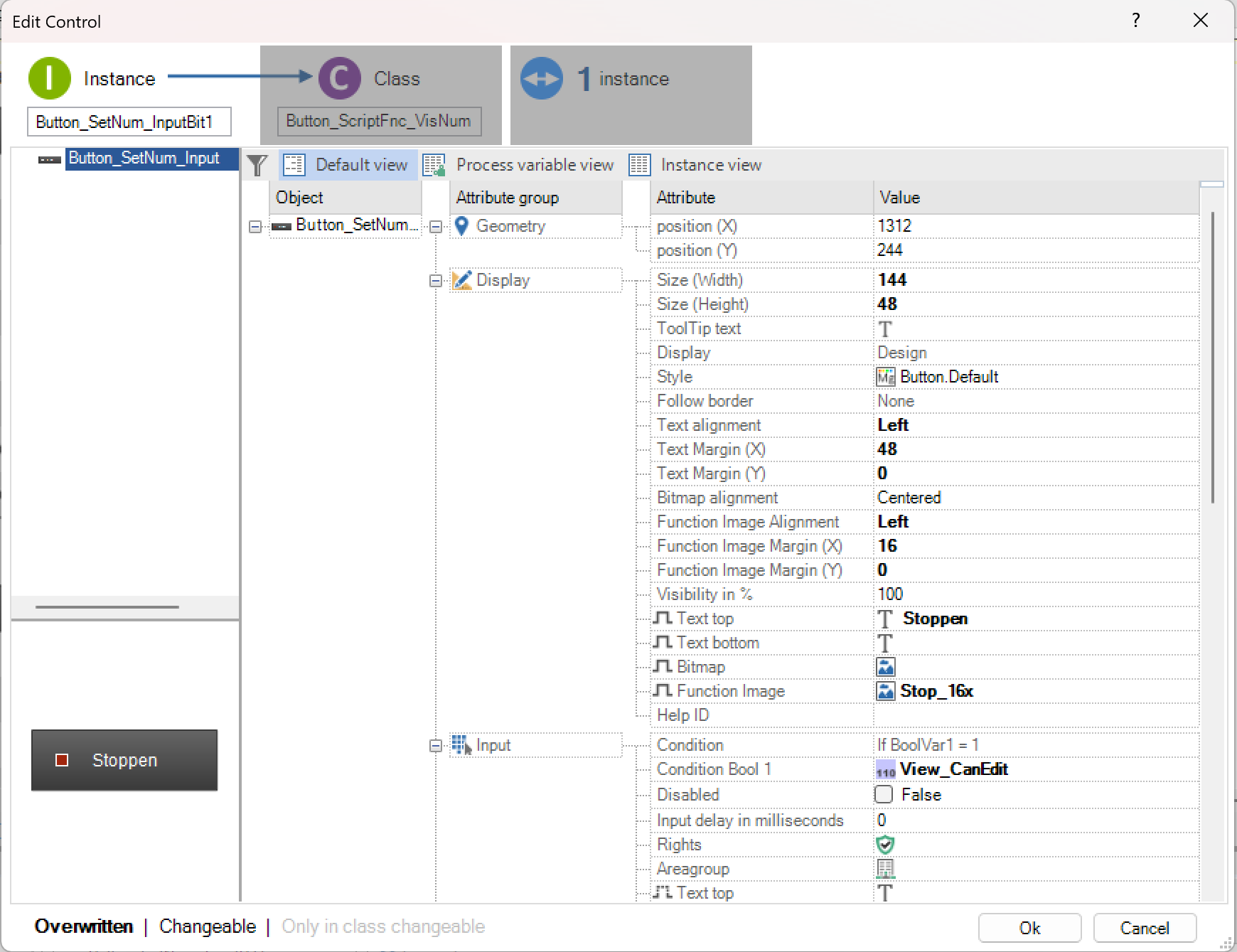
If you try to change a class value, the class tab lights up briefly (see Class view -> Mark as template).
The reference view: The references in the project of the corresponding element are displayed in the reference view.
The colour selection dialog
The PROCON-WEB colour selection dialog enables you to select colours quickly, easily and interactively and define new ones. The dialog is divided into the areas “System” and “Project”.

System: In the “System” area, 60 standard colours are defined for PROCON-WEB. These are subdivided into transparent colours, various gray, red, green, yellow and blue tones. The system colours cannot be edited or changed and are the same for every project.
Project: The user-defined colours of the project are managed in the “Project” area. In this area new colours can be defined, changed, or deleted.
Edit custom colours: Another dialog for colour selection is opened via “Create colour” or “Edit colour”.
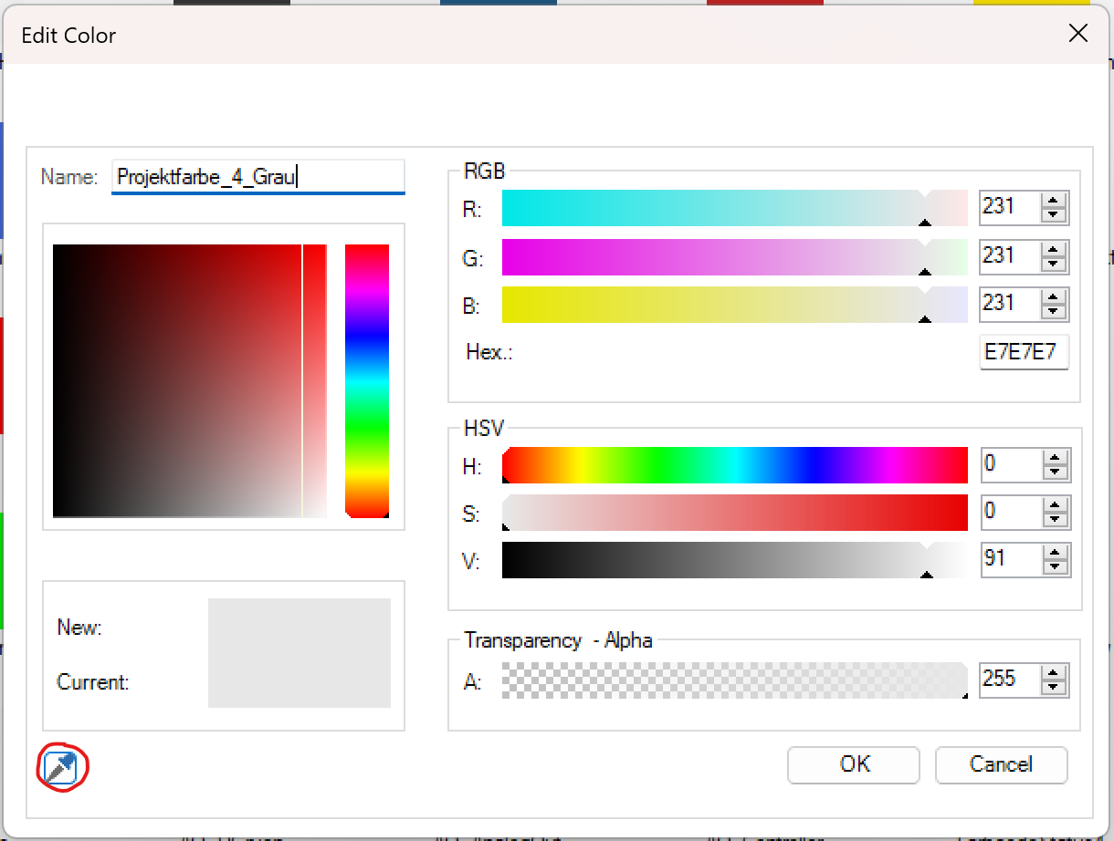
The colours can be specified in the additive colour space RGB and in colour models of the HSV type. With RGB, the colour is defined by the additive mixing of red, green, and blue. With RGB there is also the option of specifying a colour using the hexadecimal colour code. HSV is an alternative colour space to RGB and allows the selection of colours to be more intuitive. The colour is selected with the help of the hue, the colour saturation and the light value (or the dark level) (value). This can be achieved via the slider or via the rectangle on the left. The rectangle represents a coordinate network, the value of V lies on the X-axis and the value of S on the Y-axis. The current colour and the new colour are displayed in the colour preview. The colour selection is reset by clicking on the current colour.
In addition, the colour value of any area or pixel can be copied using the pipette symbol, even outside the designer. A name for the selected colour can be defined via the Name input field.
Filter function: The colour selection dialog allows filtering by colour name via a filter line. The filter works according to the * filter value * principle. The filtering remains active when switching between the individual areas. It can be filtered by name and by colour code.
Context menu in the colour selection dialog: In the context menu of the colour selection dialog, different views are available for displaying and sorting the colours in the dialog. In addition, the respective references can be displayed for each colour.
The gradient dialog
The colour gradient dialog is opened in drawing mode via the colour gradient icon Called up in the toolbar and is used to define or select colour gradients for the static symbols.
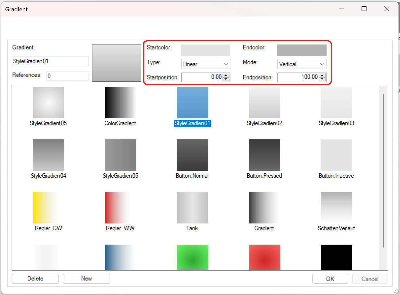
The parameters of the colour gradient can be edited immediately if the corresponding colour gradient is selected. The colours of the gradient are defined via the start and end colour. When you click on the currently selected colour, the dialog automatically switches to the tab from which the colour was selected.
The “Type” and “Mode” settings define the shape of the gradient. The user specifies the start and end of the colour change in the course via the start or end position to achieve different forms of the colour course type. Changes to the parameters immediately affect the selected colour gradient, i.e., the selected colour gradient in the selection list is also changed.
In addition, the number of references of the selected colour gradient is displayed in this dialog.
The process variable dialog
The process variables for the display or dynamization of the picture elements are specified via the process variables dialog.
The new tag properties can also be selected here. The assignment of tag properties in controls takes place via the familiar mechanism of process variable assignment. In addition to the tabs “Process variable” and “System variable”, there is now another one called “Properties” in the selection dialog. If this tab is selected, you get a list of all process variables and a combo box with the possible properties for the variable appears next to the array index field.
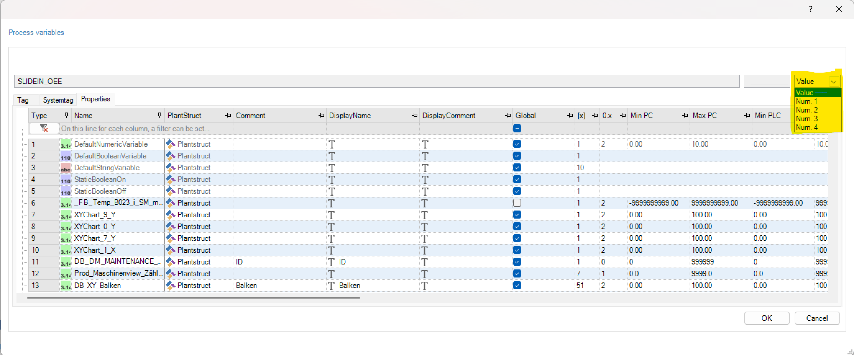
After assigning a property, the name of the process variable and the property name are displayed in the cell, separated by a point. Here for example “StaticBooleanOff.Num. 1”.
Status display in the picture editor
The status display in the picture editor is shown below the work area. The following elements are available in the status display.
Symbol |
Description |
|---|---|
|
Display of the picture resolution |
|
Display of the current |
|
Current zoom factor in % |
|
|
|
Adjust the display to 100 or 400% |
|
There are no elements outside the picture area |
|
Elements are outside of the |
|
Indicates whether an element is selected or not |
|
Shows whether the mode for scaling or sizing is active |
|
Indicates whether the user is in drawing mode or montage mode |


 bzw.
bzw. 
 bzw.
bzw. 
Functions in the picture editor
Alignment functions
The alignment functions can be used to adjust and align the symbols in the picture more quickly. The following functions are provided for aligning symbols:
Symbol |
Function |
Description |
|
|---|---|---|---|
|
Left aligned |
Function to align multiple symbols to the left. Orientation is the symbol with the smallest X position |
|
|
Right aligned |
Function to align multiple symbols to the right. Orientation is the symbol with the largest X position |
|
|
Align above |
Function for aligning multiple symbols upwards. Orientation is the symbol with the smallest Y position |
|
|
Align Bottom |
Function for aligning multiple symbols downwards. Orientation is the symbol with the largest Y position |
|
|
|
||
|
|
||


Important
Alignment functions can only be used for automation objects, status lines and function key lines if the individual elements have been selected using the multiple selection with the key combination “CTRL” + “W”.
Features for resizing
The following functions are made available to the user to allow the size of different symbols to be adjusted more quickly.
Symbol |
Function |
Description |
|
|---|---|---|---|
|
|
||
|
Adjust height |
Aligning the height of different symbols Orientation is the first symbol selected in the multiple selection |
|
|
Adjust size |
Adjust the width and height of different symbols. Orientation is the first selected symbol of the multiple selection |
|


Important
Functions for size adjustment can only be used for automation objects, status lines and function key lines if the individual elements have been selected via multiple selection with the key combination “CTRL” + “W”.
Grid
To make working with the picture editor easier, the user can set up and activate a grid. The distance and the appearance of the grid can be adjusted under “Extras” -> “Options”.
The following grid functions are available:
Symbol |
Function |
Description |
|---|---|---|
|
Show grid |
Function to display the grid in the picture |
|
Function to activate / deactivate the grid in the picture |
|
|
Function for aligning the element on the grid |
|

 | Gitter aktivieren
 | Gitter ausrichten
Test mode
The test mode is used to test the created dynamic symbols without having to generate and start the runtime. It is called up via the toolbar y pressing the play button. The edge of the work area is marked in colour as in the drawing mode. This shows that the test mode is active. The picture and its symbols, which are animated, are displayed in the work area.

Important
When the test mode is active, it is not possible to edit the elements in the picture or to change their position
The states of the variables can be controlled via the toolbox. In the “Values” area, the slide control is used for all numeric process variables, the button for all logical process variables and the input field for all text variablest.
For the dynamic attributes “visibility”, „skaling“, „moving“, „Spin“, „colour change“, „symbol change““, „colour threshold“, “blinking“, „bitmap“, “input” und „stat condition“ different variants of automation can be choosen.
The following options are possible:
Symbol |
Description |
|---|---|
|
The maximum value of the day is used |
|
The minimum value of the day is used |
|
The day is set dynamically depending on the slide control for numeric or the button for logical values |
|
Condition is always false or animation type is deactivated |
|
Condition is always false or animation type is activated |


Simulation mode
The simulation mode is an extension of the test mode; the process variables assigned to the elements can be set or changed at design time. In this way, the attributes of the elements can be tested without having to start the runtime and without having to be connected to a controller. As a result, the user can already see when creating an picture whether the elements function in the desired way.
Activate simulation mode: Call up test mode via the button and ribbon bar that is now displayed, you will find the “Simulation Settings.”
Simulation settings: In the simulation settings the user gets an overview of the elements used in the picture. This overview shows the attribute groups, the conditions and the process variable connection that can be simulated. The following columns are available in the dialog.
Column |
Description |
|---|---|
Type |
Type of dynamic element |
Class |
Class name of the dynamic element |
Instance |
Instance name of the dynamic element |
Attribute group |
Group to which the day belongs (e.g., display, rotation) |
Attribute |
Name of the attribute (e.g., value) |
Condition |
Condition text for the attribute (if available) |
Tag |
Name of the process variable assigned to the attribute group |
Grouping |
Group name that was specified for the day |
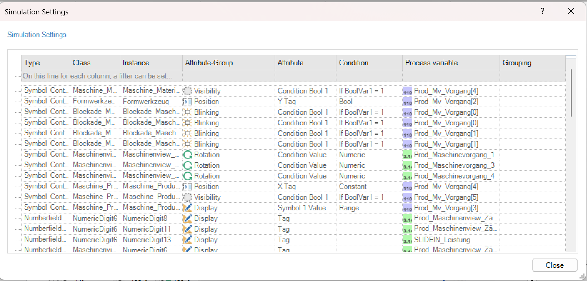
The elements are assigned to simulation groups via the Grouping column. Grouping to form simulation groups is only possible for process variables of the same type.
The simulation groups are user-defined and can be created or assigned by entering a name in this column. When the project is saved, the groupings for this picture are also saved. When simulating the values later, all elements assigned to the group are set when the group is set. In the example in the figure, the process variables for visibility are assigned to the groups “Pump active” and “Valve active”. If you set these groups, all pumps and valves are visible in the picture.
Working with the simulation mode: Before values can be simulated in the Designer, you have to switch to animation mode. The simulation settings give the user an overview of the elements and can assign them to simulation groups. After the simulation settings dialog has been closed, the user selects the “Simulation” button in the toolbox. In this view, the respective values are assigned to the process variables or simulation groups.

Group: In the “Group” column, all process variables or simulation groups that can be simulated are shown. The respective process variables are displayed if they are not assigned to a group. Even if the variable has been assigned multiple times for attribute groups (e.g., „Visibility” and “Colour change”), the process variable appears once in the list. If the same tag is assigned to several attribute groups and to simulation groups, the group and the process tag are shown in the list.
Type: In the column “Type”, the user has 4 simulation types available. The following table shows the different types and their meaning.
Symbol |
Name |
Description |
|---|---|---|
|
Defaultwert |
The process variable always has it´s fixed default value |
|
Lower limit value |
Die Prozessvariablehat immer ihren unteren Grenzwert |
|
Upper limit measurement |
Die Prozessvariable hat immer ihren oberen Grenzwert |
|
Equal |
Die Prozessvariable hat einen dynamischen veränderbaren Wert, welcher über die Spalte „Wert“ vom Benutzer geändert werden kann |


Value: The Value column is used to enter values for the respective process variables. Attributes such as “visibility” or “colour change” can be simulated through specific input.
Picture types
Process picture
One of the three screen types in PROCON-WEB is the process picture. Process pictures are independent pictures in which information is presented. Only process pictures can be defined as switch-on pictures.
Child picture
Child pictures are not independent pictures and can be called up from previously opened process or child pictures. The child picture is dependent on the associated father picture. The child pictures are only active until they themselves or the associated father pictures are closed.
In the application, child pictures are therefore often used as a dialog, for example to query whether the data is to be saved in the database or whether the process is to be canceled.
Picture elements and element hierarchy
Picture elements: A picture can consist of several different elements. PROCON-WEB differentiates between static symbols, dynamic object classes, diagrams and curves, status bars, function keys, automation objects and controls. Each object class can be created using the toolbox. Static symbols can be dynamised in addition to a dynamic symbol.
The display hierarchy is determined depending on the object classes. The user can change the order in which they are displayed in the picture between objects with the same class type. The display hierarchy described below applies to objects with different class types.
The static symbols are on the lowest level of the display hierarchy. The dynamic symbols are located one level higher. That is, a static symbol can never be displayed above a dynamic symbol. The last level contains the object classes diagrams, status lines, function keys, controls, and automation objects. As a result, objects such as controls are always displayed above number fields or static symbols, for example.
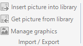
Bitmap management
In PROCON-WEB bitmaps are used to draw symbols, as icons on buttons or for picture backgrounds. To manage the bitmaps, the dialog in which the bitmaps are managed can be called up using the “Open bitmap dialog” button.

The import, export, edit and delete functions are available in the picture selection dialog. The picture processing program that is called under “Edit” can be set in the designer.
Runtime export: The designer has an optimised runtime export. This ensures that only referenced pictures are exported. If a bitmap export is required even though the picture is not referenced, this can be enforced using the “Runtime export” check box.
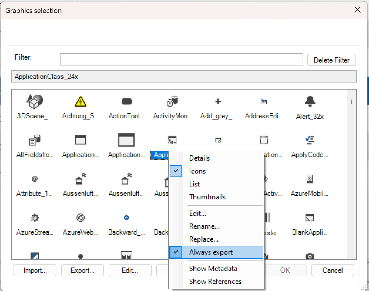
The reason for a missing reference is the “FillPictureView” function used in scripting or an external use of the picture.
Important
Picture backgrounds should be non-transparent pictures, since the runtime does not display the transparent areas correctly.
Filter: The bitmap selection dialog has a filter line with which all bitmaps managed in the project can be searched for the bitmap you are looking for.
Important
The filter is not case-sensitive in the bitmap names. The filter is of the “Starts with” type.
Create static symbols
Features in drawing mode
Tools
Function |
Designation |
Description |
|---|---|---|
|
Rectangle |
Draw rectangles with sharp corners |
rectangle |
Rounded rectangle |
Draw rectangles with rounded corners |
|
Ellipse |
Draw ellipses |
|
Circle |
Draw circles |
|
Elliptical arc |
Draw ellipses |
|
Circular arc |
Draw circular arcs |
|
Polyline |
Draw lines |
|
Polygon |
Draw polygons |
|
Text |
Creation of texts |
|
picture |
Import of external pictures |


Attributes
Function |
Designation |
Description |
|---|---|---|
|
line style |
Setting of the line |
|
Line width |
Setting of the Line width |
|
Frame and area filling |
Option for the display of the element |
|
Filling |
Filling pattern of the element |
|
Pen colour |
Pen colour for the element |
|
Foreground colour |
Foreground colour of the element |
|
Background colour |
Background colour of the element |
|
Colour gradient |
Selection and definition of the colour gradient |
|
Line start |
Selection of the type of the beginning of the line |
|
Line end |
Selection of the type of the ending of the line |


Font
Function |
Designation |
Description |
|---|---|---|
|Schrift | |
Font |
Settings of the font |
Font size |
Font size |
Setting of the font size |
|
Font attributes |
Set the attributes bold, italic, underline, and strikethrough |

Drawing static symbols
To draw new static symbols, you can switch to drawing mode using the “Draw” button in the toolbar. Alternatively, the required drawing tool can also be selected directly. It will then automatically switch to drawing mode. The background colour of the work area changes when the drawing mode is active. This can be set in the designer options. Then the required drawing tool and attributes are selected, and the symbol is drawn in the work area.
Important
During the development of PROCON-WEB, great care was taken to ensure that everything that is created in the Designer looks exactly the same in the runtime, i.e., in the browser. Unfortunately, it is currently not possible to draw elliptical arcs in the browser. As a result, the angle of the elliptical arcs in the browser is unfortunately somewhat different from what is displayed in the designer.

The complete drawn symbol is saved via the context menu “Apply as”. With the option “Apply elements as”, the selected elements are saved as a separate symbol. In the following dialog “Save as and insert” the symbol is saved or taken directly into the picture.

After saving, the symbol appears in the symbol list, from which it can be inserted into the picture with drag’n drop.
Dynamic object classes
Types of dynamization
Dynamic objects can be made dynamic in various ways, such as flashing, visibility, position.
Important
Not every object supports all types of dynamization. But every type of dynamization works the same for every object.
Which type of dynamization is supported ultimately depends on the object. The different types of dynamization are summarized in so-called attribute groups. In addition, each object contains an attribute group that describes the appearance of the object. This attribute group, which describes the representation of the object, cannot be deactivated. The administrable attributes depend on the selected control. The Size attribute has a limit of 65.5535 pixels. To prevent rendering timeout, the maximum display limit for the total size is 5,000 x 5,000 pixels. If a control is larger, rendering is omitted, and the control is only displayed schematically with names.
Presentation
Attribute |
Meaning |
|---|---|
Dynamics |
Determines whether a single picture or a list of pictures are shown depending on a numeric variable. |
Durchklickbar |
Hinter dem Symbol liegende Eingabefelder können betätigt werden bei Aktivierung. Attribtgruppen Eingabe und Funktionen könnnen dann nicht mehr ausgewählt werden. |
Class dialog input
In the case of dynamic objects, the “Input” attribute group controls whether an input can be made for this object. Inputs can be changing values or executing a function. Entries can also be regulated via conditions and / or rights. There may be more or fewer options for regulating the input.

Comparison conditions input
Condition |
Meaning |
|---|---|
Always |
Input is always allowed / not allowed |
If LogVar1 = 1 |
Entry is permitted / not permitted if the value of the logical process variable is 1 |
If LogVar1 = LogVar2 |
Input is allowed / not allowed if the value of the logical process variable is the same as the value of another logical process variable |
If NumVar1 <Const1 |
Entry is permitted / not permitted if the value of the numerical process variable is less than a defined constant |
If NumVar1 <= Const1 |
Entry is permitted / not permitted if the value of the numerical process variable is less than / equal to the value of a defined constant |
If NumVar1 = Const1 |
Entry is permitted / not permitted if the value of the numerical process variable is equal to the value of a defined constant |
If NumVar1 <> Const1 |
Entry is permitted / not permitted if the value of the numerical process variable is less or greater than the value of a defined constant |
If NumVar1> = Const1 |
Entry is permitted / not permitted if the value of the numerical process variable is greater than or equal to the value of a defined constant |
If NumVar1> Const1 |
Entry is permitted / not permitted if the value of the numerical process variable is greater than the value of a defined constant |
If NumVar1 between Konst1 and Konst2 |
Entry is permitted / not permitted if the value of the numerical process variable lies between the values of two defined constants |
If NumVar1 is between Const1 and Const2 |
Entry is permitted / not permitted if the value of the numerical process variable lies between the values of two defined constants |
If NumVar1 <NumVar2 |
Entry is permitted / not permitted if the value of the numerical process variable is less than the value of another numerical process variable |
If NumVar1 <= NumVar2 |
Entry is permitted / not permitted if the value of the numerical process variable is less than or equal to the value of another numerical process variable |
If NumVar1 = NumVar2 |
Entry is permitted / not permitted if the value of the numerical process variable is equal to the value of another numerical process variable |
If NumVar1 <> NumVar2 |
Entry is permitted / not permitted if the value of the numerical process variable is less than or greater than the value of another numerical process variable |
If NumVar1> NumVar2 |
Entry is permitted / not permitted if the value of the numerical process variable is greater than the value of another numerical process variable |
If NumVar1 is between NumVar2 and NumVar3 |
Entry is permitted / not permitted if the value of the numerical process variable lies between the values of two defined numerical process variables |
FreeConditions |
Free entry of the condition as long as the result is True / False. Input options are in a separate chapter explained |
Disabled: Negates the comparison condition
Input delay in milliseconds: Delays the input e.g. button click by the corresponding milliseconds. Prevents a keystroke from performing a function multiple times on sensitive touch panels.
Rights: Defines the rights required for input.
Area: Specifies the area in which input is permitted.
Important
“The values of the properties “Condition”, “Right” and “Range” shall be evaluated according to the following rules and accordingly the input
If the user has the right configured
If the client is in the configured area
The conditions are connected with “AND”
No rights or area declarations means “TRUE” for each field
AND connection of the condition
Deactivated or invisible is selected
Input specification
Condition |
Meaning |
|---|---|
No input limit |
Input is allowed in the value range of the variable. |
Static input limit |
Entry is permitted in the specified range of values. |
Dynamic input limit |
The value range of the input is regulated by two process variables. |
Special input: Is currently not evaluated.
Use signature (FDA): Activation of the FDA function of the input.
Request renewed login (FDA): During the runtime, the login must be carried out again to confirm the entry. The login dialog appears again for this. This can only be selected if a signature is used.
Force Comment (FDA): After the entry has been made, a dialog appears in the runtime in which a comment must be entered. This can only be selected if a signature is used.
Condition FreeCondition: Specifies whether the recorded condition must be true or must be false for the attribute to be used.
Position
In the case of dynamic objects, the “Position” attribute group enables dynamic position shifting. This can be done either in one direction (X or Y) or in both directions.

Position shift conditions
Value |
Meaning |
|---|---|
Constant |
No position shift in the corresponding direction |
Numerically |
When depending on a numerical process variable, the change in position from the symbol’s origin point to the selected end point is linear to the value range of the process variable. |
Logical |
When the logical process variable becomes active, the symbol jumps to the end position specified in the properties window. If, however, an animation duration is specified for the position shift, this symbol does not jump to the position, but moves to the end point in the period of the animation duration and depending on the animation type. |
Numerically direct |
The symbol is set to the value of the numerical process variable, regardless of the original position of the symbol in the picture. Depending on the value of the variable, the symbol can also be outside the picture! |
If a symbol is inserted from the toolbox for which no end point has been predefined, the current position is entered as the end point. With pre-defined end points, the system calculates the end points based on the current position and transfers the pre-set values. If, for example, 10 is pre-set as the end position and the current position is 300, the corresponding end point is 310.
If the element is moved or copied, the end point adapts automatically. In addition, an animation can be defined for the position shift. With this animation, an animated position shift can be realized with just a few clicks, without having to deal with this, for example, using formulas.
Types of animation
Value |
Meaning |
Value |
Meaning |
|---|---|---|---|
None |
No animation |
EaseInOutExpo |
|
Linear |
|
EaseInSine |
|
Swing |
|
EaseOutSine |
|
EaseInQuad |
|
EaseInOutSine |
|
EaseOutQuad |
|
EaseInCirc |
|
EaseInOutQuad |
|
EaseOutCirc |
|
EaseInCubic |
|
EaseInOutCirc |
|
EaseOutCubic |
|
EaseInElastic |
|
EaseInOutCubi |
|
EaseOutElastic |
|
EaseInQuart |
EaseInQuart |
EaseInOutElastic |
|
EaseOutQuart |
|
EaseInBack |
|
EaseInOutQuart |
|
EaseOutBack |
|
EaseOutQuint |
|
EaseInBounce |
|
aseInOutQuint |
|
EaseOutBounce |
|
EaseInExpo |
|
EaseInOutBounce |
|
EaseOutExpo |
|


Animation duration: Duration of the selected animation in milliseconds.
Scaling
In the case of dynamic objects, the “Scaling” attribute group enables dynamic scaling of objects. This can be done either in one direction (X or Y) or in both directions.

Scaling conditions
Value |
Meaning |
|---|---|
Constant |
No scaling in the corresponding direction |
Numerically |
When dependent on a numerical process variable, the scaling runs from the original size of the symbol to the selected maximum size linearly to the value range of the process variable. |
Logical |
The symbol assumes the maximum size when the logical process variables become active. However, if an animation duration is specified for scaling, the scaling is animated. |
Numerically direct |
The symbol is scaled to the value of the numerical process variable, regardless of the original size of the symbol. Depending on the value of the variable, the size of the symbol can also be 0! |
Note
The scaling is like changing the size, but here the whole element is enlarged. For example, the frame remains the same when you change its size, and it is enlarged when you scale it.
More scaling options
Option |
Description |
|---|---|
Maximum size |
Maximum expansion of the X and Y directions in pixels with the maximum value of the process variable |
Size dynamization origin |
Size dynamization origin in pixels relative to the upper left corner of the symbol |
Animation |
Types of animation of scaling. See also position |
Size
In the case of dynamic objects, the “Size” attribute group enables objects to be dynamically changed in size. This can be done either in one direction (X or Y) or in both directions. If the origin of the size dynamization is to be set to the centre of an picture at the position X = 100, Y = 100, the value of the centre of the picture to be scaled must be specified.
Note
Pictures that have already been scaled cannot be “scaled back” to a free point. In the case of negative scaling, a larger, unscaled picture can be used, which is then compressed in the same way with the origin point of the size dynamization.

To realize the dynamic size change, the following settings must be made.
Conditions of size
Value |
Meaning |
|---|---|
Constant |
No size change in the corresponding direction |
Numerically |
When depending on a numerical process variable, the change in size from the original size of the symbol to the selected maximum size is linear to the value range of the process variable. |
Logical |
The symbol assumes the maximum size when the logical process variables become active. |
However, if an animation duration is specified for the size change, the size change is animated. |
|
Numerically direct |
The symbol is increased or decreased to the value of the numeric process variable, regardless of the original size of the symbol. |
Depending on the value of the variable, the size of the symbol can also be 0! |
More options of size
Option |
Description |
|---|---|
Maximum size |
Maximum expansion of the X and Y directions in pixels with the maximum value of the process variable |
Size dynamization origin |
Size dynamization origin in pixels relative to the upper left corner of the symbol |
Animation |
Types of animation of resizing |
See also position |
Visibility
In the case of dynamic objects, the “Visibility” attribute group enables the visibility of objects to be changed dynamically.

Comparison conditions visibility: The comparison conditions for the dynamic visible or invisible switching are the same as for the input.
Action: Circuit visible or invisible
Rights: Required rights to perform this action
Animation / animation duration: See animation at position
Rotation
In the case of dynamic objects, the “Rotation” attribute group enables objects to be rotated dynamically.
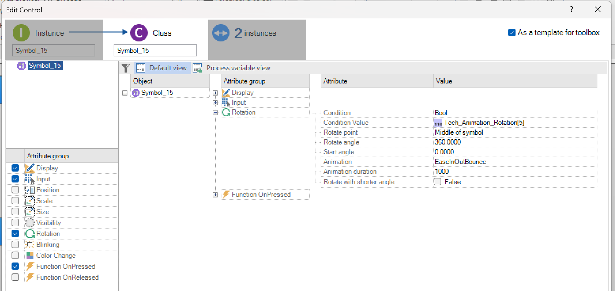
Each dynamic symbol can be rotated dynamically depending on logical or numerical process variables. The user must specify the starting angle and the rotation angle. It can also be specified whether the rotation should take place around the centre of the symbol or around a point of rotation that can be freely defined in the picture.
Note
A positive angle of rotation leads to a left turn, a right turn is implemented by a negative angle of rotation.
Animation / animation duration: If you choose an animation, you can decide whether you want to rotate with the shorter angle or not For animation duration or ways of animation: see animation at position
Flash
With dynamic objects, the “Flashing” attribute group enables dynamic flashing of objects.

The blinking or non-blinking of a symbol is controlled by numerical or logical process values. The flashing function depends on conditions that are identical to the conditions under “Visibility”. The interval (in ms) can be used to specify how long the object is visible or invisible. Animation and animation duration are to be parameterised in the same way as for position.
Threshold
With the “Threshold” property, up to eight constant or dynamic thresholds can be used with which the foreground or background colour can be changed.

The following options are available for Threshold.
Number: The “Number” option indicates the number of thresholds of the object. Up to eight thresholds can be defined.
Colour change condition: “Constant”, “Logical” or “Numerical” can be selected for “Colour change condition”. With “Logical” or “Numerical”, the colour change is determined by the value of a process variable.
Place: Place at which the colour change is to be carried out when the threshold value is reached.
Colour: Colour to be displayed when the threshold is reached.
Colour change
In the case of dynamic objects, the “Colour change” attribute group enables objects to be dynamically changed in colour.

When changing colours, the colour change can be selected for the individual elements such as text, background, etc.
Element |
Modification |
|---|---|
Colour for text |
Colour change of the textual part. |
For filled symbols with a pattern, the text colour corresponds to the joint colour (joint of the wall pattern) |
|
Colour for lines |
Change the colour of the lines (edges) |
Colour for filling |
For filled symbols without a pattern, the fill colour corresponds to the background |
Colour for background |
Colour change of the text background |
Colour change of the symbol background |
|
For filled symbols with a pattern, the background corresponds to the filling (brick of the wall pattern) |
The following properties are available for configuring a colour change.
Numerical and logical area: With this option, the value range of the process value is mapped linearly to the two specified colours. Depending on the sequence selected, the colour is changed in the runtime system.
Numerically and logically, directly: This colour change option allows a colour change according to a fixed selection, linear to a process value. If the colour selection is defined via logical process values, the symbol is given the colour of the logical process variable at the top in the order that was set. Meets none Condition for logical direct closed, the first element in the list is used as default for display.
Logical, coded: With the coded colour switching, the logical. Process values a bit field is formed and evaluated as a binary number. This value then determines the table position of the specified colour selection.
Numeric, direct list: In the case of a direct list, the exact colour value for a certain value of the process variable can be specified via another dialog. The colour remains until the next specified value.

In the example above, the colour red is selected for values> = 4 and <8.
Functions
In the case of dynamic objects, the “Function” attribute group enables the execution of up to five defined functions.
Important
The five possible actions are processed asynchronous. The numeration of the action 1 to 5 is not equal with the process order. The functions are independent of each other and their time of processing can vary, meaning it is possible, that action3 is processed before action!
The attribute group function is available in different versions depending on the dynamic object
Name |
Meaning |
|---|---|
Press function |
Function is executed when the object is clicked |
Release function |
Function is executed when, for example, the mouse is released |
Input function |
Function is carried out after input (e.g. number field) |

The various functions are shown in the following tables.
Logical functions:
Function |
Description |
|---|---|
Logical: set Log1 |
Logical process variable is set to the value 1 |
Logical: delete Log1 |
Logical process variable is set to the value 0 |
Logical: invert Log1 |
Logical process variable is inverted |
Logical: Log1 = Log2 |
Logical process variable is equated with a logical process variable |
Logical: change Log1 |
Logical process variable is set to 0/1 using the ‘Page up / Page down’ key |
Logical: set Log1 (button) |
Logical process variable is set to 1 as long as the button is pressed. When releasing the button, the before valid value of the tag is set anew. |
Logical: delete Log1 (button) |
Logical process variable is set to 0 as long as the button is pressed. When releasing the button, the before valid value of the tag is set anew. |
Logical: invert Log1 (button) |
Logical process variable is inverted as long as the button is pressed. When releasing the button, the before valid value of the tag is set anew. |
Logical: Log1 = Log2 (button) |
Logical process variable is set equal to a logical process variable as long as the button is pressed. When releasing the button, the before valid value of the tag is set anew. |
Important
If a communication error occurs with the functions Logical: set Log1 (button), Logical: delete Log1 (button), Logical: invert Log1 (button), Logical: assign Log1 (button), the set value is retained. This value is no longer reset after the fault has been eliminated.
Important
If the cursor is pulled away from the button while actuating and releasing the mouse button at another position, the function is run in spite of it.
Numerical functions:
Function |
Description |
|---|---|
Num: Num1 + = Const1 |
Numerical process variable is increased by a fixed value |
Num: Num1 - = Const1 |
Numerical process variable is reduced by a fixed value |
Num: Num1 = Const1 |
Numerical process variable is set to a fixed value |
Num: Num1 = Konst1 (button) |
Numerical process variable is set to a fixed value as long as the button is pressed. When releasing the button, the before valid value of the tag is set anew. |
Num: Num1 + = Num2 |
Numerical process variable is increased by the value of a numerical process variable |
Num: Num1 - = Num2 |
Numerical process variable is reduced by the value of a numerical process variable |
Num: Num1 = Num2 |
Numerical process variable is set to the value of a numerical process variable |
Num: Num1 = Num2 (button) |
Numerical process variable is set to the value of a numerical process variable as long as the button is pressed. When releasing the button, the before valid value of the tag is set anew. |
Picture functions
Function |
Description |
|---|---|
Picture: New Picture |
Add a new picture to the current picture |
Picture: New Picture numerically |
Add a new picture to the current picture (picture number = value of a numerical process tag) |
Picture: New picture (multi instance) |
Open a new image from a context, which can also be opened simultaneously from another context, e.B. to be able to compare settings of two motors next to each other, which are based on the same basic image, but are filled with different values by different structures |
Picture: close Picture |
Close a certain picture (e.g., child picture) |
Picture: Close Picture numerically |
Close a specific screen (screen number = value of a numerical process variable) |
Picture: Close Picture (alle instances) |
Closes all instances of the image that were opened, e.B. both engine images that were opened next to each other for comparison |
Picture: Close Picture numerically (alle instances |
Closes all instances of the image of an image number (= value of a numeric process variable) that are open |
Picture: Picture change |
Switch to a specific picture |
Picture: Numerical Picture change |
Change to a specific screen (screen number = value of a numerical process variable) |
Picture: print Picture |
Print a specific picture |
Picture: Print Picture numerically |
Print a specific picture (picture number = value of a numerical process variable) |
Important
The “Print” function calls up the print dialog of the default browser. For example, this can change the page format and scale be hired. Likewise, depending on the browser, the header and footer, and background graphics can be enabled or disabled. By default, the header displays the current date and timeas well as the title of the page. In the footer, the URL and to find the page number and number.
In the browsers of Google and Microsoft, an automatic print be hired. However, this requires a configuration of the Standard printer. The browser must be able to use the –kiosk-printing “ parametefor example, via a link. In this then be entered in the field “Target

Other functions
Function |
Description |
|---|---|
Special: call up a program |
Call up an external program (transfer parameters: program including path) |
Special: special function |
Calling up a special function (see chapter special functions) |
Text: Text1 = value |
Text variable is set to a fixed value |
Script: run script |
Execute the selected script |
Navigation functions
Function |
Description |
|---|---|
Navigate back |
Navigate to the previous view |
Navigate forward |
Navigate to the next view |
Navigate to the view |
Navigate to the selected view |
Record functions
Function |
Description |
|---|---|
Data record: Send |
Read data record with specified name from specified database |
Record: Capture |
Write data record with specified name to specified database |
Data record: delete (via variable) |
Delete data record from database, variable contains data record name |
Data record: Send (via variable) |
Read data record from database, variable contains data record name |
Data record: capture (via variable) |
Write data record to database, variable contains data record name |
Dynamic symbol
To create a dynamic symbol, any static symbol can be dynamised to a dynamic symbol. Static texts are dynamised into constant or dynamic texts.
Note
Static texts can also be dynamised as numeric or logical number fields.Rectangular symbols can be dynamized as a bar chart.
Important
Static texts can also be dynamised as numeric or logical number fieldsRectangular symbols can be dynamized as a bar chart.

A static symbol is created via the entry “Dynamise” -> “Dynamic symbol” made dynamic.

The system automatically opens the class dialog in which the properties of this class of the dynamic symbol are specified.
The different properties are assigned to the symbol here. Most of the attributes were already described in the previous chapter (see chapter Types of dynamization) The following chapter describes the attributes and how they work of the dynamic symbol.
Symbol change
The symbol change is used to dynamically exchange symbols. Several options are available for changing symbols.
Constant: The “Constant” option is active by default as soon as a dynamic symbol is created. The static symbols, which form the basis for the dynamic class, can be set here constantly. The static symbol that was dynamised is typically specified here.
Numeric area: If you select the Numeric area option, the symbol switch is carried out using an area from the symbol list.

“Symbol_1” forms the beginning and “Alarm” the end of the range of successive symbols. The value range of the numerical process variables is mapped linearly on the symbol list in the runtime system. With a value range of 0 … 9 and a list of 5 symbols, the first symbol is displayed for 0 and 1, the second symbol is displayed for 2 and 3, etc.
Logical area: With the option “Area Logical” you can switch between two symbols. Symbol 1 is shown when the value of the associated process variable is 0, symbol 2 is shown when the value of the process variable is 1.
Direct logical: In the case of direct assignment, a selection of two to eight symbols is assigned to its own logical process variable. The symbol to be displayed is determined by the process variable. The logical process variable, the value of which is 1, determines the symbol to be displayed. If several variables are set to 1, they are prioritized according to the order. If all variables are set to 0, the element with the highest priority is also displayed. Meets none Condition for logical direct closed, the first element in the list is used as default for display.
Direct numeric: The range of values of the associated numerical process variables is mapped linearly to the symbols specified. With the “Direct Numeric” symbol switching, up to eight symbols are possible.
List: The list option selects the symbols between which you want to switch. The corresponding symbol is displayed depending on the value of the assigned process variable.

Number fields
In addition to the possibility of generating number fields from static texts, you can use the “Number fields” symbol can be created in the toolbar. The classes of the number fields are managed in the toolbox. After selecting the number field type (logical or numerical), the system automatically opens the class dialog for the number field.

The following points can be parameterised under representation:
Value: Process variable that this number field should represent.
Tooltip text: The tooltip text to be displayed.
Appearance: Choice of standard number field or design number field. If “Design” is selected, a style must also be added (see Style Guide in Chapter surface) to get voted.
Transparent: The option “Transparent” shows the background of the number field transparently.
Font / text colour / background colour: Definition of the font, text colour and background colour. If the “Transparent” option is active, the background colour is not evaluated.
Fixed size: If the checkbox for the fixed size is activated, you have the option of defining the size, alignment, text spacing and line specification.
Unit: If you specify a unit here, it is specified directly after the number. This unit is a simple text that cannot be defined in multiple languages. In contrast, see units on tags.
Format
The “Format” attribute group can be used to define how the process variable to be displayed is formatted

The number format required for the number field is edited under Number system”. The following options are available:
Decimal
Hexadecimal
Binary
Octal
Exponentially
Date / time
Time (timer)
Note
Only the display changes to the corresponding number system. The entry is still made in decimal.
Important
The numeric field display in the format “Date / Time” and the system variable “$ Current.UTCTime” work with millisecond values. In contrast to this, the Time () and DateToStr () functions work with seconds values. If necessary, a conversion must be made here.
Under “Define format” the user can specify how many places and decimal places the field should have for the number field.
Note
When working with zeros in front of the decimal point, the digit for the sign is also assigned a zero for positive numerical values.
Under “Define format” the user can specify how many places and decimal places the field should have for the number field. If the “Define format” checkbox is not activated, as many positions are used as are required to display the assigned process variable.
Input
In the case of number fields, the “Input” attribute group has been

Under the “Input specification” property, you can specify whether the number field should have an input restriction. The following options are possible:
No input limit: With the “No input limit” option, the value range of the assigned process variables is used as the input range.
Static input limit: If the option “Static input limit” is used, the user can specify constant values as the lower and upper input limit.
Dynamic input limit: The “dynamic input limit” uses numeric process variables as input limit values. The limit value of the lower and upper limit is determined by the value of the assigned numeric process variable.
Note
Static and dynamic input limits are only useful for numeric number fields.
Bar graph
The bar display is used to graphically display process values. The possible properties that can be assigned to the class are “Presentation”, “Visibility”, “Threshold” and “Flashing”. “Input” or the “Input function” aren´t possible.
With “threshold” the difference to the number field is that the bar changes colour completely or only partially when the threshold value is reached. All other properties are analogous to the dynamic object classes already described. A target value can be entered in the “Representation” attribute group, which is then displayed on the bar.
Dynamic text
Dynamise static texts
In PROCON-WEB the user has the possibility to dynamise the static texts to constant texts, dynamic texts or to number fields. The static texts are dynamised using the same procedure as static symbols.

Dynamic text
The display of the dynamic text in PROCON-WEB depends on the value of the assigned text variable.

In addition to the pure display, the “Input” property can be assigned for this text object. This means that texts can be changed dynamically at runtime. Options such as text colour, background colour and alignment of the text can be configured under “Display”.
Important
Has a text field, but no fixed size, but has an input option, the picture can be shifted if the outer edge of the picture is reached when entering the text or “beyond” is written. If the text is reduced again, the shift is reversed if it has not yet been saved. After that, the shift can only be corrected with an update (F5).
Format: The attribute group “Format” is used to enter various text formats (ex. Text, password, time, date, date-time).

Note
The “Format” attribute only defines which touch dialogue is called up. It is not a formatting of manual entries in the text field!
The following table shows the settings for the individual formats.
Format |
Parameter |
Meaning |
|---|---|---|
Text |
||
Password |
Password sign |
The character that should be output instead of plain text can be entered as a parameter. |
Time |
Time format |
As a parameter, you can choose between 24h and 12h display. |
Date |
Date format |
Various representations of the date can be specified as parameters. |
Date / time |
Time format/Date format/Delimiter/Display format |
The above-mentioned settings can be made as parameters, as well as a separator between the individual values and the order. |
Constant text
The “constant text” differs from the “dynamic text” in that no dynamic text entries can be made or the text does not change dynamically. All other properties of dynamic text objects are also available for constant text.

Due to the object-oriented structure, different constant texts can be defined for each instance.
Dynamic content: Dynamic content can also be added for the constant text. This allows the user to mention process variable values in the text. The placeholders for process variables were based on the scheme used in the alert definition. A process variable can be described in the text as follows:
Definition |
% |
Type |
Name |
% |
|---|---|---|---|---|
Description |
% |
N: numerically L: logical T: text |
Name of the process variable |
% |
Example |
% |
N |
Temperature |
% |
The process variable can also be added to the selected position via the context menu.
Label text
The “Label Text” control is used to display various attributes of the assigned variable or the assigned structure.

Format: The attribute group Format is used to define which attribute of the assigned variable or the assigned structure is displayed.
Note
Not all combinations of “format” and assigned variable or assigned structure are useful.
Definition of the instance values of dynamic object classes
The procedure for defining the instance values is identical for all dynamic object classes. Depending on which properties have been selected for the dynamic object class, the instance values can be assigned accordingly.

In addition to the instances of dynamic properties, instance values of static properties can also be parameterised. The view in the properties window can be switched between “Standard”, “Process variables” and “Instance values” for faster parameterisation. All dynamic properties to which a process variable is to be assigned are displayed under “Process variables”. All possible properties and the associated instance values are displayed under “Instance values”. In this view, in contrast to the “Standard” view, multiple changes are possible.
Important
Only instances can be changed in the properties window! The properties can only be changed in the class dialog of the corresponding dynamic object class.
Note
The instance values should only be defined in the properties window since each instance of the object class already has this instance value when defined in the class dialog.
Dynamic Expressions
Dynamic Expressions summarizes the terms FreeConditions and FreeValues. For both is an editor available in which JavaScript is used to a limited extent.

The Syntax of Comments is the same as in C++ and other languages.
// Single-line Comment
/* That is a long,
multi-line comment */
/* You can’t comment, /* Nest */ SyntaxError */
Comments are like whitespaces and are depraved when the script is executed
|
Properties (tag array) |
|---|---|
length |
length |
pop() |
concat() |
push() |
join() |
concat() |
slice() |
join() |
indexOf() |
reverse() |
every() |
shift() |
some() |
slice() |
map() |
sort() |
filter() |
splice() |
reduce() |
unshift() |
reduceRight() |
indexOf() |
|
every() |
|
some() |
|
map() |
|
filter() |
|
reduce() |
|
reduceRight() |
Important
When using operators, you have to be aware, that the editor is case-sensitive. Meaning, you have to write „true“ instead of “True” or “TRUE”. Otherwise there will show an error message when creating the project.
Arrays within a structure do not support functions or properties “tags.NumericTag.unitValue” will retrieve the unit of the value. For structures, only the display name of the tag can be accessed with “.displayName” and the display comment of the tag with “.displayComment”. This must be accessed with a “$name” to avoid naming conflicts with elements in the structure.”If a tag begins with a small letter, it isn´t highlighted. If an error occurs when executing a dynamic expression, the default value is used for the corresponding data type (false for FreeCondition/Bool FreeValue, 0 for Num FreeValue, “” for String FreeValue) Also, the error is displayed in the browser console.

If you access an invalid index in TagArrays, the array returns a default tag and an error is displayed in the browser console. The Default tag always returns the Default value for value and unitValue of the data type (false for Bool, 0 for Num, “” for String). For a numeric tag, min.value min.unitValue max.value max.unitValue decimalDigits.value, and decimalDigits.unitValue returns 0.

When importing DynamicExpressions via a bibliotheca, it can happen, that it isn´t working properly anymore. In that case, a comment is written into the DynamicExpression that it has to be proofed manually.
Free Conditions
FreeConditions can be used at every point where conditions can be recorded for an attribute. The FreeConditions can currently be administered in the following attribute groups:
Class dialog input
Visibility
Flash
Function icon 1
Function icon 2
Engaged (button)
The condition can be freely defined here if the query returns “True” or “False”. In the event of an incorrect entry, an error message is output, and the value is set to the last valid value. The same applies if an undefined variable or function is used.

Syntax: Valid operators are
Operator |
Function |
|---|---|
< |
Less than |
> |
Greater than |
=== |
Equal |
!= |
Unequal |
&& |
And |
Add |
|
Subtract |
|
* |
Multiply |
/ |
divide |
Example: 5> 4
Numeric literals: Integers can be expressed as decimal (base 10), hexadecimal (base 16), octal (base 8), and binary (base 2).- A decimal number literal consists of a sequence of digits without a leading 0- A leading 0 or 0o (or 0O) for a number literal indicates an octal number. Octal numbers can contain only the digits 0 to 7.
A leading 0x (or 0X) indicates a hexadecimal number. Hexadecimal integers can contain digits (0 - 9) and the letters a - f or A - F as digits. (The spelling of the letter does not change the value of the digit. Z.B. 0xa = 0xA = 10 and 0xf = 0xF = 15.- A leading 0b (or 0B) indicates a binary integer; binary integers can contain only the digits 0 and 1.
Floating point Literals: A floating-point literal can contain the following sections:
A decimal integer that can be signed (“+” or “-“).
A decimal point (“.”).
A decimal point number (another decimal number).
An exponent.
The exponent consists of an “e” or “E” followed by an integer, which can be marked with a sign (“+” or “-“). A floating-point number must consist of at least one digit and either a decimal point or an “e” (or “E”). In a nutshell, the syntax looks like this:
[(+|-)] [digits] [.digits] [(E|e)[(+|-)]digits]
String Literals: A string literal consists of zero or more characters enclosed by double (”) or single (’) quotation marks. A string must always be enclosed by the same quotation marks. Either single or double quotation marks
Use of constants: Numbers can be entered directly; strings must be marked with “”. Example: “Hello”! = “Test”
Entry in the FreeCondition field |
Return value |
|---|---|
5 < 10 |
True |
5 > 10 |
False |
5 === 10 |
False |
5 != 10 |
True |
5 + 5 === 10 |
True |
5 – 5 < 10 |
True |
5 + (10 * 3) != 100 |
True |
“I am a string” === “I am a string” |
True |
“I am a string” != “I am a string” |
False |
“I am a longer string”> “I am a string” |
True |
“I am a longer string” <”I am a string” |
False |
When using variables, the word “tags” must be placed in front of the variable name with a period. To use the value, put “.value” after the variable name. The min / max values are addressed using “max.value” / “. Min.value”.
Example
Entry in the FreeCondition field |
Return value |
|---|---|
tags.NumA.value < tags.NumB.value |
True |
tags.NumA.value > tags.NumC.max.value |
False |
tags.StringA.value === tags.NumB.value |
False |
tags.StringB.value != tags.NumC.decimalDigits.value |
True |
The use of arrays works as follows: tags.Array1 [5] is used to address the 5th position of Array1. With tags.Array1 [tags.Variable1.value] .value you get the value of the array from the position that is stored on variable1.
|
|
|---|---|
tags.ArrayA[5].value |
tags.ArrayA[tags.NumA.value].value |
tags.TagWithoutArray.value |
Use of functions
Math. functions |
String functions |
|---|---|
Math.round() |
“StringTest” .charAt () |
Math.pow () returns value of the number to 3 |
StringTest“.charCodeAt() |
Math.sqrt () returns the square root of a number |
“StringTest” .concat () combines two or more Strings |
Math.abs () returns the absolute value of a number |
“StringTest” .fromCharCode () converts unicode-values into character |
Math.ceil () rounds a number to the nearest integer and returns the result |
“StringTest” .indexOf () Returns the position of the first occurrence of a specified value in a string |
Math.floor () rounds a number down the nearest integer and returns the result |
“StringTest” .lastIndexOf () Returns the position of the last occurrence of a specified value in a string |
Math.sin () returns the sinus value of a number |
“StringTest” .match () searches a string for a match with a regular expression and returns the matches as an Array object |
Math.cos ()returns the cosinus value of a number |
“StringTest” .replace () searches a string for a specified value or regular expression and returns a new string in which the specified values are replaced |
Math.min ()returns the number with the lowest value |
“StringTest” .search () searches a string for a specified value and returns the position of the match |
Math.max () returns the number with the highest value |
“StringTest” .slice () extracts parts of a string and returns the extracted parts in a new string |
Math.random () returns a random number between 0 (included) and 1 (included) |
“StringTest” .split () splits a string into an array of substrings and returns the new array |
Math.acos () returns the arcuscosinus value of a number between PI/2 and PI/2 in the radians |
“StringTest” .substr () should not be used, use instead substring() |
Math.asin ()returns the arcussinus value of a number between PI/2 and PI/2 in the radians |
“StringTest” .substring () extracts parts of a string starting with the character at a specified location and returns a specified number of characters |
“StringTest” .toLowerCase () converts a string to lowercase |
|
“StringTest” .toUpperCase ()converts a string to uppercase |
|
„StringTest“.startsWith() returns true if a string begins with a specified string; false otherwise |
Example
Entry in the FreeCondition field |
Return value |
|---|---|
Math.max(10,20,30) > Math.min(10,20,30) |
True |
10 == Math.max(10,20,30) |
False |
„StringTest“.charAt(3) === „P“ |
False |
„Hello“.concat(„ World“) === „Hello World“ |
True |
Free Values
FreeValues can be used where Tags are implemented that can´t be written to and where it is not possible to use FreeConditions. The syntax is analogous to the FreeConditions, only the return values differ here. The return values can be
Logical
Numerically
Strings New icons have been introduced for this purpose:


 string
Für Numerische Variablen kann ein Free-Value mit einem numerischen Wert erstellt werden. Z.B.: - tags.MyNumber.value * 10 - 42 - tags.MyBoolean.value ? 100 : 0

Four input fields for FreeValue appear. The value, min, max, decimal places, and unit selection. The behavior of the FreeValue cell corresponds to the FreeCondition cell. It can be entered directly into the Script Code cell. If the cell is left, the check is carried out via the Type-Script Server. If the entered code is valid, it remains valid if it is not valid the editor opens. There may be a double unit conversion and thus incorrect values in the display if “unitValue” is accessed and a unit is also stored in the numeric field.
For a logical day, a Boolean value. E.B
tags.MyBoolean.value
Tags.MyNumber.value < 100
Tags.MyString.value.startsWith(Hello)
false

The behavior of the FreeValue cell corresponds to the FreeCondition cell. It can be entered directly into the Script Code cell. If the cell is left, the check is carried out via the Type-Script Server. If the entered code is valid, it remains valid if it is not valid the editor opens
For a string tag, a tag with a corresponding string result. Z.B.:
tags. MyNumber.value + ‘_’ + tags. MyString.value + ‘!’.

The condition can be freely defined here if the query returns “True” or “False”. In the event of an incorrect entry, an error message is output, and the value is set to the last valid value. The same applies if an undefined variable or function is used.
Currently, the FreeValues can be administered in the following controls:
Dynamic text
Checkbox
Slide switch
QRCode 1
Web browser
Dynamic symbol
Ternary expression: When crating FreeValues, it isn´t allowed to use “IF”. To bypass this, and proof a condition or assign a value to a tag a so called „Ternary expression“ can be used: Tag = (condition) ? (Assignment if true) : (Assignment if false) (condition) ? (expression if true) : (expression if false)
Examples: Ensuring value > 0
(tags.something.value > 0) ? tags.something.value : 0
- tags.Diagramdisplaymode.value == 0 ? tags.Diagramdailyconsumptionday.value
: tags. Diagramdisplaymode.value == 1 ? tags. Diagramdailyconsumptionmonth.value
tags.DiagrammAnzeigemodus.value == 2 ? tags.DiagrammTagesverbrauchJahr.value
tags.DiagrammAnzeigemodus.value == 3 ? tags.DiagrammTagesverbrauchGesamt.value
: tags. Diagramdisplaymode.value == 2 ?
Simple controls
SlideIn
A SlideIn is a control that can move another picture into the current picture from the outside by touching it or using a variable. As soon as the SlideIn is 30% open or closed, the gesture manager controls the opening or closing of the entire control automatically.

The following options can be set:
Attribute |
Meaning |
|---|---|
Symbol |
Defines the symbol that represents the slide-in. |
picture |
Defines the picture that corresponds to the content of the slide-in. |
Picture arrangement |
Specifies where the above picture should be opened. |
Position |
Specifies the position at which the picture content specified above is attached to the slide-in picture. |
External variable |
The SlideIn can be extended with a process variable if this (boolean) = 1 or retracted if the variable has the value 0. |
Automatically close |
Specifies whether the SlideIn automatically moves out of the picture again when you let go. |
PictureView
An PictureView is a control that can display different types of pictures. In contrast to a symbol, an PictureView can also display animated gifs or SVGs.

The following options can be set:
Attribute |
Meaning |
|---|---|
Dynamics |
Determines whether a single picture or a list of pictures are shown depending on a numeric variable. |
picture |
Defines the picture that is displayed by the PictureView, if constant display was selected. |
In contrast to pictures in symbols, animated gifs and SVGs are also treated as such and displayed accordingly in runtime. |
|
Picture list |
Selection of the picture list to be displayed, if the list display was selected. In contrast to pictures in symbols, animated gifs and SVGs are also treated as such and displayed accordingly in runtime. |
In contrast to pictures in symbols, animated gifs and SVGs are also treated as such and displayed accordingly in runtime. |
|
Value |
Numeric variable that determines which picture in the picture list is displayed. |
(0 = 1. Picture, 1 = 2. Picture, 2 = 3. Picture, …) |
Navigation element
Under the ribbon „picture editing“ the former selection „PictureView” is replaced with a pick list “Pictures”. The list contains “PictureView” and the new “SVGView”.

The SVGView uses the same attributes as the PictureView. Additionally, it includes the attribute “Color Change”. Under “Display” the point “dynamic” has opposing to the PictureView no pick list. The control can only use SVG.
Attribute Colour change: The color change is like other known color changes, e.g., numeric fields. There is a difference how the color change affects the chosen area. The color change for SVGView can be set separately for line, filling, and background. For the numeric field e.g., the color change is applied for all options.
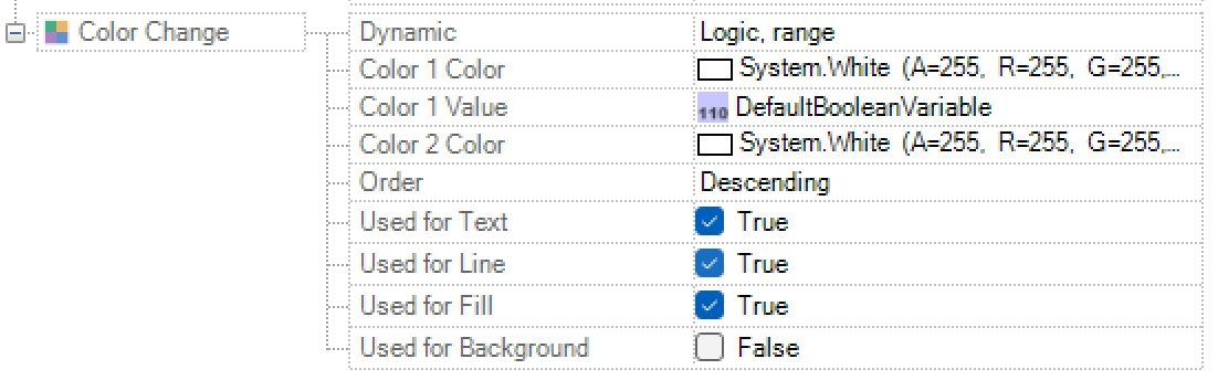
The settings for the color change are the same as usual (Num/Log direct, Num/Log range, Log encoded and Num list)
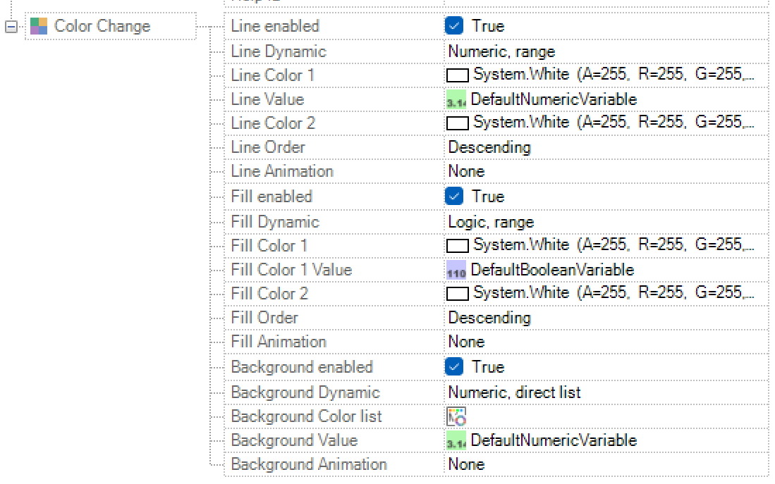
Important
If values are set for the attributes Line, Background and Fill in the class class, the dynamisations in the instance will not take effect!
Important
The selection „line“ is applied to lines and text. A distinction is planned for later stages and currently not available.
Checkbox
Checkboxes in PROCON-WEB can look like the one shown in the graphic below. It is possible to dynamically change the entries and the visibility of a checkbox. An input function can also be defined.

The appearance of the checkbox is mainly determined by the style guide (see the style guide in chapter surface) certainly.
Important
Checkboxes can only be displayed horizontally; no rotation is possible!

In the “Displayed value” field, the labelling is specified that the checkbox should have in the picture. The logical process variable that is to be set at runtime when the checkbox is activated can be parameterised under the “Value” field.
Combo box
Comboboxes in PROCON-WEB can look like the one shown in the graphic below. It is possible to dynamically change the entries and the visibility of a combo box. An input function can also be defined.
The appearance of the combobox is mainly determined by the style guide (see style guide in chapter surface) certainly. A maximum of 256 fixed list elements are possible in a combo box.
Important
Comboboxes can only be displayed horizontally, no rotation is possible!

The value of the combobox can either be written to a numerical value (= index) or to a string value (= displayed text). Of course, this can also happen in the opposite direction. If the process variable is set to the value -1, no list element is selected in the combo box.
The parameterisation of the instance values for the list entries to be displayed is carried out in the property “Displayed value”. By selecting the selection button, another dialog opens in which the list entries can be created, and their order changed.

A defined index can be entered for each entry in the list. The indices cannot be duplicated, but they can have gaps.
Via right-mouse-button you can open a dialogue and with that a variable can be set as value resp. property.
List entries can be made visible dynamically via a process variable. By default, no variable is entered, which is to be equated with visible.
Important
List entries can only be deleted or added in the default language! If you are projecting in a different language, the buttons are inactive.
Buttons
Concept of buttons
A button is another control element that is like the earlier function keys. In contrast to the function keys, buttons are detached from a fixed line. The standard representation of a button is very similar to a function key.

A defined style can also be used for the button. These styles are described in the style guide (see the style guide in chapter surface) created.
Note
See also the configuration style guide in the chapter surface
In addition to the standard attributes as with dynamic objects, the attributes “display pressed”, “status condition”, “LED status display” and “function icon” can be selected for a button. In this way, for example, several states can be implemented for the display, which in the case of dynamic objects could only be implemented with a symbol change or colour change and visibility and the corresponding project planning effort.
The following chapters take a closer look at the attributes and their options that have not yet been considered for dynamic objects.
Presentation
The general appearance of the button is configured under Display. The following table shows the available attributes.

The following options can be set:
Attribute |
Meaning |
|---|---|
Size |
Expansion in X and Y directions |
Expansion in X and Y directions |
Tooltip text to be displayed |
Appearance |
Specifies the appearance of the button. In addition to the standard display, the Design option is available. With the Design option, the display of the buttons is based on the display defined in the style guide |
Row edge |
Tabs can be realised with the row edge. The row edge halves the button so that one side of the button has a straight edge. In other words, with the row edge below option, rounded buttons give you an object whose bottom corresponds to a rectangle. |
Only active with “Design” appearance |
|
Text alignment |
Alignment of the labelling text |
Text margin spacing |
Specifies the distance the text should have from the edge |
Bitmap alignment |
Alignment of the background bitmap on the button |
Function icon alignment |
Alignment of the function icon in the button |
Function icon distance |
Distance of the function icon from the edge |
Visibility |
Indicates whether the button is always visible |
Text below / above |
Specifies the text of the top / bottom line |
Colour |
Specifies the colour of the text |
Background colour |
Specifies the background colour of the button |
Bitmap |
Selection for displaying a bitmap on the button |
Function icon |
Since a button can have several states, it is optionally possible to define a function icon for each state. |
Note
The function icon is always in the foreground when the button is
Pressed
With the “Pressed” attribute group, the user can define a different display for the button when it is pressed. In comparison to dynamic objects, the user saves himself a colour or symbol change and the associated process variables.
The following attributes are available for “display pressed”.
Attribute |
Meaning |
|---|---|
Text above |
Specifies the text to be displayed in the upper line when the button is pressed |
Text below |
Specifies the text that is to be displayed in the lower line when the button is pressed |
Colour |
Specifies the colour of the text that is displayed when the button is pressed |
Background colour |
Specifies the background colour of the button that is displayed when it is pressed |
Bitmap |
Selection of the bitmap of the button that is displayed when it is pressed |
Function icon |
Specifies the static function icon that is displayed when it is pressed |
Important
If no text is used for text above / below, the text that is defined under Display is used. Therefore, a space should be entered in the text field if no text is to be used in the pressed display.
Class dialog input

As with all other dynamic objects, the input function for buttons can be deactivated, linked to conditions, or locked by a user level. In addition, under Input you can define how the button should be displayed at runtime if no input is possible.
For the attribute group “Input”, the following attributes can also be defined for buttons.
Attribute |
Meaning |
|---|---|
Text above |
Specifies the text that should be displayed in the top line of the button when the input is blocked |
Text below |
Specifies the text that should be displayed in the bottom line of the button when the input is blocked |
Colour |
Specifies the colour of the text that is displayed when it is locked |
Background colour |
Specifies the background colour of the button that is displayed when it is locked |
Bitmap |
Selection of the bitmap of the button that is displayed in the locked state |
Function icon |
Specifies the static function icon that is displayed in the locked state |
Engaged
In addition to the display in the normal state, in the pressed state and in the locked state, the status condition can be defined for another state.
The following table explains the possible attributes for status conditions
Attribute |
Meaning |
|---|---|
Condition |
Specifies the condition for which the latched state is enabled / disabled |
Action |
Indicates whether the latched state is active / inactive depending on the condition |
Text above |
Specifies the text to be displayed in the top line of the button when the latched status is active |
Text below |
Specifies the text that should be displayed in the bottom line of the button when the latched status is active |
Colour |
Specifies the colour of the text that is displayed when the Snap status is active |
Background colour |
Specifies the background colour of the button that is displayed when the latched status is active |
Bitmap |
Selection of the bitmap of the button that is displayed when the latched status is active |
Function icon |
Indicates the static function icon that is displayed when the latched status is active |
LED status display
Using the LED status display, the extended button can visualise the status of a machine or part of a machine using colourus. The definition of the LED status display is analogous to the colour change; the adjustable options are identical. In addition, the LED status display can flash, for example to indicate a change from one status to another. A further colour can be defined for the blinking, with which the blinking is to take place.

The following table shows the attributes of the LED status display and their meaning.
Attribute |
Meaning |
|---|---|
Dynamics |
Specifies the colour change condition for the status display. Analogous to the colour change attribute group |
Animation |
Define animation of the colour change |
Alignment |
Specifies where the status display should be displayed on the button |
Size |
Specifies the size for the area of the status condition |
Effect icon |
Specifies the bitmap to be displayed in the status condition area |
Flash |
Activate / deactivate the flashing function for the status display |
Condition |
Specification of the condition for the flashing function |
Action |
Selection of whether to blink / not to blink depending on a condition |
Flashing colour |
Specifies the colour you want the status indicator to blink |
Dynamic function icons
In addition to the static function icons, two dynamic icons can be defined in the extended button.
The display appears when the set condition is met.
The following table describes the possible options for the function icons and their meanings
Attribute |
Meaning |
|---|---|
Condition |
Specification of the condition for the visibility / invisibility of the function icons |
Action |
Selection of whether the function icon should be visible or not visible depending on the condition |
Function icon |
Selection of the bitmap to display the function icon |
Function icon alignment |
Specifies where the function icon should be displayed in the button |
Function icon distance |
Specifies the distance from the edge of the button |
Slide switch
The “slide switch” control is used to control a logical variable and is activated via the icon created in the toolbar.

The following options can be set:
Attribute |
Meaning |
|---|---|
Presentation |
The variable value to be controlled, the object size, the appearance (standard or style) and the background colour are defined under display. |
Class dialog input |
In the same way as for the other controls, input is activated depending on the conditions under Input. In addition, an input limit and special input can be configured. |
Visibility |
Visibility switching depending on the corresponding condition |
Additional function |
Analogous to the other controls in PROCON-WEB, an additional function can be executed with the additional function when entering at runtime. |
Slider
The “Slider” control is used to control a numerical variable and is activated via the icon created in the toolbar.

The following options can be set:
Attribute |
Meaning |
|---|---|
Presentation |
The variable value to be controlled and the object size are defined under Display. |
The appearance of the slider is mainly determined by the style guide (see style guide in the Interface chapter). |
|
Class dialog input |
In the same way as for the other controls, input is activated depending on the conditions under Input. In addition, an input limit and special input can be configured. |
Position |
Position shift depending on the corresponding condition |
Visibility |
Visibility switching depending on the corresponding condition |
Flash |
Flashing depending on the corresponding condition |
Input function |
Analogous to the other controls in PROCON-WEB, an additional function can be executed with the additional function when entering at runtime. |
Pie chart
The “pie chart” control is used to graphically display up to 10 values. These values can be constant or a numeric variable. The control is generated via the icon in the toolbar.

The following options can be set for the display:
Attribute |
Meaning |
|---|---|
Circle proportion in degrees (90 ° -360 °) |
Percentage of circles that the pie chart represents as a maximum. |
Inside distance in percent |
Defines the inner area of the circle that remains empty. |
Show label |
Display of the labelling for the values. |
Text colour |
Colour for the inscription text. |
Text display threshold |
Threshold from which value the labelling text is displayed. |
Frame width of the sectors |
Frame width of the sectors in pixels. |
Frame colour of the sectors |
Defines the frame colour of the sectors |
Clockwise rotation |
Specifies the direction of rotation in which the orientation is displayed. |
Chart rotation |
A basic rotation of the control is specified here. |
Data: With the pie chart a distinction is made between normal display and progress display. The following settings depend on the type.
Normal representation:
Attribute |
Meaning |
|---|---|
Explosion distance |
Distance in pixels for “Exploded View”. |
Number of sectors |
Number of values that are displayed (2 - 10). |
Sector n value type |
Switching between constant or dynamic value. |
Sector n value |
Enter the constant or dynamic value. |
Sector n colour |
Colour of the sector. |
Sector n Exploded view |
Determination of whether the sector should “explode”, that is to say moved outwards. |
Remaining progress colour |
Colour of the remaining progress in the progress display. |
Progress indicator
Attribute |
Meaning |
|---|---|
Setpoint |
The percentage display is calculated based on this value. (Actual = 1000, target = 500 -> 50%) |
Selection of the MinValue Type |
Determination of which minimum value should be used |
“No input limit”: The minimum value of the day is used |
|
“Static input limit”: A fixed value can be entered directly |
|
“Dynamic input limit”: The minimum value is set using a numeric variable |
|
Selection of the MaxValue Type |
Definition of which max value should be used |
“No input limit”: The max value of the tag is used |
|
“Static input limit”: A fixed value can be entered directly |
|
“Dynamic input limit”: The maximum value is set via a numeric variable |
|
Remaining progress colour |
Colour of the area that is not filled. |
Sector 1 value |
This is the actual value that is displayed as a percentage of the setpoint. |
Sector 1 colour |
The area of the actual value is shown in this colour. |
It should be noted that the selected MaxValue type does not depend on the MinValue type. For example, you can also use a day as the minimum value, during which the maximum value is a static entry
Threshold: The threshold and colour change attributes are only available if the progress indicator is active in the Data category. A distinction can be made between an area change and a total change. The range change defines different colours for sectors of the progress of the pie chart. The total change, on the other hand, swaps the entire sector of progress.
Conditions for the colour thresholds can be defined individually for each colour. A distinction is made between logical, numerical, and constant conditions. If several conditions are met, the colour that has a higher value in the designer configuration is always selected.
Attribute |
Meaning |
|---|---|
Change of area |
A distinction can be made here between overall and area changes. The overall change changes the complete control while the area change only fills the value range. |
Number |
Defines the number of colours |
Condition |
Condition of the threshold |
Colour |
Colour of the threshold |
Value |
Value that the condition must meet |
Picture area
The “Picture area” control basically corresponds to a “Picture” type container. In contrast to a container, a picture area can be used like a normal control in a picture (containers are only available in one layout!). A new element is created using the icon generated in the toolbar.

The picture area element has an additional property in the “Appearance” attribute group. This represents a picture list. Here you select the pictures that are displayed in the Picture Area element. Otherwise, the attributes / properties correspond to the container element of the “Picture” type
Functions for changing the picture area: In the functions (e.g., button -> press function) there are 2 further options.

Picture area: Fill -> A picture area element is specified here, and a picture list is created. The picture list of the selected element is replaced by the new picture list.
Picture Area: Fill (all instances) -> Specifies a Picture Area element and creates an image list. The image list of the selected item is replaced by the new image list. This can depend on a context, for example an image with an AO to which various structures are added. The command can be used to insert all instances in parallel in the image area.
Picture area: Empty -> The picture area element is specified here whose picture list is to be deleted. Picture Area: Empty (all instances) -> Specifies the Picture Area element whose image list of all instances should be deleted, regardless of any context.
The behaviour for zoom and scrolling, equals the one of a container.
Container
The “Container” control defines areas in the picture that will later be filled with navigation elements or pictures through navigation. A container is created using the icon generated in the toolbar.

Basically, there are two different types of containers, picture containers and navigation containersThe following table lists the most important attributes of the container object and their meaning.
Attribute |
Meaning |
|---|---|
Frame width |
Width of the frame around the container or 0 for no frame |
Container type |
Picture or navigation container |
Arrangement |
Can only be changed with the picture container. |
Filled: The picture is displayed in the area of the container |
|
Filled: The picture is displayed in the area of the container. |
|
Distance (X) |
Only with a flowing arrangement, distance between the contents |
Distance (Y) |
Only with a flowing arrangement, distance between the contents |
Container behaviour |
Depending on the selected container type and behaviour: |
Standard (wish container), scroll container or zoom container can be selected |
|
Dynamic size |
With scroll and zoom containers, the size value can be changed in the runtime. |
Save the X scroll value |
With scroll and zoom containers, the scroll value can be saved to a variable |
Save Y scroll value |
With scroll and zoom containers, the scroll value can be saved to a variable |
Save X scroll size |
With scroll containers, the scroll size can be saved to a variable |
Save Y scroll size |
With scroll containers, the scroll size can be saved to a variable |
Save Y scroll size |
If this function is selected, it is only possible to scroll through the specified variables for the scroll values and sizes in a container |
Scrollbar permanently active |
With scroll and zoom containers, the scroll value can be saved to a variable, if the picture that is to be shown is bigger than the container itself |
Save zoom value |
With zoom containers, the zoom value can be saved to a variable |
Maximum zoom factor |
A maximum factor can be recorded for zoom containers. If there |
Show navigation points |
Selection of variables that serve as navigation points |
Save navigation index |
Specifies whether the index should be saved and on which variable |
Scale content |
Determines whether the content is scaled (and how) or not |
Help ID |
Here an ID is assigned for the help control |
If there are no zoom or scroll values saved, the standard values will be set when opening the container the first time in the runtime. When opening the container the next time, the values will be set again as they were, when closing the picture, if the cache of the browser hasn´t been deleted in between.
Note
Nicht die Größe es Inhalts wird vergrößert/ verkleinert, sondern nur der Container. Das bedeutet, wenn man das Verhalten haben möchte, das man den „abgeschnittenen“ Bereich anwählen kann, muss man dazu das Containerverhalten auf entweder ScrollContainer oder ZoomContainer stellen und die Checkbox Dynamische Größe setzten.
Complex controls
Grid control
The grid control is used to display and edit data records during runtime in a screen. In addition, the displayed data can be exported to MS Excel, for example, or filtered at runtime. In addition, the control can be operated via the style guide (see style guide in chapter surface) can be adapted to the appearance of the project. A grid is shown over the symbol Grid created in the ribbon bar under picture tools. A grid can be defined in different forms:
Data grid: for displaying tables in a database
Message grid: to display messages
Notification grid: for displaying notifications
MDA grid: to display the machine times
Message statistics grid: to display the alarm & message statistics
User management grid: to display the alarm & message statistics
An existing view is required for a grid. This view can either be a data management view (see views in chapter Data), or a message view. The view defines, for example, which columns are to be displayed, which column headings are to be displayed, which filters are used or how the individual value of a cell in the table is to be displayed.
Since the views are defined globally, the grid has the advantage that you usually only need one grid class. Different views can thus be referenced in the instance without changing the properties of the grid control.
Data grid
Create a new data grid control: Via the symbol A grid can be created in the ribbon bar under picture tools. The class dialog opens in which the type “data grid” must then be selected. The following attributes are available:
Presentation: In the presentation, the view, size, appearance, column heading, and style can be customised. After assigning the view, the control is filled with a preview. Only test data are inserted here, no data from the actual table in the database is used.
A special style can be assigned to the data grid via “Appearance”. The style definition for the data grid is under Style Guide (see Style Guide in chapter surface) shown in more detail.
Characteristics: Properties are special functionalities that can be added to the data grid.
Action |
Meaning |
|---|---|
Show filter line |
A filter line is displayed in the header line |
Show footer |
The footer with the number of data records shown is displayed at the bottom of the table |
Sort columns |
Sorts the columns alphabetically by their title line name |
Resize columns |
The size of a column can be adjusted by clicking between two header columns. |
Column resizing active |
Unlocks the resizing |
Save automatically |
Saves the value changes automatically |
Number of data records active on variable |
Saves the current number of loaded data records to a numeric variable |
Scrollbar permanently active |
This can be used to activate the display of the scrollbar during runtime |
Actions: With the Actions attribute, certain actions can be carried out controlled by variables.
Action |
Meaning |
|---|---|
Update active |
Specification of a logical variable for the update action |
When this logical variable is set, the data grid automatically updates its data. If the data was updated successfully, an event occurs (see Events). |
|
The logical variable is automatically reset by the data grid after use |
|
The logical variable is automatically reset by the data grid after use. |
|
Page up / page down active |
Specification of a logical variable for the page up / down action |
If this logical variable is set, the data grid scrolls one page up or one page down |
|
The logical variable is automatically reset by the data grid after use |
|
The logical variable is automatically reset by the data grid after use. |
|
PDF / Excel export active |
Specification of a logical variable for the export action |
When this logical variable is set, a PDF or Excel export is triggered. This opens the browser-specific download dialog. |
|
Selected lines active |
0: no entry selected |
1: Entry selected |
Events: Events are occurencies that are sent from the data grid to PROCON-WEB. Only special functions can be set on events.
Event |
Meaning |
|---|---|
Selection changes active |
If the selection in the data grid control is changed, this special function is triggered |
The event can be triggered by user input, actions or selection filters |
|
Data saved active |
If the data has now been saved in the data grid control, this special function is triggered. |
The event can be triggered by automatic saving, actions or by means of control bar actions. |
|
Double click active |
If you double-click a line in the data grid, this special function is triggered |
The event can only be triggered by user input |
|
Data was loaded active |
When the data has now been loaded, this special function is triggered |
The event occurs through update or through the first loading. |
|
Error occurred active |
This event is triggered if an error occurred during communication or processing of the data. |
Control bar: The control bar is always above the data grid control. This can be adjusted in the style guide (see the style guide in chapter surface). Each function of the control bar can be assigned a right.
Function |
Meaning |
|---|---|
“Save” button active |
This button triggers manual storage of the changed data. Then the event “Data was saved” is triggered. |
“Print” button active |
This button opens the print dialog. |
“Excel” button active |
This button triggers a manual Excel export of the data applicable to the current filter setting. |
“Refresh” button active |
This button releases a manual update of the grid. The surface is updated and the data is requested again. |
„Überschrift“ aktiv |
A column heading can be activated here and the alignment can be specified. You can choose between left, right or middle |
“XML export” button active |
This button enables the saved recipes to be exported as an xml file. |
“XML import” button active |
This button enables the import of saved recipes from an xml file into the file management. |
“Data export” button active |
This button enables the saved recipes to be exported as an Excel file. You can export either one line, several or all lines of the view. Linked data managements are displayed in distinct sheets. |
“Data import” button active |
This button enables the saved recipes to be imported from an Excel file. You can import either one line, several or all lines of the view. Linked data managements are displayed in distinct sheets. |
Data grid style definition: In the style guide (see Style Guide in chapter surface) A style definition for the data grid can be created under Complex Controls.
Display of data grid control in the designer in the picture: The data grid control offers a preview of the display of the grid. The grid automatically adds 3 columns with random values. These values are not a display of the current values in the database.
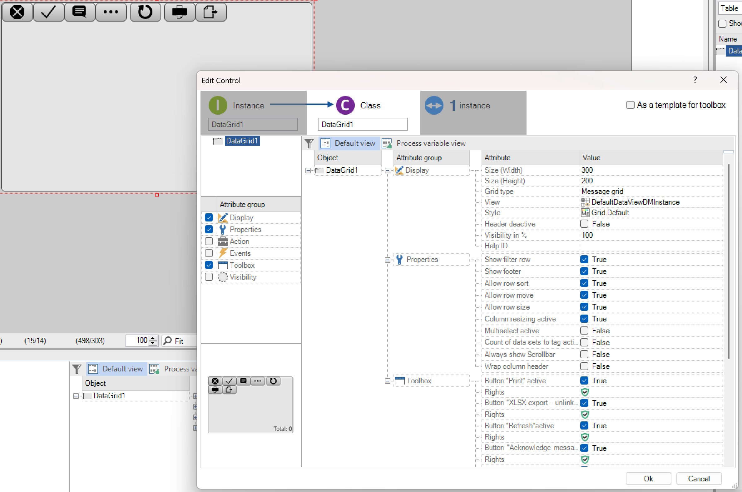
Functions in the runtime
Display of loading, faulty connections: If the amount of data is larger or the database connection is slow, long loading times are shown with the aid of a loading indicator. The complete visualisation can be used without any problems during the time.

If the ODBC connection is wrong or the database is not available, this is shown graphically.
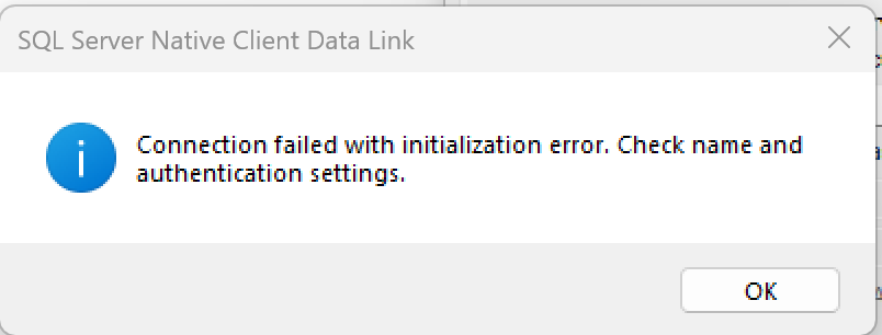
If the connection is correct, the data will be displayed in the grid.
Export of records from the database: With runtime export, either all data records can be exported or just a selection of individual data records. If no selection is made, you will be asked whether the entire database should be exported.
If the export is successful, the “Recipe-export.xml” file is downloaded and can then be edited. The file is structured as follows:
<dataRows>
<ExportDataRow>
<RecordName>Max2</RecordName>
<HeaderData>
<HeaderData ColumnName="Name">
<Value xsi:type="xsd:string">Max2</Value>
</HeaderData>
<HeaderData ColumnName="CreatedOn">
<Value xsi:type="xsd:dateTime">2018-11-15T14:50:06.58</Value>
</HeaderData>
<HeaderData ColumnName="CreatedBy">
<Value xsi:type="xsd:string">WebService</Value>
</HeaderData>
<HeaderData ColumnName="ChangedOn">
<Value xsi:type="xsd:dateTime">2018-12-12T15:17:38.823</Value>
</HeaderData>
<HeaderData ColumnName="ChangedBy">
<Value xsi:type="xsd:string">DataServer</Value>
</HeaderData>
</HeaderData>
<UserDefinedData>
<TagData TagGuid="2ec2bf5d-9d28-44c1-be13-8533d96efe7d" TagName="Alter">
<DisplayName>Alter</DisplayName>
<DisplayComment />
<Value xsi:type="xsd:double">0</Value>
</TagData>
<TagData TagGuid="f868ccb0-f299-4fa1-97d2-e8b307855c88"TagName="Nachname">
<DisplayName>Nachname</DisplayName>
<DisplayComment />
<Value xsi:type="xsd:string">Maier</Value>
</TagData>
<TagData TagGuid="45f21a4f-6beb-4d07-a54a-a29cf3420167" TagName="PLZ">
<DisplayName>PLZ</DisplayName>
<DisplayComment />
<Value xsi:type="xsd:double">0</Value>
</TagData>
<TagData TagGuid="6a8a06a9-1f71-4060-a673-b801025c08d6" TagName="Vorname">
<DisplayName>Vorname</DisplayName>
<DisplayComment />
<Value xsi:type="xsd:string">Max2</Value>
</TagData>
<TagData TagGuid="1115a42a-1502-4841-b52b-734912c25ae3" TagName="Wohnort">
<DisplayName>Wohnort</DisplayName>
<DisplayComment />
<Value xsi:type="xsd:string">Würzburg</Value>
</TagData>
<UserDefinedData>
</ExportDataRow>
In this example, the record name is the block:
<recordname>max2</recordname>
<HeaderData ColumnName="Name">
<Value xsi:type="xsd:string">Max2</Value>
</HeaderData>
Import of records into the database: If a data record (identical data record name “ColumnName”) already exists in the database, the complete data record is updated with the data from the export file.
Message grid
Definition of a message grid control: The message grid shows logbook entries, active and historical messages or the action logVia the symbol A grid can be created in the ribbon bar under picture tools. The class dialog opens in which the type “Message Grid” is then to be selected under Representation. The message grid differs only in a few points from the the data-grid.

Control bar:

This is possibly the biggest difference to the data grid. There are also the following buttons:
Function |
Meaning |
|---|---|
FunctioAcknowledge message” button active |
The button opens a dialog that allows the user to acknowledge the selected message. |
“Reset message” button active |
The button opens a dialog that allows the user to reset the selected message |
“Comment message” button active |
“The button opens a dialog that allows the user to comment on the selected message. |
“Specify message” button active |
If the “Machine times” feature is enabled, the button allows the message to be specified (see Machine times). |
Functions at runtime: The functions of the message grid are explained here. Some of the functions / buttons are only available if the control has been configured accordingly in the Designer! The functions for export and update behave identically to the data grid. The additional functions of the control bar are now described here:
Acknowledge message: If the opened dialog is closed with “OK”, the acknowledged field is labeled with the current date in the message log.
Reset message: If the opened dialog is confirmed with “OK”, the selected alarm / message is removed from the message list.
Commenting on a message: If the opened dialog is provided with a comment in the comment field and then confirmed with “OK”, the specified comment is displayed in the comment column in the message log.
Re-specifying the message: This requires basic knowledge of the topic Machine times to be available. If you select a message / alarm for further specification, a dialog opens with all available messages / alarms for selection. If you confirm the “OK” dialog, the previously selected alarm will be specified by the selected alarm.
Notification grid
Via the symbol A grid can be created in the ribbon bar under picture tools. The class dialog opens in which the “Notification-Grid” type must then be selected under Representation. The notification grid differs from the Data grid.
Control bar:
Explanation of the buttons
Button |
Meaning |
||
|---|---|---|---|
|
Abort: The selected notifications are cancelled by pressing the button. If a forwarding has already been completed, no action is taken. |
||
|
Delete inactive orders: Deletes all forwarded or cancelled forwarding’s |
||
|
Manage subscriptions: Opens a dialog in which all subscriptions can be viewed and edited. |
||
|
Manage notification groups: Opens a dialog in which notification groups can be created and existing ones can be changed. |
||
|
Manage shifts: Opens a dialog for creating and changing layers |
||


All subscriptions can be seen in the table below. A subscription is an assignment of a message definition to a notification group. The deactivation flag, the recipient and the escalation strategy can be modified directly in the table. All changes are applied immediately. If one or more subscriptions are selected, they can be removed using the “Delete Subscriptions” button.
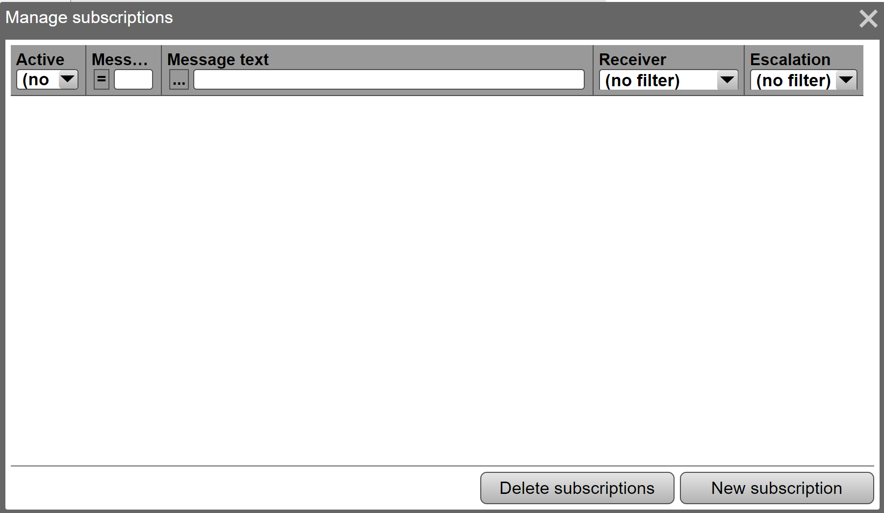
One or more subscriptions can be added by clicking on the “New Subscription” button.
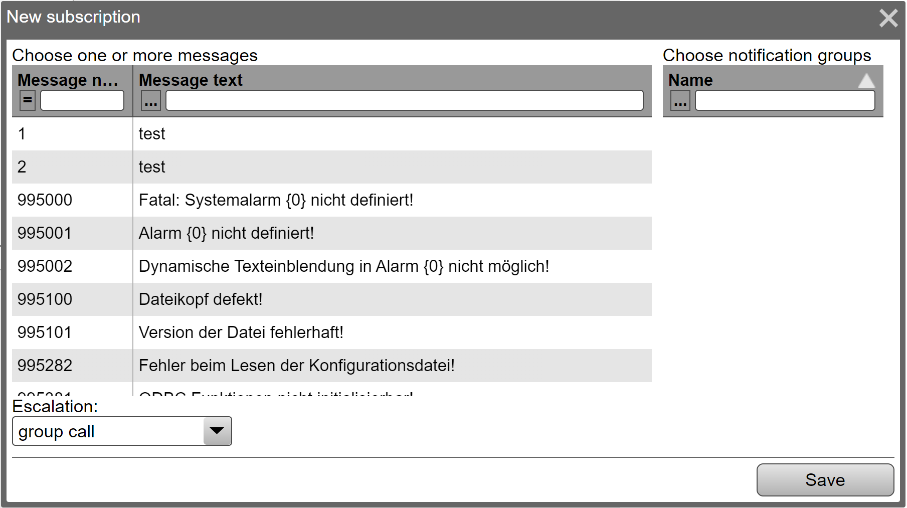
First one or more message definitions must be selected. One or more notification groups must then be selected. Finally, select an escalation strategy and click “Save”. A subscription entry is created for each combination of message definition and notification group.
Manage shifts: If the items “Notification” and “Shifts” are activated in the configuration, shift management can be called up in a notification grid during runtime.
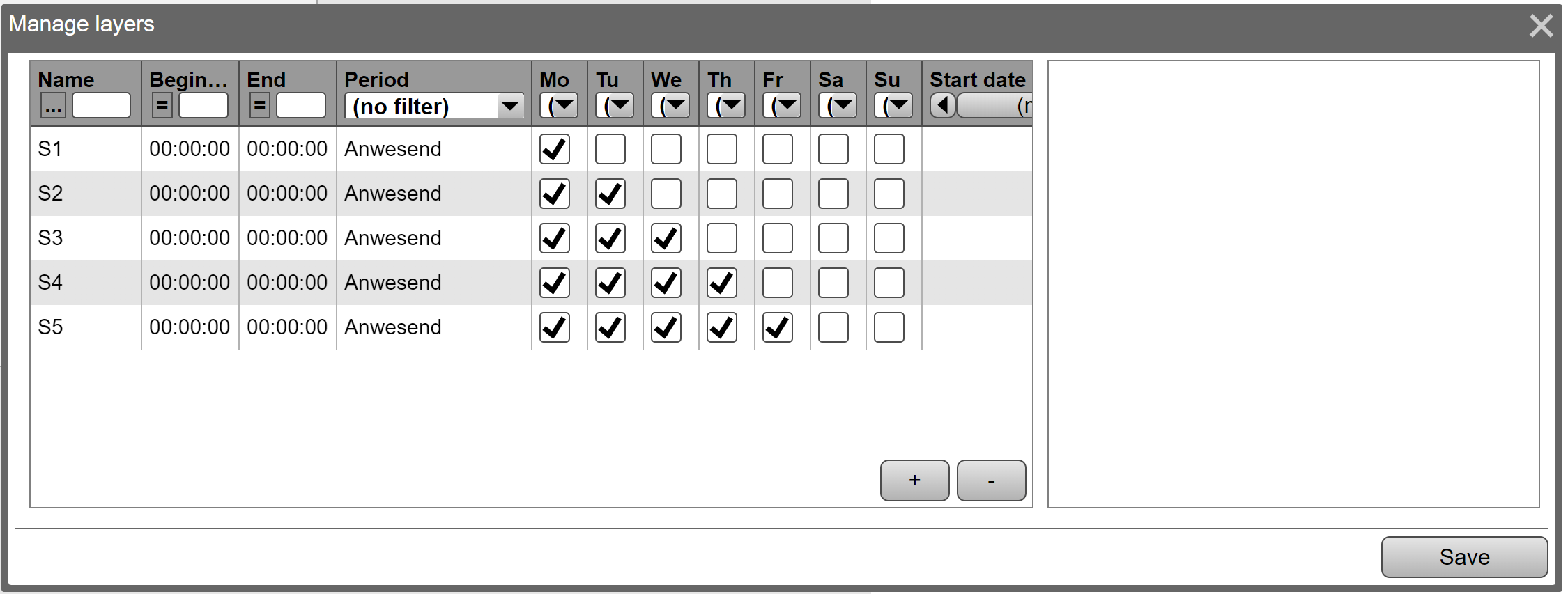
Each shift has a name, a time range (start and end) in which it is active or inactive. This is determined via the “period type”. A start and / or end date can also be specified. It is also possible to fill in just one of the two fields. A calendar week in which this shift should be valid can also be recorded. If a calendar week and start / end date have been entered, “all criteria must be met for the view to be effective.
If the end of the shift is recorded before the start of the shift, the shift ends the next day. If the end time is the same as the start time, the shift lasts exactly one day. Different days of the week can be assigned to each shift. If a shift extends over two days, the day of the week on which it begins must be specified.
Any number of users can be assigned to each shift. A user can also be stored in several shifts. In this example, alarms are sent every day to the employees present on the “early shift” shift between 5:00 and 13:00.
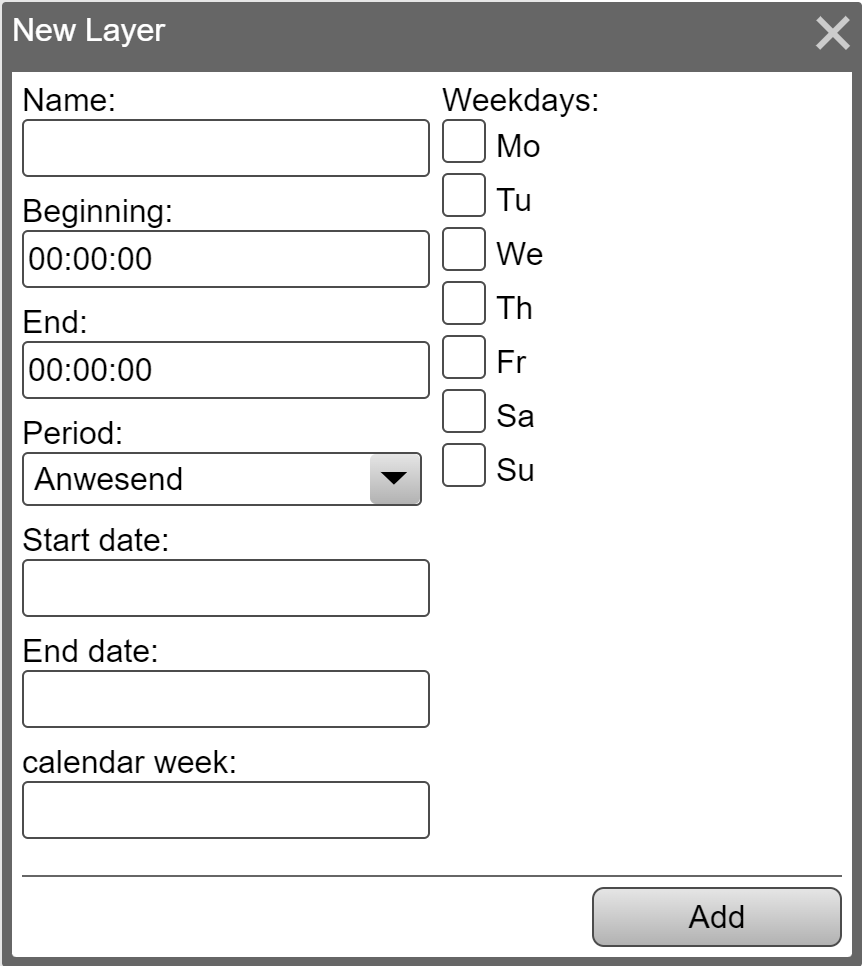
MDA grid
The MDA grid shows DIN data.Via the symbol A grid can be created in the ribbon bar under picture tools. The class dialog opens in which the type “MDA-Grid” must then be selected under Representation. The MDA grid differs only in a few points from the Data grid.
User management grid
The user management grid shows the users or user groupsVia the symbol A grid can be created in the ribbon bar under picture tools. The class dialog opens in which the type “User administration grid” is then to be selected under Representation. The user management grid differs only for Data grid because here some attributes are not available in the attribute groups. This means that only the options relevant for user administration are available.
Chart control
Historical trend data can be displayed in a chart control. Up to 32 trends can be displayed simultaneously in a chart control. The diagrams can be compiled and saved dynamically at runtime. For this purpose, the data recorder tracks are simply linked to the diagram at runtime. In addition to data recorder tracks, XY curves can also be displayed in the chart control.
Definition of a chart control
To define a chart control, the icon is displayed in the toolbar Chart selected, the class dialog of the chart control opens.
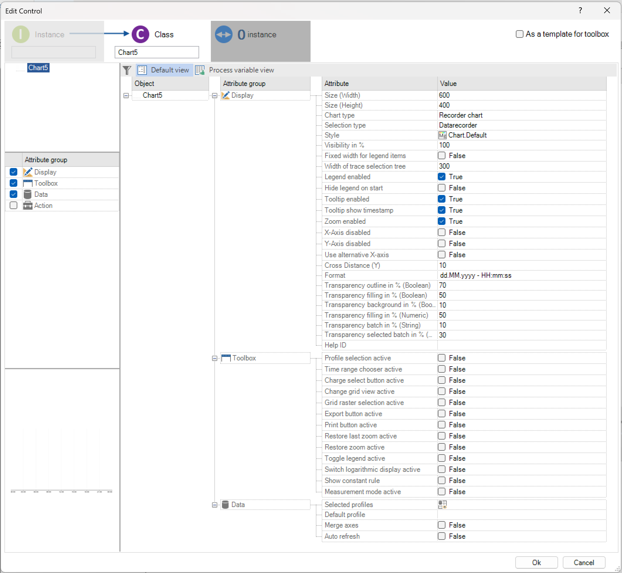
The following section explains the options and attributes of the control in more detail.
Presentation: The user configures the size and background colour of the control under Display. Under Diagram Type, you can determine whether the control displays recorder data (data recorder tracks) or XY curves. A style defined via the style guide can be selected or the standard layout can be used (see style guide in chapter Work surface).
Function |
Meaning |
|---|---|
Size (width) |
Defines the absolute width of the element |
Size (height) |
Defines the absolute height of the element |
Chart type |
Choice between recorder and XY diagram |
Selection type (only recorder chart) |
Here you can choose between data recorder and system structure. |
Style |
The style of the style guide is referenced here |
Visibility (%) |
The degree of transparency can be specified here in% |
Fixed width for legend entries |
Defines the width for legend entries and track selection |
Legend activated |
The legend can be shown or hidden |
Hide legend on startup (only if legend is activated) |
The legend is hidden when it is initially opened |
Activate tooltip |
Tooltips are activated for tracks |
Tooltip show TimeStamp |
Only available on recorder chart |
Not activated until Tooltip is enabled. Timestamp of the value is displayed during the tooltip. Formatting is not possible. |
|
Activate zoom |
Zoom can be activated for the user here. |
Deactivate the X / Y axis |
Axes can be hidden here manually |
Define alternative X-axis |
Activates the alternative X-axis (replaces the time-based X-axis with a variable) |
Track for alternative X-axis (only if Define alternative X-axis is selected) |
A recorder variable can be selected here which replaces the X-axis |
Unit for alternative X-axis (only if Define alternative X-axis is selected) |
Unit to be displayed on the alternative axis |
Transparency |
in the representation attribute of a chart there are six settings for the transparency values of the tracks in the chart |
Transparency Background in % |
|
Transparency border in % |
|
Transparency Fill in % |
|
Transparency Fill in % |
|
Transparency batch in % (text) |
|
Transparency batch in % (text) |
|
Help ID |
Here an ID is assigned for the help control |
Limit distance (Y) |
Distance to the drawing areas in pixels. Values that lie on the axis limits are shifted accordingly and are therefore no longer covered by the X axis |
Formatting |
Definition of the format for the X-axis as well as the time range selection. Depending on the time range, only certain parts of the specified format are displayed. The possible formats can be found in the overview of the time ranges below |
Curve selection: Two modes of curve selection can also be defined under Representation. The standard selection as before is the profile selection. A profile predefined at design time or a profile created at runtime can be selected here. Another option is the selection based on the system structure. For this, an entry point in the system structure must be specified. During the runtime, only the elements that are assigned to the selected system structure element or these sub-elements are displayed.
Control bar: The display of the functions in the user bar of the chart control at runtime is defined under Control bar. In addition, the functions can be locked with user authorisations.
Function |
Meaning |
|---|---|
Profile selection active |
Shows a combo box with the available profiles. You can also define profiles yourself. |
Time range selection active |
Shows the time range of the currently displayed data |
Time range |
After activating the time range selection, the desired times can be selected here. This is saved with and displayed again when the profile is reloaded. |
Batch button active |
Change grid view is active |
Switches to the tabular display |
Grid grid selection (only if grid view is active) |
Grid grid selection (only if grid view is active) |
Shows the time range over which the value average is formed |
Export button active |
Opens a dialog in which the compression rate, time range and name of the file can be selected. A .csv file is then generated. |
Print button active |
Opens the print dialog of the browser |
Reset last zoom active |
Restores the last zoom setting (can also be done by clicking the right mouse button in the chart area |
Reset zoom |
Resets the complete display (to the last selected time range) |
Show / hide legend |
Hides the legend (track names and colour) |
Switch over alternative X-axis |
Allows to switch between the standard time axis and the alternative X axis defined in the display. Since the logger records incrementally, a track must be specified to record the data, which records a numerical value that is increased when the value changes. |
Another requirement for recording with an alternative X-axis is a batch variable. The button is only activated if this batch is available in the current profile. |
|
If tracks belonging to a different data recorder are selected, they will not be displayed in the alternative view. They are visible in the normal time view. |
|
Toggle logarithmic display |
Applies the log (x) to all visible values and displays them in the chart. |
Show ruler permanently |
Enables the ruler to remain visible during runtime, even if the mouse is moved outside of the chart. |
Standard: No. |
|
Measurement mode active |
If the measuring mode is activated, the other parameters that are to be evaluated can then be specified. As a result, in addition to the values shown in the curve, min / max values, process capability indices, etc. can also be displayed, depending on whether it is a numerical or Boolean curve. |
Standard: No. |
|
Measurement mode statistical values (Num) |
The Min / Max / AVG / cp / cpk values can be specified for selection in the runtime for numerical curves via another dialog |
Measurement mode lower limit value (cp, cpk) |
A numeric variable can be selected here that represents the lower limit value |
Upper limit measurement mode (cp, cpk) |
A numeric variable can be selected here that represents the upper limit value |
Measurement mode statistical values (Boolean) |
The Min / Max / AVG / Rising Edge / Falling Edge values can be specified for selection in the runtime for Boolean curves via another dialog |
Data: Under data, the project engineer defines which data recorder views the diagram should display at runtime and which of the preselected views is initially displayed. A standard view can also be configured here. In addition, the axes can be combined if necessary. This tries to reduce the picture elements with a high number of curves. For this, the min / max G limits must be within a tolerance that can be configured. The following properties are also considered when summarising:
Alignment (left, right, both sides)
Unit
Logarithmic representation
Inversion
If a track whose axis is in an axis group is highlighted, the colour of the group changes to the colour of the track and is retained until the next axis is highlighted.
Actions
Diagram selection active: With Diagram selection active, a text variable can be assigned for the selection of the selected diagram. If the value of the process variable is changed, the control tries to find a diagram with the name. If the control is successful, the corresponding diagram is selected. Communication is bidirectional. If the user changes the diagram via the control, the name is also written to the process variable.
Time selection active: To be able to specify the time range, the mode must first be specified via the variable of the “Time range mode” attribute. The following modes and formatting are possible:
Value |
Time range |
Format parts |
|---|---|---|
Custom |
Less than 1 second |
Hours, minutes, seconds, milliseconds, AM / PM |
LastOneMinute |
Last minute |
Hours, minutes, seconds, AM / PM |
LastTwoMinutes |
Last 2 minutes |
Hours, minutes, seconds, AM / PM |
LastThreeMinutes |
Last 3 minutes |
Hours, minutes, seconds, AM / PM |
LastFiveMinutes |
Last 5 minutes |
Hours, minutes, seconds, AM / PM |
LastTenMinutes |
Last 10 minutes |
Hours, minutes, seconds, AM / PM |
LastOneHour |
Last hour |
Hours, minutes, AM / PM |
LastTwoHours |
Last 2 hours |
Hours, minutes, AM / PM |
LastEightHours |
Last 8 hours |
Hours, minutes, AM / PM |
LastTwentyFourHours |
Last 24 hours |
Hours, minutes, AM / PM |
ThisWeek |
Current week (chart width <400) |
Month, day, day of the week |
ThisWeek |
Current week (chart width> = 400) |
Year, month, day, day of the week |
ThisMonth |
Current month (up to 28 days) |
Year, month, day, day of the week, hours, minutes, AM / PM |
Custom |
> = 28 days (chart width <400) |
Month, day, day of the week |
Custom |
> = 28 days (chart width> = 400) |
Year, month, day, day of the week |
Custom |
User-defined (via variables) |
Year, month, day, day of the week |
Today |
Today |
Hours, minutes, AM / PM |
LastFifteenMinutes |
Last 15 minutes |
Hours, minutes, AM / PM |
LastTwentyMinutes |
Last 20 minutes |
Hours, minutes, AM / PM |
LastTwentyFiveMinutes |
Last 25 minutes |
Hours, minutes, AM / PM |
LastThirtyMinutes |
Last 30 minutes |
Hours, minutes, AM / PM |
LastThirtyFiveMinutes |
Last 35 minutes |
Hours, minutes, AM / PM |
LastFortyMinutes |
Last 40 minutes |
Hours, minutes, AM / PM |
LastFortyFiveMinutes |
Last 45 minutes |
Hours, minutes, AM / PM |
LastFiftyMinute |
Last 50 minutes |
Hours, minutes, AM / PM |
LastFiftyFiveMinutes |
Last 55 minutes |
Hours, minutes, AM / PM |
If the “Custom” time range mode is set, the variables for “Start time range” and “End time range” must also be set. The times are specified using numeric variables that represent the time in milliseconds.
Finally, the logical flag of “Set time selection” must always be set. The control then takes over the time settings (if the mode is valid) and resets the flag.
The variables are used bidirectionally. They are described with the current values of the control for each user action.
Functions of the chart control at runtime
Functions control bar: The icons can be changed in the style guid
Symbol |
Function |
Meaning |
|---|---|---|
|
Chart selection |
Combobox for selecting the diagram to be displayed in the view |
|
Edit profile |
Button to edit and create profiles |
|
Save profile |
Button to save the currently selected profile |
|
Delete profile |
Deletes the currently selected profile |
|
Batch selection |
Opens the batch selection dialog. The logged batches can be displayed here. This button is only active if batch data have been used. |
|
Time range |
Mit den Buttons links bzw. rechts kann im Zeitbereich geblättert werden. Durch Auswählen des Zeitbereich-Buttons kann die Filtereinstellung für den Zeitbereich geändert werden. Die Darstellung ist dann auch die gewählte Formatierung abhängig. |
|
Prints the display of the diagram picture |
|
|
CSVExport |
Export of the currently displayed values as data in an MS Excel table in CSV format |
|
Zoom |
Resets the current zoom |
|
Resets the last zoom setting |
Resets the last zoom setting |
|
Toggle the X-axis |
Changes between the standard time axis and the alternative X axis defined in the display. |
|
Logarithmic representation |
Switches to the logarithmic display |
|
Legend |
Shows the name and and colour for each track. Can be configured via the pen: |
The colour equals to the colour of the track. If the edit mode is active, an icon is also displayed, and the curve settings window opens with a click. If you click on the track name, the corresponding track is hidden and shown again |
||
The “X” for remove is only visible when you are in edit mode. This can be used to delete the track from the current profile. |
||
|
Show ruler |
When activating, the ruler stops at the point where the mouse left the chart. Even after changing the picture, the ruler can be seen again at this point. |
|
Measurement mode |
Display of each one ruler for the start time and one for the end time. The additional values saved in the selected period are displayed below the chart and can be exported. |


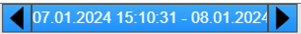


Measurement mode in runtime: If the measurement mode is activated, a grid with the defined values and further options for setting appears below the chart.
Important
If the chart is too small, a message dialog appears, and the measurement mode is hidden. The button then has no function despite being activated in the Designer!

Function |
Meaning |
|---|---|
Activation button |
Activation / deactivation of the measurement mode during runtime |
Measuring range limitation |
Can be moved to define limits for the measuring range (blue) and the section (red). The AutoRefresher is automatically stopped if it has been activated. |
Measurement range limits |
The measuring range can be defined / changed hereIf the specified dates are outside the current chart axis limits, these are adjusted so that they fit into the chart. If the cut out protrudes completely or partially, it will be completely removed |
Settings section |
Activate / deactivate measurement section including adjustability via date |
Show / hide the data grid |
Show / hide the data grid |
Switching data |
2 separate grids for numeric and boolean data, which can be switched using these buttons. If there are no tracks for a type, the associated button is deactivated. |
Data grid |
Display of the current data, the values that can be displayed can be specified in the designer |
Working with the chart control
With the chart control, the values recorded in data recorders can be displayed dynamically during runtime, depending on a time range.
To create a new profile, the button “Edit profile” selected. The left half of the diagram expands to include the variable selection.

The desired variables of the data recorder can be selected here. These are then also listed in the legend. On the -The display type and colour can be configured using the button of a track.
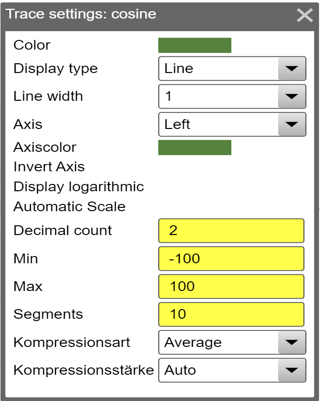
Attention
On a numeric curve decimal points can be specified; this works in the designer as well as in the runtime. They change the display of Y-Axis as well as the grid for the corresponding data. The number of decimal points for axis and grid is always the same.
If there is no selection made for the number of decimal points, the number of decimal points defined on the variable itself will be used. Elsewise the configured number will be used.
When editing the profile during runtime the decimal points are always stated fixed. Therefore, when adding a new curve to the profile the value is based on the decimal points configured on the variable. Afterwards they can be freely selected.
An exception is the tooltip, here the number of decimal points is ALWAYS based on the number of decimal points on the variable. This is, because now there will be no rounded values shown, only actual, logged values.
When all the required variables have been selected, a name for the profile must be assigned in the “Name” field. Then the profile with the “Save profile” button. On the “Delete profile” button, the currently selected profile can be deleted, provided it was only created during runtime.
Attention
In the case of XY curves, tracks with different X areas cannot be assigned to the same profile.
Further function in diagrams
Zoom: In the created diagram, the user can zoom in on the diagram by opening an area with the zoom function selected beforehand. Right-click or click on the “Reset zoom” button, the existing zoom can be reset.
Scrolling: By clicking and dragging an axis, the limit values of all axes are adjusted by the size of the dragged area. Depending on the direction in which the movement takes place, the displayed area becomes smaller or larger. If the axis limit values are determined dynamically, this no longer happens after the scrolling process and the axes do not change until the zoom has been reset.
Limit adjustments of the Y-axis: By moving the top / bottom edge of a Y-axis, ONLY the max / min limit of the axis can be adjusted. As you drag, a label with the new value is displayed on the cursor. Does NOT work if the axis limits are determined dynamically.
ToolTip: If you hover over the drawing area of a chart, a ToolTip is displayed with the values at the time that corresponds to the cursor position. The complete time stamp is displayed. Formatting is not possible.
Report viewer
Report viewer concept
With the help of reports, created with SAP Crystal Report, data from various sources can be processed to present information more clearly and more appealingly (e.g., data of a production line on manufactured quantities, defective goods, etc.). To be able to do without external tools and programs for displaying such reports, a new control has been introduced, the report control. It can be freely positioned and configured similarly to other controls (style, size, etc.).
Since parameters can also be transferred to reports, e.g., to filter the information displayed (e.g., show all values that are greater than a certain limit value), new setting options have been added in PROCON-WEB to be able to configure this parameterisation.
Configuration
There are three configuration menus in total:
OLEDB connection: Settings for database connections can be made here.
Report configuration: Here reports can be loaded into the project and various settings can be made for the respective parameters.
Profile configuration: Based on a report configuration, profiles can be created and configured, which are ultimately assigned to a report control to display them at runtime. First, a database connection must be created on which the report can be based to fill the data. This is done under the item Report - OLEDB connection. All you have to do is enter the local database settings, which can be set using the connection wizard.

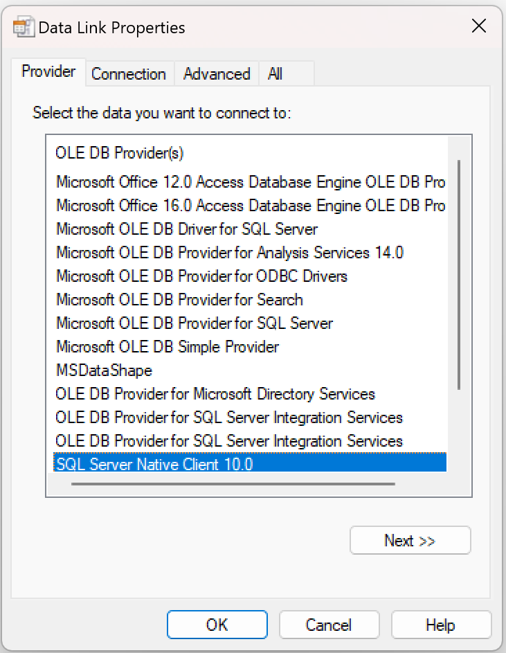
This wizard helps to create a connection to a data source on which the report relies for processing and displaying the data. First, a so-called provider can be selected. A provider is available for many different data sources, which enables access to this data (e.g., for Oracle databases, SQL servers, etc.).
Further information on the data source (server / database name) as well as login information can then be entered if access to the data sources is password protected. Depending on the provider, there are additional settings that can be changed if required (this is usually not necessary, but these values can still be changed if necessary).
After clicking on “OK”, the information entered is converted into a connection string that contains all the information and can be processed by the report.
In the next step, the reports (* .rpt) created in SAP Crystal Report are imported and configured. This is done in the sub-item report configuration. A new report can be imported by right-clicking in the free area. Depending on how the report was created, parameters can be transferred beforehand; these are then read directly from the report. However, additional parameters can also be added in the designer.

An OLEDB connection must be selected immediately after adding the report. To do this, you can click on the button in the cell under “OLEDB connection”, which opens a selection dialog in which all existing connections are displayed, and the desired ones can be selected by double-clicking or clicking on “OK” (after previous selection) can.
Next to the name is the “Report” column, in which the path and file name of the selected report file can be found.
Next to it there is a checkbox that can be used to select whether the report should be saved in the project database.
If the check mark is set, the report is read from the project directory in the runtime.
If the check mark is not set, the report is read from the set path.
This can be an advantage if the report changes after the configuration and can thus be exchanged afterwards. The path can be changed by clicking in the cell if the report is later at a different location.
Settings for the parameters can then be made:
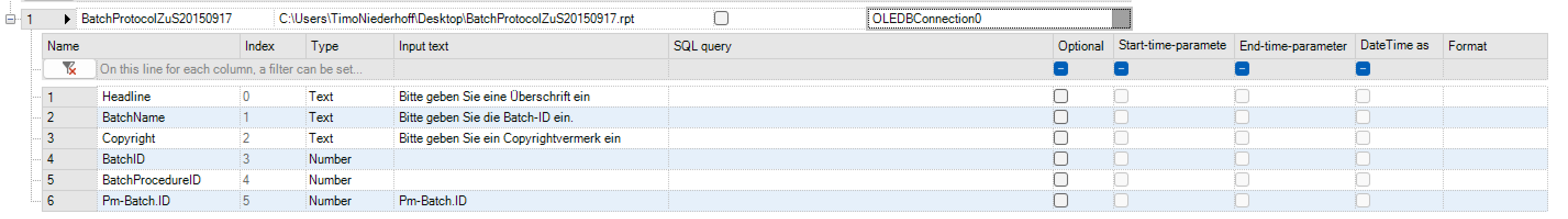
Column |
Meaning |
|---|---|
Name |
The name of the parameter. This is used to transfer to the report, which is why it should not be changed if it has been imported from the report. |
Type |
The name of the parameter. This is used to transfer to the report, which is why it should not be changed if it has been imported from the report. |
Input text |
This text defines what is next to the input control. This can be used as a hint for the entry (e.g. “Enter batch number”). |
SQL command |
If “Combo” or “ListView” is selected as the input control element, this field is activated. Then an SQL command can be entered which is used to fill in these elements. In this way, a combo box can be filled with predefined values in order to make long entries superfluous. |
Optional |
By ticking the box “Optional”, the input for a parameter can also remain empty, so no value is required. |
Time as a string |
If a report for generation is based on time information, which is available as a string in any format, this tick can be clicked. However, only if “Date” or “DateTime” has been selected as the parameter type. A calendar control element appears, which allows a time to be selected. The selected date is then converted to another format. What this format looks like can be specified in the next field. |
Date format |
If an individual date format is used, a pattern of how this format is structured can be defined in the last column. By right-clicking on the complete line and selecting “Check date format”, you can test which format will generate the entered pattern. To do this, the current date is converted according to the pattern and output in a box. For example, the input “dd / MM / yyyy” generates the output “07/05/12” after a check.. |
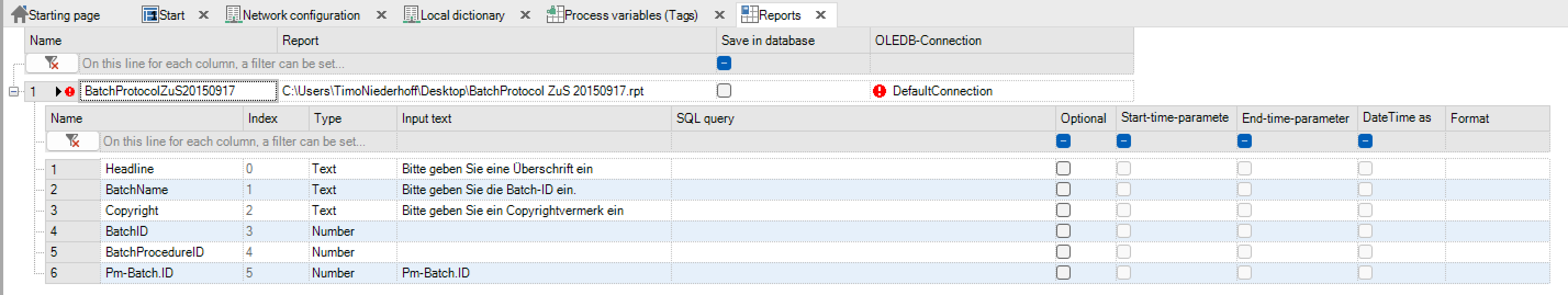
Parameters can be added or removed by right-clicking on a report. The purpose of adding parameters is that the filling of dynamic control elements that are filled by an SQL command (“Combo”, “ListView”) can be filtered even further. For example, an additional parameter “system number” can be created. This parameter can then be used in the SQL command (e.g.: SELECT * FROM Production WHERE Plant_ID = {? Plant number}); it is replaced by the selected value before execution. Please note that the parameter name must be in curly brackets, preceded by a question mark ({? Parameter name}).
After configuring the report, a profile is defined, again by right-clicking on “Add profile”. The report, which has the option of defining a user level, is then assigned to this profile. This has the advantage of blocking reports that should not be visible to all users.
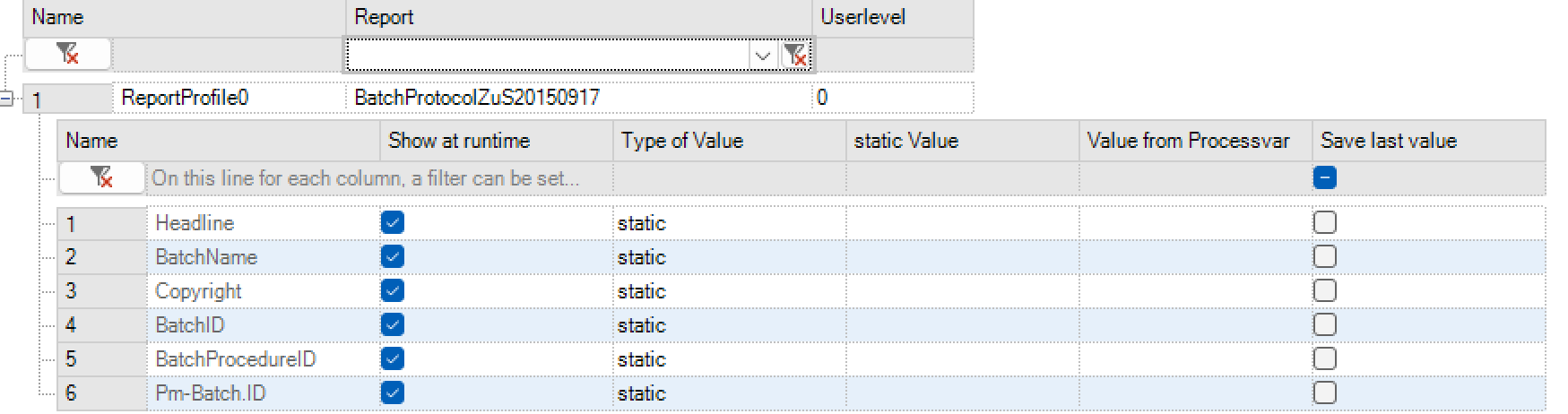
With the tick in the column “Show at runtime”, you can determine whether a fixed value is transferred as a parameter or whether it can be changed at runtime. A constant parameter is then given in the Value column.
Assignment of report profile to report control
After everything has been created and configured, the report can be assigned to the control. This happens in the picture montage.
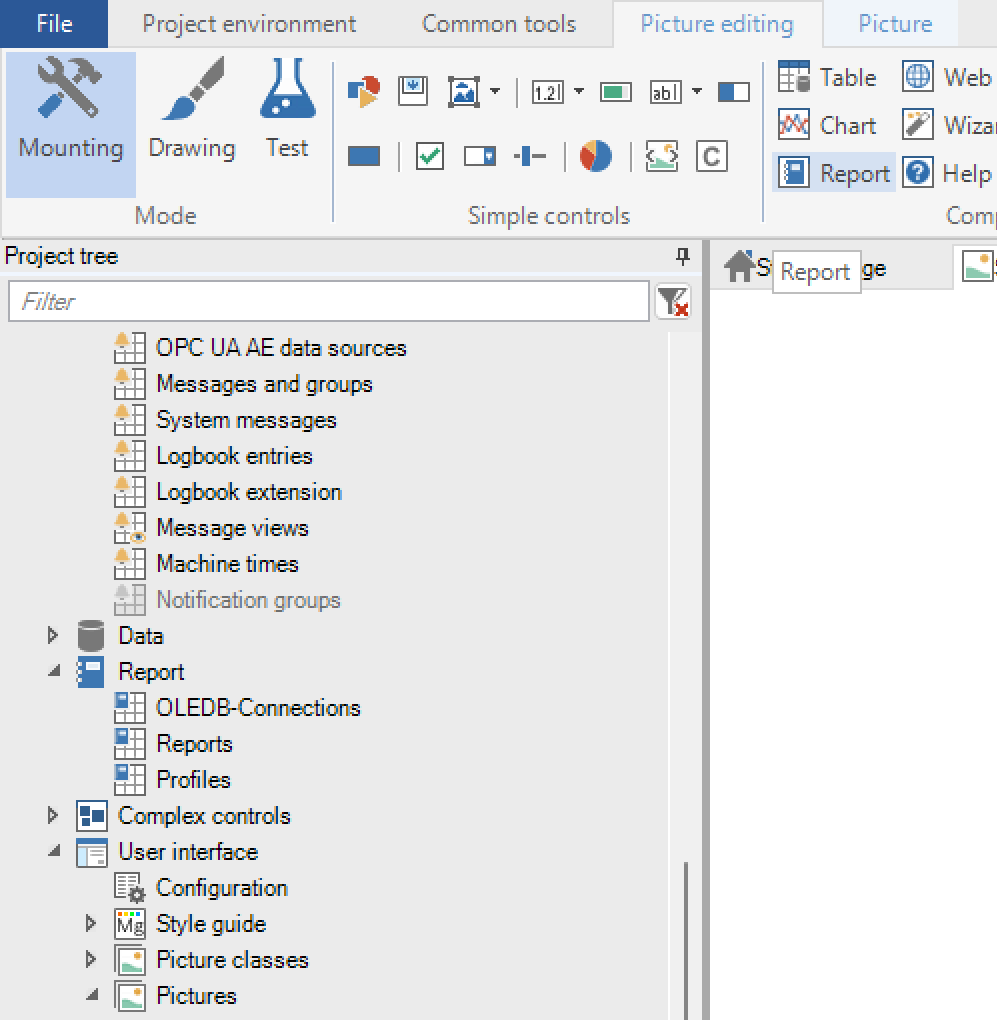
The class dialog opens

According to the class-instance concept, settings can be made here that apply to all report controls of this class. The configuration is roughly divided into 3 parts:
Presentation: The appearance can be changed here. In addition to the size and position, this also includes the font and button size. Profiles can also be assigned here. To do this, click the button in the “Instance value” column in the “Select profile” line. A dialog opens in which all profiles are displayed. One or more profiles can be selected (multiselect!). These are then offered for display in the runtime.
Control bar: The control bar with the buttons can be configured. Most of the control elements (all except for the list for the selection of the profile, as well as control elements for changing the page) can be activated or deactivated and assigned a user level, which is necessary to be able to operate these control elements (otherwise the control elements are deactivated but visible).
Actions: Finally, there is also the option of having the report printed by setting a logical variable. To do this, the checkmark is set for “Print active” and then a logical process tag is selected. If this variable is set to logical = 1, printing is carried out automatically on the standard printer set up in the system. To print multiple times, the variable must first be set to 0 before being set to 1 again! A report profile can then be assigned in the instance dialog. Afterwards, the project can be exported, and the runtime started. Please note that there is no connection and no profile with default values. The name of the profile to be displayed can also be determined at runtime using a string variable.
Operation at runtime
If the project was started and an picture was selected with a report viewer, the ReportViewer interface appears:

At the top left is the profile bar in which a profile can be selected. A selection opens a dialog to specify the parameters that have been configured in the Designer.
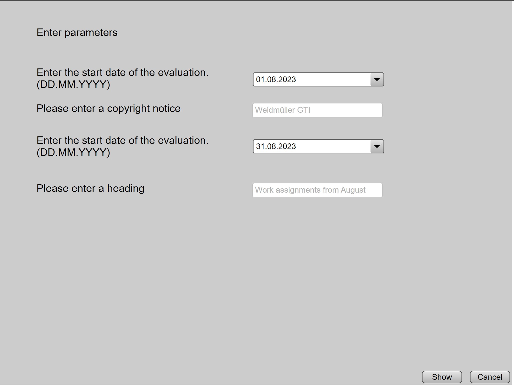
The input text is displayed for each parameter and a control element is created (in this case a simple text field). After the parameter (s) to be transferred have been entered, you can click on “Show”. The window closes and the report is loaded.
The other buttons are used to create, edit and delete profiles. When creating and editing, only the permanently configured values can be changed! A completely new configuration is only possible in the Designer.
In addition, input fields are available for zooming and scrolling (for multi-page reports).
If two parameters have been marked as time range parameters, a further one appears next to the page change control to change these parameters and thus easily change the time range:
Behind it there are tools for printing, exporting, and searching.
Web browser control
The web browser control integrates the Internet Explorer into the visualisation application without having to call up an external program. The web browser control can be used to display Internet pages as well as help files or application manuals in PDF format. The URL is transferred via a text variable.
Important
Some web pages do not allow to be opened via an I-frame; accordingly, they cannot be opened using the web browser control.
Important
The content of the web browser control can´t be displayed in a screenshot (print-key)
Create and edit web browser controls
In the System Controls ribbon group under Picture processing, the web browser control can be created with the “Web browser” option. As known from other controls, a class dialog opens for the web browser control.

The following section explains the possible attributes for the web browser control
Presentation: The size of the control can be specified under Display and the text variable for the URL can be assigned.
Actions: The Update active property can be assigned to the control under Actions. This allows the website displayed to be updated, triggered by a Boolean variable.
Note
If the URL in the text variable is changed, the view of the web browser control is automatically updated. If the same page is to be updated, the update via the logical variable is used
Wizard control
The wizard control allows the configuration of a sequence of steps which are displayed one after the other. A step can consist of a simple instruction text or contain one or more process pictures that can be interacted with. The creation of such a sequence can be used to specify a specific course of action. There are several functions for additional control and monitoring:
Up to 3 levels can be created for a wizard configuration. At a higher level, one or more steps of the basic level can be replaced (more on this below).
Steps can be grouped. Only when all steps of a group have been completed can the next one be continued
When a step is completed, a previously defined logical variable can be set to “True”
Continuing from one step to the next can be made dependent on the fulfillment of a condition. To be able to use a wizard, a wizard configuration must also be created under “System Controls” -> “Wizard Configuration”.
Definition of a wizard control
To define a wizard control, the icon is displayed in the toolbar Wizard selected, the class dialog of the wizard control opens.

In addition to entries for size and appearance, there are some special points in the class / instance dialog.
Presentation
The desired configuration can be selected via “Wizard configuration”.
“Jump to active step” automatically scrolls to the active step. This eliminates the need to scroll manually.
A status bar can be displayed.
Several texts (“Step”, “Back”, “Next”) that are displayed can be defined.
Icons and icon sizes: Here icons for different states and states can be selected. The largest icon size determines the height of the steps!
Actions: Several variables can be defined here, which on the one hand trigger certain actions and on the other hand provide information to the outside world. Before these variables can be selected, a tick must be set.
Level variable: Numerical variable in which the current level (0-2) is written.
Step variable: Numerical variable in which the position of the current step is written. Also saves the current position if the wizard is closed in the meantime.
Number of steps variable: Numerical variable in which the number of steps is written.
Completed variable: Logical variable that shows whether the wizard has been completed (all visible steps processed). Also saves the “Completed state” of the wizard if it is closed.
Reset variable: If this logical variable is set to “true”, the wizard is reset. Then the variable is set back to “false”. When resetting, all acknowledgment variables are set to false!
Test mode variable: If this variable is set to “true” when the wizard is opened, the wizard opens in a test mode. Continuation conditions and variables are ignored.
Tag navigation: If this point is activated, the buttons in the wizard are deactivated. A total of 4 logical variables belong to this point:
Forwards / backwards: Navigate forwards or backwards in the wizard (forwards only if this is permitted).
Forward / backward allowed: Indicates whether forward or backward navigation is possible. (Forward is only allowed if there is no continuation condition or if this is fulfilled, back is always allowed except for the first step).
Jump to current step: Scrolls to the active step if is set to “true”. The value is then reset to “false”
Functions in the runtime

If the wizard is displayed in the runtime, a list appears containing all the steps that are included and visible. The active step / group of steps is highlighted. If a process picture / several process pictures have been selected, these slide below the step title.
If the tag navigation is active, no buttons are displayed in the wizard (the logical variables must be used). Otherwise, there is a bar with buttons for navigation below the steps with pictures, while steps without pictures have a “Next” button next to the step text. If the step has an acknowledgment variable, this will be set to “true” when the next button is pressed.
If the step has a continuation condition, this must be met in order to proceed. Until it is fulfilled, the “waiting state” is signalled by a rotating symbol next to the step text:

If there is no acknowledgment tag, the system continues automatically if the condition is met. Otherwise, the condition must be met, and the step must be acknowledged manually.
If the check mark “Prevent going back” was set for a step or if it has a continuation condition, there is a restriction when going back: It is possible to navigate to this step, but only “passively” can be viewed. This means that no further conditions are taken into account, no acknowledgment variables are set and if the step contains pictures, no entries can be made in these (symbolized by overlaying a gray-transparent overlay over the pictures).
Help control
Help topics are created and edited via the help control during runtime.
Definition of a help control
To define a help control, the icon is displayed in the toolbar HelpControl selected, the class dialog of the help control opens.

The standard parameters such as size and colours are defined hereYou can also define which buttons are active for creating and editing help topics and which rights are associated with them.
Functions in the runtime
Using the help control itself, it is possible to create, edit or adapt the help topics in the runtime.
QR code control
The QR Code-Control allows the display of a QR Code based on a static text or a string variable. A QR code control is activated via the icon generated in the toolbar.
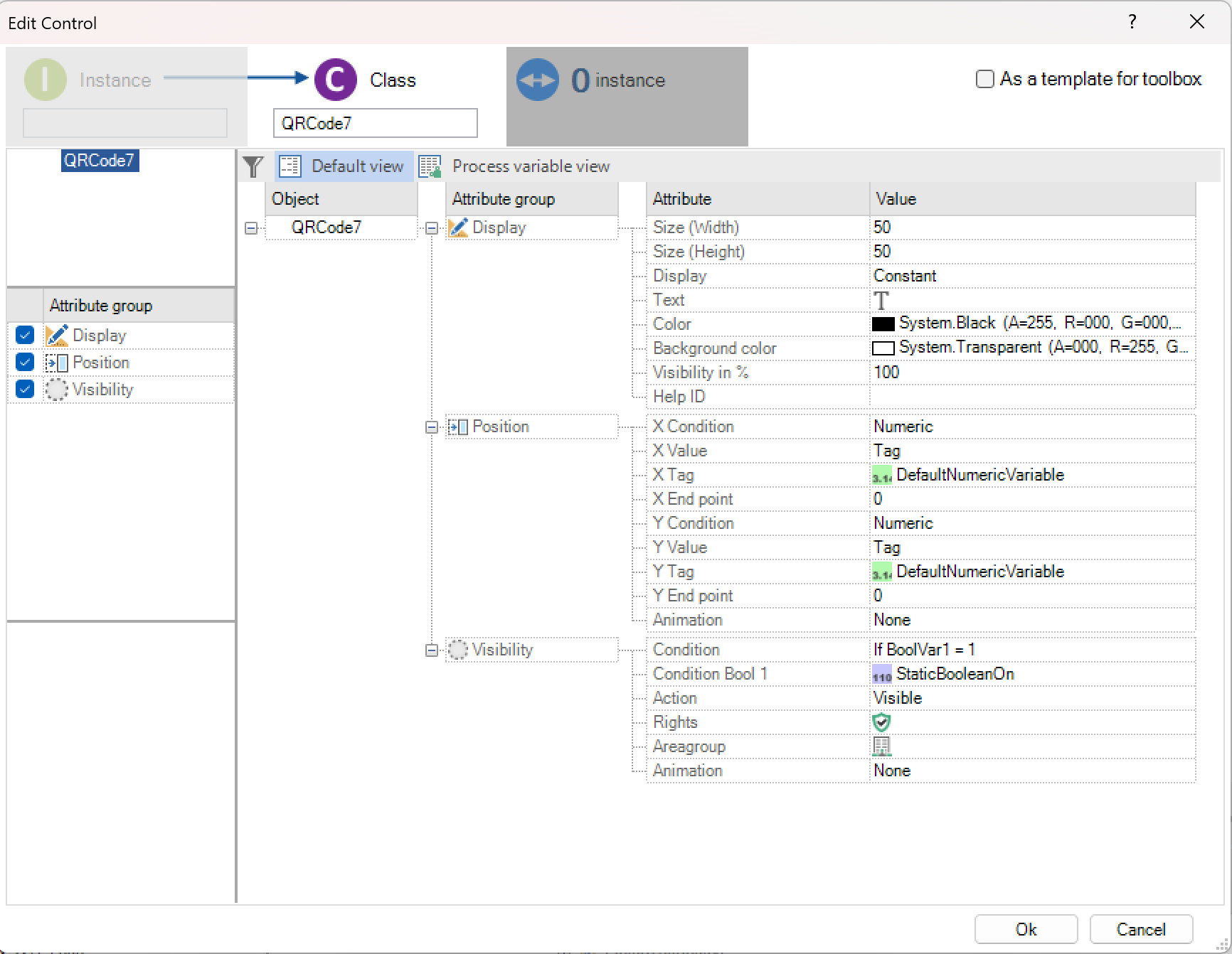
In addition to displaying the QR code, the position and visibility of the control can also be configured.
Custom control
Definition in the designer
The custom control allows the integration of your own JavaScript controls into the PROCON-WEB interface. A custom control is activated via the icon generated in the toolbar.

The control created here is also rendered in the designer and should be displayed as it was at runtime. If the system cannot find the relevant function, a placeholder is displayed.
Important
The name of the function (class) must be specified exactly as it is in the External.js is defined.
The PROCON-WEB runtime also allows the custom control to be dynamised like almost all PROCON-WEB controls. It is also possible to define a list of tags via which the control communicates with the PROCON-WEB runtime or with the process.
Implementation in the “External.js”
The implementation of the custom controls must take place in the “External.js” in the WebVisu directory.
function MyCustomControl($element, $innerDiv, opts) {
    $element.css('background-color', 'lightblue').css('cursor', 'pointer');
    // Beispiel für ein Click-Event
    $element.click(function() {
        alert("Hello! I'm a custom control :)");
    });
    // Beispiel für Verarbeitung von Tags
    if (opts.tagList) {
        var values = [];
        for (var i = 0; i < opts.tagList.length; i++) {
            tagManager.subscribe(opts.tagList[i], onTagUpdate, $element, i)
        }
    }
    function onTagUpdate(value, state, args) {
        values[args] = value;
        print();
    }
    function print() {
        $element.html(values.join('<br>'));
    }
}
The above example shows how a tag connection and the reaction to a click event are to be implemented.
Accordion control
An accordion is a navigation element that appears in the content area of a Website is used. It is used for extensive lists of content to map in a space-saving way. Normally, each accordion entry has about a title and a content. By clicking on the title, the Content faded in. In PROCON-WEB a Alignment of containers, which are filled with PROCON-WEB images, minds.
Configuration
About the icon |Accordion| in the area of complex controls, the Opened dialog with the class editor.
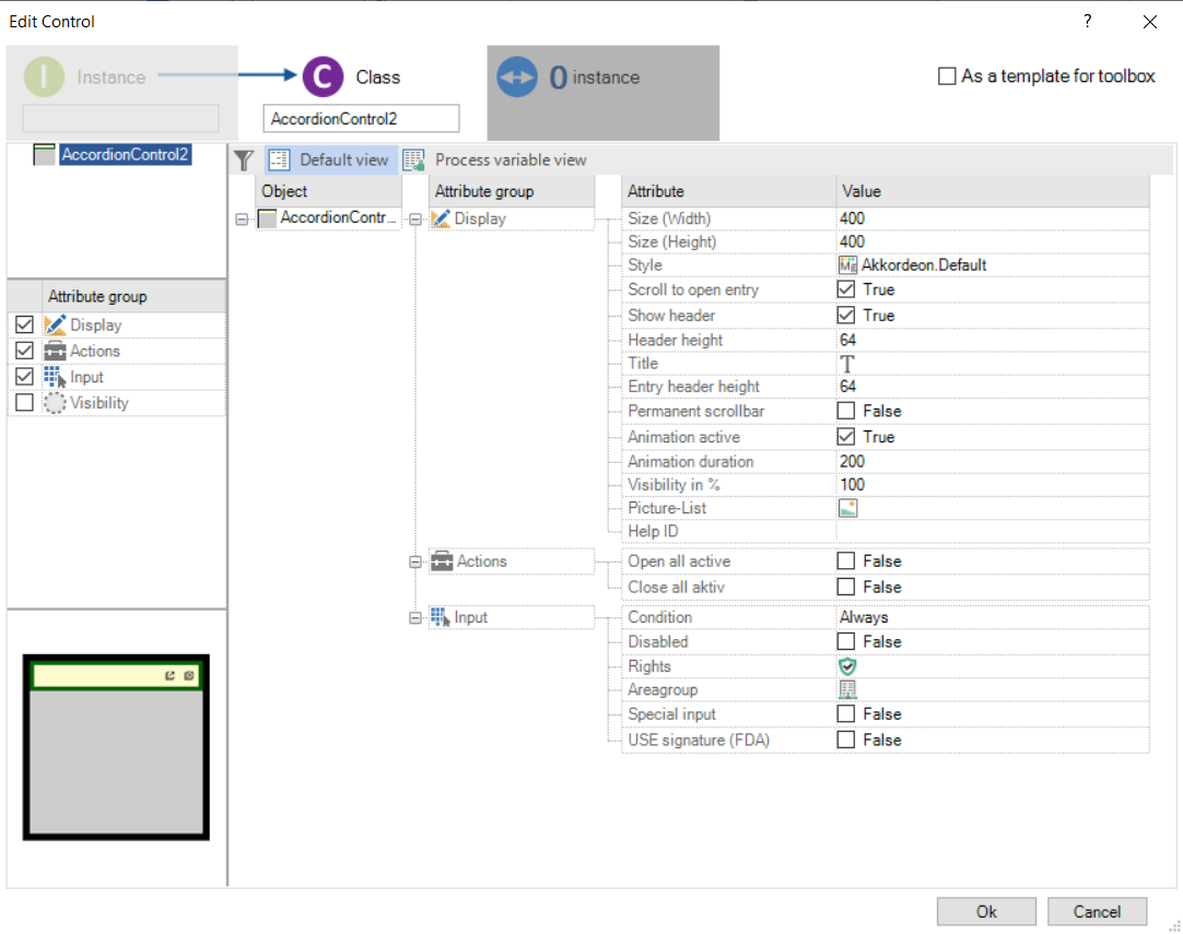
“In addition to the size and display, additional configurations to be made:
Scroll to open entry: When activated, when opening an entry, it is placed at the top.
Show heading: Displays the top bar with the title and the two icons on or off.
Headline height: Headline height
Title: Content text of the title line
Height of the heading: Height of the entries in the accordion
Image List: Selection of images that will be displayed in the accordion.
Actions: When the “Open All” or “All” attributes are enableClose”, the icons in the title bar are deactivated.
The functions can be executed via Boolean variables. The Icons can be e.g. Be placed on a button.
Important
The image in which the accordion is can also be found in the image list be selected. This leads to an endless loop!
Functions in the runtime
In runtime, the accordion is set according to the configuration at Calling up the picture in which it is located, completely closed.
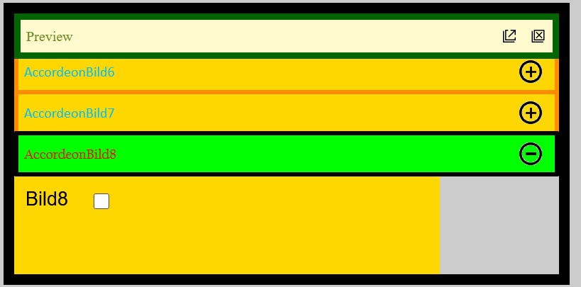
If not turned off in the configuration, there are signs in the upper right corner of the Title line of the accordion, the icons to open and close the individual entries. The entries are marked with the name of the images and can then be opened or closed.
If a picture is larger in its vertical size than the accordion, the entries below move further down. Is the image in its horizontal size wider than the accordion, becomes a horizontal scroll bar introduced.
Note
The scroll bar does not come from the accordion, but from the stored image!
Wird ein Akkordeon geöffnet und die Sichtbarkeit verändert, so wird es beim nächsten öffnen im zuletzt definierten Zustand angezeigt.
Automation objects
Definition of automation object
An automation object consists of several individual static and dynamic objects that are combined to form a group. The elements can be constant symbols, text fields, number fields or bar charts, for example. The automation object thus describes a complete system part, such as a tank or motor.

Creation of an automation object
To be able to create an automation object, the respective picture elements are selected with the lasso. In the context menu with the right mouse button, the option “Group” is selected, and the name of the automation object is defined.
In the toolbox under “AO”, a class of this automation object is automatically created that can be used multiple times in the project.
If existing automation objects are to be changed or expanded, the required elements are inserted into the AO using drag’n drop. To remove, the elements to be removed are individually selected and deleted using the “W key”. To transfer the changes to the layout of an automation object to all other instances of the underlying AO, right-click in the context menu and select the option “Layout Instance -> Class.”
The position of the AO is determined by the upper left corner being counted as Value 0.0. All the other elements within the AO receive their position in the AO in relation to it. If a single Element of the AO is used within another picture, it may happen that the already determined Values are located outside of the picture. If that case occurs the values must be corrected manually for the corresponding instance. Therefore, it is recommended to not define any values within the call of the AO
Note
It is not possible to copy individual elements from an automation object. Only the complete AO can be copied.
Dynamization of automation objects
In addition to the dynamization that the individual objects of an automation object can have, the automation object itself can also be dynamized.
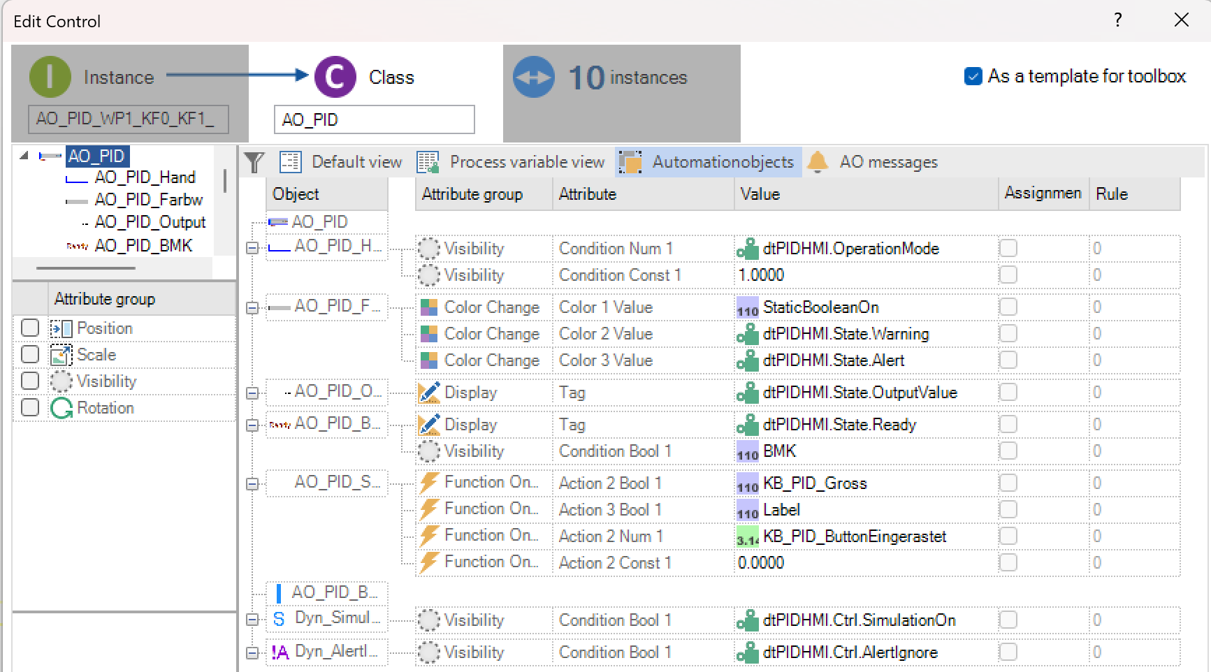
Possible dynamizations are currently:
Position
Scaling
Visibility
Rotation
The parameterisation of the dynamization takes place analogously to the picture objects in PROCON-WEB. However, no extended assignment, assignment of structural elements or dynamic structure assignment is possible for the parameters of the AO dynamization itself.
Important
The test mode in the Designer does not currently support the dynamization of the automation object itself.
Assignment for automation objects
Allocations can be used to link the same parameters or parameters that are related to other parameters.
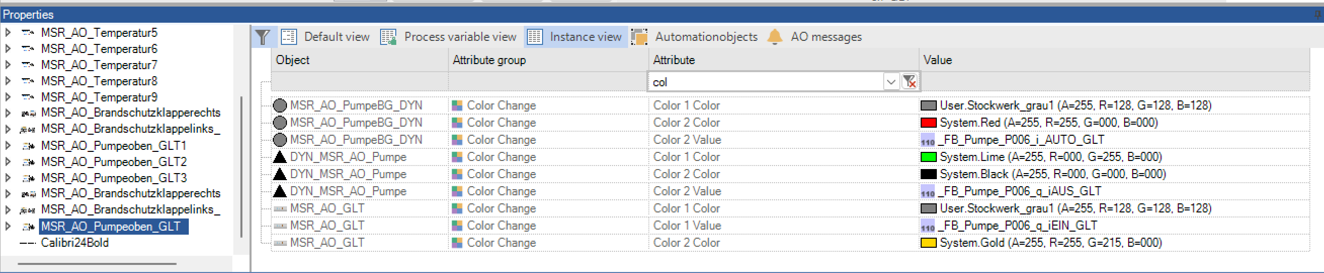
The instance values of the attributes can be assigned to one another in the properties window. In the figure, a bit is to be assigned to each LED. The first field index of the process variable is assigned to the first element. With the assignment the user can assign elements to the first element. A field index can thus be automatically assigned for each element. If the first instance value is changed, all assigned process variables change automatically. Different assignments are marked with different colours.
The assignments are made via the context menu of the right mouse button over the element to which it is to be assigned.
The following options are available in the context menu:
Option |
Meaning |
|---|---|
Map lines |
Is selected if additional elements are to be assigned to an element. |
Mapping expanded |
The rule is entered directly, e.g. +2 or often used rules are selected. If nothing is entered, this column is not assigned. |
Delete assignment |
Deletes the assignment made for the automation object. |
Assignment of structure instance objects for automation objects
A structure instance object can be assigned to each automation object in PROCON-WEB. First, a structure must be assigned to the automation object in the class dialog.

To do this, switch to the view for automation objects and select the corresponding structure via the context menu. A dialog now opens in the Instance value column in which the structure element for the respective object of the automation object can be selected.
After closing the class dialog, the “Automation objects” view is switched to in the properties window or in the dynamics dialog. With the “Assign instance” option, a dialog opens in which the corresponding instance for the AO can be selected.
The process variables that point to the structure instance object are automatically assigned to the automation object. To be able to assign process variables despite this structure assignment, the “SHIFT” key is pressed during the selection. This opens the process tag selection dialog instead of the dialog for instance selection.
Dynamic assignment of structures for automation objects
Selection of structure classes in AO class
The selection of a structure in the AO class works as known via the context menu in the class-instance dialog in the “Automation objects” view.
The selection of a structure in the AO class works as known via the context menu in the class-instance dialog in the “Automation objects” viewThe familiar structure selection dialog opens here. However, you can now select several structural classes. These are shown in the “Text” line, separated by commas.

If more than one structural class was assigned to the AO, all possible structural elements of the structural classes appear when selecting the element. In the example two classes are assigned and the appropriate elements can be selected accordingly.

After the element selection, the structure elements are shown in the “Values” column as before.

Selection of structure instance in AO instance
The structure instance is selected as before via:
the context menu in the picture
the context menu in the attribute grid (picture montage below)
the context menu in the class-instance dialog
If a structure class has been assigned in the AO class, the familiar structure instance selection dialog opens when selecting the instance. Here you select an instance whereupon the process variables that are mapped to the structure elements are displayed.
If you have selected several structure classes in the AO class, the instance selection dialog changes. It shows the structure classes in the first column. A corresponding instance can be selected in the second column.
Dynamic structure
Instead of selecting a structure instance in an AO instance, you can also set the “flag” dynamic structure. There is a checkbox both in the structure instance selection dialog for one instance and in the selection dialog for several instances of different structure classes. If this is selected, no structure instance can be selected. The grid now shows the corresponding structural class elements in the “Values” column.
A dynamic assignment of process variables can take place at runtime, for example a structure assignment (with instance) is carried out in an AO. In the AO there is an element with the function “Open picture”. In the picture to be opened there is also an AO with the same structure assignment. However, the “dynamic structure” flag was set here. If the picture is now opened, it receives the structure instance information from the AO. This is how the mapping to the process variables takes place.
Assignment of tag properties
In the AO, tag properties can be assigned like the structure assignment. To do this, select the entry “Assign type process variable properties” via the context menu. A dialog then appears in which types of process variable properties can be created and given a name (everything is done via the context menu!)
Then the assignment to the individual AO sub-elements takes place as known from the structure element assignment. In the selection dialog, the corresponding property is selected via a combo box. The assignment appears in the cell as with the assignment for controls. However, it is not the name of the process variable that can be seen here, but that of the type created (e.g. “NumericType.Num. 1”).
After the assignment in the AO class, a specific process variable must be assigned in the instance to the types of process variable properties.
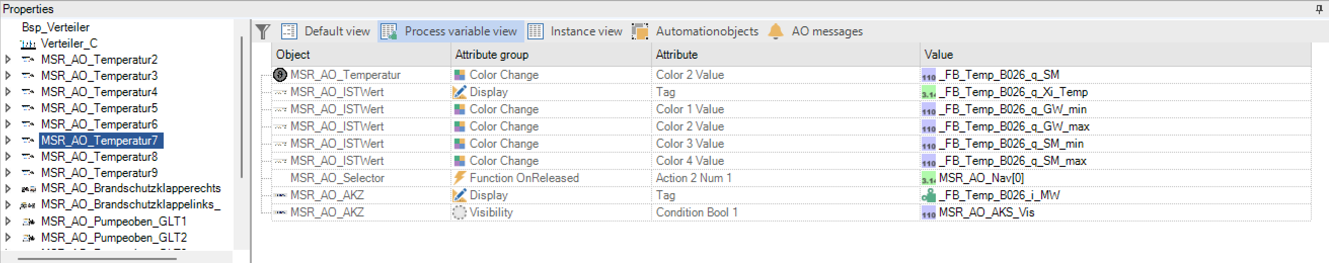
The mapping in the elements is now carried out automatically (as with the structure assignment).


Alarms in AOs and AO instances
Create alarm
“Alarm” classes can now be created in an AO class. There is another tab for this in the class instance dialog (“AO messages”). If you switch to this tab, you get the grid view known from message processing.

In addition to the known columns, there is a further column for the alarm classes “Res. Area”. The number of the alarm class is used as the “start number” for the instance generation. The reserved area defines how far the alarm number is incremented. This value is the same for all alarms in an AO.
Example: Alarm number = 1000 / number range = 10> Instances with the numbers 1000 to 1009 are generated. If the maximum alarm number (here 1009) is reached, all other alarm instances receive the same number (here in the example 1009)
The number of the alarm class is used as the “start number” for the instance generation. The number range defines how far the alarm number is incremented. The reserved number range can be displayed in the alarm class. To do this, the class editor must be activated in the alarm editor.

Structural element in AO
If a structure is assigned in the AO, structure elements can be used in the alarm (instead of a process variable assignment). The mapping of structure elements to process variables takes place analogously to the previously known behaviour after an assignment of a structure in the AO instance.
Alarms in AO-Instances
If alarms have been defined in an AO class, the alarm instances are automatically generated for each AO instance. If you create further AO instances, the designer automatically creates alarm instances. In the class instance dialog these can also be viewed and edited in the “AO messages” tab. However, new alarms can only be generated via the AO class!
Captured texts can be passed from the class to the instances via the selection menu. The numbers can also be adjusted in the class and updated in the instances.
Placeholder in the alarm text
To be able to differentiate between alarm texts better, placeholders are available for the alarm text. There are the following placeholders:
Place holder |
Text |
|---|---|
% AOI% |
Placeholder for the AO instance name |
% SI% |
Placeholder for structure instance names. If there are several structure assignments, the name of the first structure instance is used |
%SI_StructureClassName% |
If there are multiple structure assignments in an AO, a declaration can be made by entering a structure class name. |
An update is possible in the grid via the context menu “Update all message texts”.

If you delete an AO instance, the associated alarms are also deleted (if not further referenced)
Import and export of alarms in AOs
Existing structural elements are taken into account both when exporting and importing alarms. When exporting, the mapped variable is written to the XML file instead of the structure element. If no variable is stored, the default variable is set. When importing, if a structure assignment is recognised, any change to the variable is also processed.
Tooltips
The tooltips for objects in the designer can be managed in PROCON-WEB. Tooltips can be specified for dynamic objects and controls. The tooltip text is specified in the instance dialog under display.

Note
Tooltips can be given in several languages. See also Text-Im / Export.
Using the special functions 422 and 423, all tooltips in the picture can also be displayed or hidden. This can be particularly advantageous for touch surfaces (in the sense of a help function).