Work surface
Structure of the designer
Control bar with ribbons
A ribbon control bar is a graphical operating concept for programs in which the menu bar and tool bar combined. The ribbon control bar is also used in well-known software products such as Microsoft® Office.A ribbon control bar for calling up the functions is integrated in PROCON-WEB.
Function and structure of the ribbon control bar

In the head area of the window there is a quick access toolbar, which contains frequently used functions and tools, such as the functions “Save project”, “Close project”, “Print”, “Undo” and “Restore”.
Below the quick access toolbar are the so-called ribbon tabs in which the various ribbon groups are available. In these the tools are listed. Depending on the activated area (images, process variables, …), context-related ribbon tabs are displayed which are switched when the area is changed. The individual ribbon groups are explained in more detail in the following chapters.
Quick Access Toolbar
The toolbar can be used to have quickly access to frequently used tools.
This allows you to work faster and more efficiently because you don’t have to jump back and forth between the individual tabs.
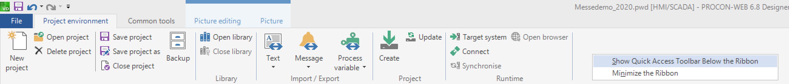
The bar can be arranged below the menu ribbon. If it is hidden, it can be found in the top left next to the GTI logo. If you want to add another function, click on the corresponding symbol with a right click. A dialog opens with the field “Add to toolbar for quick access”.
The symbol now appears in the toolbar for quick access.
Ribbon tab file
General functions for project management, help, printing, and options can be found under the so-called Backstage area in the tab “File”. The options are explained in more detail in the chapter “Options in the Designer”.
Ribbon tab project environment
The following table shows the ribbon groups and tools available under “Project Environment”.
Ribbon-Gruppe |
Symbol |
Tool |
Description |
|---|---|---|---|
Project |
|
New project |
Creation of a project |
|
Open project |
Loading a project |
|
|
Delete project |
Deleting a project |
|
|
Save project |
Save the current project |
|
|
Save project as |
Save the current project under a different name or file path |
|
|
Close project |
Closes the current project |
|
|
Backup |
Create a backup of the project database |
|
|
Open library |
Opens another PROCON-WEB project that is used as a librar |
|
|
Close library |
Close the library project |
|
|
Text |
Opens the menu for text import/export |
|
|
Alarm |
Opens the menu for alarm import/export |
|
|
process variable |
Opens the menu for process variable import/export |
|
|
XML |
Only visible when the option “XML-Import active” in the designer options is activated. Single pictures, graphics or the whole project configuration can be im- or exported |
|
|
Create |
Generates the project files for the runtime system |
|
|
Updates the project files for the runtime system. |
Only files that have been changed are updated |
|
|
Target system |
Selection of the target system |
|
|
Go online/offline |
Transfers the project files to the web browser. If a password has been set, it must be entered here |
|
|
Start |
Marks the project as the current project. Otherwise, this is currently without function. The runtime is called up via the browser. |


Ribbon tab standardtools
The ribbon tab “Standard Tools” contains the tools insert, cut, duplicate, undo, restore, find, replace, print, and print preview. In addition, the language selection and the filter for the system structure are in this tab.
Ribbon tab tag
The ribbon tab “Tag” is available when the operator is in the process variables or the structure editor. The available tag tools are listed in the following table.
Ribbon-Gruppe |
Symbol |
Tool |
Description |
|---|---|---|---|
Create |
|
logical |
Creates a logical process variable |
|
numerically |
Creates a numeric process variable |
|
|
Text |
Creates a text variable |
|
View |
|
Activates the class editor for creating tag classes |
|
Extended |
|
Driver selection |
Opens a list with all available drivers |
|
PLC import |
Opens another window in the work area to import variables directly from the PLC program |
|
|
reorganize indices |
Used to reorganize the indices of the process variables in order to close possible gaps in the corresponding runtime file. Should be used when many process variables have been created and deleted |
|
Table view |
|
columns display |
Selection of the hidden columns to be shown again |
|
filter row |
Show/hide the filter row |
|
|
grouping field |
Show/hide the grouping field |
|
Column width |
|
Fit to screen |
Adjusts the column width to the current screen resolution |
|
Adjusts to content |
Adjusts the column width to the size of the content |
|
|
Resets to default |
Resets the adjustments for the column width |


Ribbon tab alarm tools
The “Message” ribbon tab is available when the operator is in the message processing editor.
Ribbon-Gruppe |
Symbol |
Tool |
Description |
|---|---|---|---|
Create |
|
New |
Creates a new message |
Table view |
|
columns display |
Selection of the hidden columns to be shown again |
|
filter row |
Show/hide the filter row |
|
|
grouping field |
Show/hide the grouping field |
|
Column width |
|
Fit to screen |
Adjusts the column width to the current screen resolution |
|
Adjusts to content |
Adjusts the column width to the size of the content |
|
|
Resets to default |
Resets the adjustments for the column width |

Ribbon tab Data tools
The “Data” ribbon tab is available when the operator is in the data plug-in. The tools displayed in the Data ribbon tab are analogous to those in “Tag” and “Message”.
Ribbon-Tab image tools
The image editing ribbon tab is available when the operator is in the image editor.
Ribbon-Gruppe |
Symbol |
Tool |
Description |
|---|---|---|---|
Mode |
|
assembly |
Switches to assembly mode |
|
drawing |
Switches to drawing mode |
|
|
animation |
Switches to animation mode |
|
Symple Controls |
|
dynamic symbol |
Creation a dynamic symbols |
|
SlideIn |
Creation a SlideIn´s |
|
|
ImageView |
Creation of ImageViews for the display of images |
|
|
number field |
Creation of dynamic number fields (numeric, logical) |
|
|
bar graph |
Creation of dynamic bar graphs |
|
|
text field |
Creation of dynamic text fields |
|
|
slide switch |
Creation of slide switches |
|
|
Button |
Creation of buttons |
|
|
Checkbox |
Creation of checkboxes |
|
|
Combobox |
Creation of comboboxes |
|
|
Slider |
Creation of a slider |
|
|
Pie chart |
Creation of pie charts |
|
|
Picture area |
Creation of picture areas |
|
|
Container |
Creation of containers |
|
Systemcontrols |
|
Grid |
Creates a grid control for displaying and editing data records |
|
Chart |
Creates a curve diagram for displaying and editing trends |
|
|
Report |
Creation of report viewer controls for dynamic display of Crystal Reports |
|
|
WebBrowser |
Creation of web browser controls |
|
|
Wizard |
Creation of wizard controls |
|
|
HelpControl |
Creation of help controls |
|
|
QRCode |
Converting a text or link into a QR code |
|
|
CustomControl |
Creation of custon controls |
|
Font |
|
Tools for setting the font and font size |
|
Filling colours |
|
Foreground color |
Selection of the foreground colour of symbols |
|
Background color |
Selection of the backround colour of symbols |
|
|
Gradient |
Selection of the colour gradient type |
|
Shapes |
|
rectangle |
Function for drawing rectangles |
|
Rounded rectangle |
Function for drawing roundes rectangles |
|
|
Ellipse |
Function for drawing ellipses |
|
|
Circle |
Function for drawing circles |
|
|
elliptical arc |
Function for drawing elliptical arcs |
|
|
circular arc |
Function for drawing circular arcs |
|
|
Line |
Function for drawing lines |
|
|
Freehand |
Function for drawing lines |
|
|
Text |
Function for creating texts |
|
|
Image |
Function for inserting bitmaps |
|
|
Cursor |
Finish creating shapes |
|
Style |
|
Line widht |
Specification of the line width in drawing mode |
|
line style |
Specification of the line style in drawing mode |
|
|
start of the line |
Specification of the start of the line in drawing mode |
|
|
end of the line |
Specification of the end of the line in drawing mode |
|
|
Filling |
Changing the appearance of the shape in drawing mode |
|
Allignment |
|
left-aligned |
Alignment of the symbols left-aligned, depending on the symbol highlighted in purple |
|
right-aligned |
Alignment of the symbols right-aligned, depending on the symbol highlighted in purple |
|
|
Align above |
Alignment of the symbols above, depending on the symbol marked in purple |
|
|
Align below |
Alignment of the symbols below, depending on the symbol marked in purple |
|
|
Align horizontally |
Alignment of the symbols horizontally, depending on the symbol marked in purple |
|
|
Align vertically |
Alignment of the symbols vertically, depending on the symbol marked in purple |
|
|
Adjust width |
Adjusts the width of the symbols, depending on the symbol highlighted in purple |
|
|
Adjust height |
Adjusts the height of the symbols, depending on the symbol highlighted in purple |
|
|
Adjust size |
Adjusts the size of the symbols, depending on the symbol highlighted in purple |
|
|
All the way to the top |
Moves the selected element to the top within its layer |
|
|
All the way to the bottom |
Moves the selected element to the bottom within its layer |
|
|
One level up |
Moves the selected element one level higher within its layer |
|
|
One level down |
Moves the selected element one level lower within its layer |


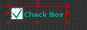


Image:
Ribbon-Gruppe |
Symbol |
Tool |
Description |
|---|---|---|---|
General |
|
new picture |
Creates a new picture |
|
Open picture |
Image selection to open the required image |
|
|
Save picture as |
Saves the picture under a different name |
|
|
Delete picture |
Selection dialog for deleting the corresponding picture |
|
Import/Export |
|
Exports image to the library |
Exports the selected image to the library (only active if a library is loaded) |
|
Get picture from library |
Imports the selected image from the library (only active if a library is loaded) |
|
|
Bitmap management |
Opens the bitmap management dialog |
|
Grid |
|
Activate grid |
Activates the grid function |
|
Align grid |
Function for setting up the starting point of the grid |
|
|
show grid |
Shows / hides the grid |
|
Aids |
|
simulation settings |
Opens the simulation settings (only available if the simulation mode is activated) |
Picture while drawing |
switches off the remaining, unmarked symbols that are present in the image to transparent, invisible or leaves them displayed |
||
|
image in a separate window |
Displays the image in a separate window. Unlocks “Toggle full screen”. |
|
|
Toggle full screen |
Switches the picture to full screen |
|
|
Show on second monitor |
|Switches the processed image to the 2nd monitor |


Ribbon tab script tools
The “Script Tools” ribbon tab is available when the operator is in the image editor. The available script tools are listed in the following table.
Ribbon-Gruppe |
Symbol |
Tool |
Description |
|---|---|---|---|
General |
|
Scripting help |
Opens the online help in the chapter “Script” |
Aids |
|
Go to line |
Jumps to the selected line |
|
line breaks |
Activates line breaks |
|
|
line numbers |
Activates line numbers |
|
Edit |
|
Moves out |
Moves the text in the default setting by four characters to the left |
|
Indent |
Moves the text in the default setting by four characters to the right |
|
Compile |
|
Compile |
Compiles the current script |
Debugging |
|
Attach SkriptServer |
Starts a debug session or simulation |
|
Single Step |
Goes with single steps through the script |
|
|
Stop Script |
Ends the session or simulation |
|
|
Toggle Breakpoint |
Set/delete a breakpoint in the script |


Options in the designer
The specific settings for the designer are made in the options. The “Options” dialog is opened via the “File” entry “Options”. The different settings are explained below.

General
The application language can be set under “General”. The language of the designer can be chosen between German and English. A change requires a designer restart. The selected language should match the language of the operating system so that, for example, dialogs are displayed in the correct language and number formats are expected with a point instead of a comma as a separator.
Designer
The following settings can be made for “Designer”.
Options:
Area |
Option |
Description |
|---|---|---|
General |
||
Save automatically when closing |
If this option is activated, the project is automatically saved when it is closed. If the option is deactivated, a dialog with a saving query is displayed. |
|
Warning when the designer closes |
Queries whether the Designer should really be closed |
|
Log project changes |
Project changes are logged and can be viewed |
|
XML image import |
With this option an XML image import can be allowed. The so called „automatic poject creation“ can be activated with this. That means, that with the XML-file of an existing project, new projects on basis of them can be created |
|
Global dictionary |
||
Load the global dictionary when starting the program |
Defines, of the dictionary is loaded when starting the designer |
|
se dictionary in the project |
Dictionary can be activated or deactivated for the current project |
|
Name of the database of the dictionary |
Sets the name of the dictionary |
|
Connection to the dictionary-database |
Connection string to the dictionary-database |
|
Runtime |
||
Port for Identifikation of the target system |
Default:16800 |
|
Default Webbrowser |
Specifies in which browser the runtime is displayed. If there is no entry, the operating system uses the standard web browser |
|
Streaming-time out |
Defines, when the streaming goes into time-out in seconds (min 10 max 300) |
|
SystemServer Port |
Specifies the port on which the system server is addressed. |
|
Time-out für das Neustarten |
Defines, when the server goes into time-out in seconds (min 10 max 300) |
|
WebServer Port |
Specifies the port on which the web server is addressed. |
|
The default value is 16700, if there is no entry, the standard port 80 is used |
||
WebServerSub URL |
Attachment to the URL for calling a client with a unique number |
|
Syntax: /?client=1 |
||
Project import-export |
||
Creating a project backup during export |
With this option, when generating the runtime data, a packed designer project is also stored in the project folder under the “PWD file” folder. If the project backup is in the project folder, a designer project can be generated again from the runtime data with the help of this file via the project import. If the backup is not available, the runtime project cannot be imported again. |
|
Generate error log file |
With this option, the errors when importing projects or generating the runtime that are displayed in the error dialog are stored in an error file. |
|
Check message texts during export |
By activating this option, the message texts are checked for configuration errors during export and displayed in a message box. Examples for configuration errors are duplicate message numbers or the wrong sequence of dynamic message texts with multilingual message texts. To activate this option, the option “Check project on export” must be selected. |
|
Check project during export |
With this option, the project is checked for configuration errors when the runtime is generated and displayed in a message box. Examples of configuration errors are inactive drivers or duplicate variable names. |
|
Directory of the error log file |
The directory in which the generated error file is to be saved is specified here. The standard path after installation is the WorkData folder in the Designer directory. |
|
Project start |
||
Open library with project |
Loads the specified library project when opening a project |
|
library project |
Path of the library project |
|
Directories |
||
Working directory |
Directory in which the project database is saved |
|
Bitmap import directory |
Directory from which the bitmaps are imported |
|
Export directory |
Directory in which the runtime environment is saved. |
|
WebVisu export directory |
Directory for the WebVisu project export (if no directory is selected, it is exported to the project directory) |
|
Warnings |
||
Licence |
Shows the current quantity structure of the designer |
|
Show message when overstepping the amount of licensed tags |
Default: Yes |
|
Warning level |
Selects the quantity structure for which the designer should issue warnings |
|
Enable warning messages |
Activate / deactivate warning for exceeding of the quantity structure |
|
Target system |
Possible target systems that can be configured |
Library:
Area |
Option |
Description |
|---|---|---|
General |
||
Take all picture references with you |
If an image has references to other images, these become also imported |
|
Take all process variables with you |
Specifies whether the assigned process variables are also imported. If the option is deactivated, the default variables are used |
|
Write information display to file (LibraryDisplayResults.xml) |
If errors occur during import / export from / into the library, information is written to the XML file LibraryDisplayResults.xml. |
|
Path of the XML file with the import / export information |
Path specification for the LibraryDisplayResults.xml file |
|
Configuration settings of the merge dialog |
||
Addition to picture number |
Specifies the value that is added to the existing image number in the event of an import conflict. |
|
Addition to message number |
Specifies the value that is added to the existing message number in the event of an import conflict. |
|
Show all items |
This option is deactivated by default. If this option is activated, all elements that are present in the image are displayed in the merge dialog |
|
Conflict properties |
Specifies the option that is selected as the default by the system in the event of an import conflict. “UseExisting” uses the existing element, “CreateNew” creates the element anew. When selecting “update”, the already existing element will be updated with the new attributes |
|
Postfix after a name change |
Specifies the characters that are appended to the existing name in the event of an import conflict |
|
Prefix after a name change |
Specifies the characters that are placed in front of the existing name in the event of an import conflict |
Script
The following global settings are possible for the script editor.
General: |
||
|---|---|---|
Area |
Option |
Description |
Show the line numbers |
Displays the line numbers on the left edge of the script |
|
New line |
Activate / deactivate the automatic line break |
Image
The following settings can be made for “Image”.
General: |
|||
|---|---|---|---|
Area |
Option |
Description |
|
Automationobject |
Geometrie-Daten und AO-Größe bei Zusam- menführung ignorieren |
Bei dem Zusammenführen von Duplikaten in der Bildmontage kann bei Automationsobjekten die Größe und die Geometrie-Daten der Unterelemente (Position, Skalierung, Rotation) ignoriert werden |
|
Accept instance values when generating AO |
This option determines whether the instance values of the selected objects are adopted as class values. |
||
Insertion point |
Specifies the point at which a new object is inserted when the input mode is set to “Point” |
||
Colours |
Background colour |
Specifies the default background colour |
|
Foreground colour |
Specifies the default foreground colour |
||
Pictures |
|||
Edit pictures with: |
External program for editing pictures |
||
If there is no entry, the standard of the operating system is used |
|||
Style |
|||
Gradient |
Shows the gradient used last |
||
Filling style |
Default style for fills |
||
Filling type |
Default type for fills |
||
Filling colour symbols |
Activates / deactivates whether the standard filling colour should be used when drawing symbols |
||
Filling colour texts |
Activates / deactivates whether the standard filling colour should be used for texts |
||
Others |
Selection over outer frame |
Selection of static symbols takes place via the outer frame |
|
Render custom controls |
Deactivates / activates the rendering of the preview of CustomControls. This can reduce loading times for the preview in the device configuration or the image selection dialog. |
||
Use GDI + transformation |
Activates / deactivates GDI + transformation when drawing symbols |
||
(GDI + is the successor to GDI; GDI stands for Graphics Device Interface) |
|||
Draw Geometry |
Draw inner help geometry |
||
Class object transparency |
Indicates whether the class objects are displayed transparently on an image instance |
||
Text |
Text font |
Standard font for texts |
|
Preview / Toolbox |
Use colour for preview / toolbox |
Activates the colour setting for the toolbox or the preview window in the class / instance dialog |
|
Background colour of the preview / toolbox |
Colour setting for the background colour in the toolbox or the preview window in the class / instance dialog |
||
Drawing mode |
Image display in drawing mode |
Specifies whether and how the remaining unselected elements should be displayed when drawing |
|
Show elements in the attribute grid |
With this setting, the elements are displayed or not displayed in the properties window while drawing |
||
Show multiple elements in the attribute grid |
With this setting, multiple elements are displayed in the attribute grid in the event of multiple selection. If the parameter is deactivated, the attributes are only displayed for individual elements in the attribute grid |
||
Review of the element in the picture |
Checks whether the individual elements (character primitives) are all within the image. By deactivating it, you can switch to drawing mode more quickly for large symbols, since the elements of the symbol are not checked to see whether they are outside the picture. |
||
Crayon |
Brush thickness |
Standard brush thickness |
|
Line start / end of line |
Configures the default setting when using the Start / End of Line feature |
||
Colour of the brush |
Standard brush colour |
||
Brush style |
Standard brush style |
Grid: |
||
|---|---|---|
Area |
Option |
Description |
Grid colours |
Grid colours |
Colour for the grid |
Grid strength |
Indication of the strength of the grid |
|
Brush style |
Style of display of the grid lines |
|
Grid function |
Activate grid |
Activate grid|Activates / deactivates the snap function of the grid |
show grid |
Activate grid|Activates / deactivates the display of the grid |
|
Grid geometry |
Grid starting point |
Specifies the starting point of the grid |
Grid size |
Specifies the distance between the grid points |
Image: |
||
|---|---|---|
Area |
Option |
Description |
Image:*” |
Background colour |
Standard background colour for images, number fields, function keys and controls |
Font text |
Standard font of the texts |
|
Font symbol |
Standard font of the symbols |
|
Font button |
Standard font of the buttons |
|
Font numbers |
Standard font of the number fields |
|
Foreground colour |
Standard background colour for images, number fields, function keys and controls |
|
Image geometry |
Image starting point |
Starting point at which the image is opened at runtime |
Image size |
Specifies the default image size to be used in the project |
|
Designer mode |
Animation mode frame colour |
Colour selection for changing the colour of the background when the animation mode is active |
Image montage frame colour |
Colour selection for changing the colour of the background with active image montage |
|
Element position colour |
Colour specification for the display when elements are outside the image |
|
Frame size |
Distance from the working window to the picture in the picture montage |
|
Drawing mode frame colour |
Colour selection for changing the colour of the background when the drawing mode is active |
Lasso: |
||
|---|---|---|
Area |
Option |
Description |
Lasso view |
Distance to the object |
Specifies the distance between the lasso and the object. -1… 30 |
Size of the handles |
Specifies the size of the points for sizing on the lasso |
|
Lasso background colour |
Background brush colour of the lasso |
|
Lasso thickness |
Brush thickness of the lasso |
|
Colour of the lasso of the individual objects |
Colour of the lasso of the individual objects with multiple selection |
|
Brush colour of leading single object |
Brush colour of leading single object with multiple selection |
|
Brush style |
Brush style of the lasso |
|
Lasso colour frame |
Colour of the frame of the lasso |
Construction and handling
The PROCON-WEB Designer works with the so-called “multi-Window” technology. The user interface is divided into four windows: the project tree, the work area, the toolbox, and the attribute window. The individual windows are explained in more detail in the following chapters.
The project tree
All editor plug-ins can be opened via the project tree. By default, the project tree is located on the left side of the interface, but it can also be hidden.

In addition to the editors, information on the currently opened project is also available via the project tree. To do this, “Project” must be marked in the project tree. A small overview with the project information is then displayed below the window.

Information |
Description |
|---|---|
Project name |
Name of the project |
Projekt-ID |
ID (Guid) of the project |
Target |
Target system of the project |
Database version |
Version of the project database |
SQL server version |
Version of the SQL server with which the project was processed |
Created on |
Creation date |
Saved on |
Date of last saving |
Exported on |
Date of last generation of the runtime |
The work area
The project changes are made in the work area, depending on the plug-in that is opened. In the image assembly, for example, symbols are drawn and placed in the work area, variables are created in the process variable editor, etc. In addition, you can switch to editors that are already opened via the tabs.
The toolbox
Several functions are available in the toolbox. On the one hand, all static and dynamic symbols that have already been created are listed in the toolbox, which are inserted into the picture using “Drag’n’Drop”. Name and type filters are available in the toolbox, through which the user can filter out all currently irrelevant classes and thus find the required elements more quickly and integrate them into the picture.

Note
The toolbox window is only available in the image montage
The property window
The attributes of the selected symbols are displayed in the properties window. The image attributes can also be configured in this window.
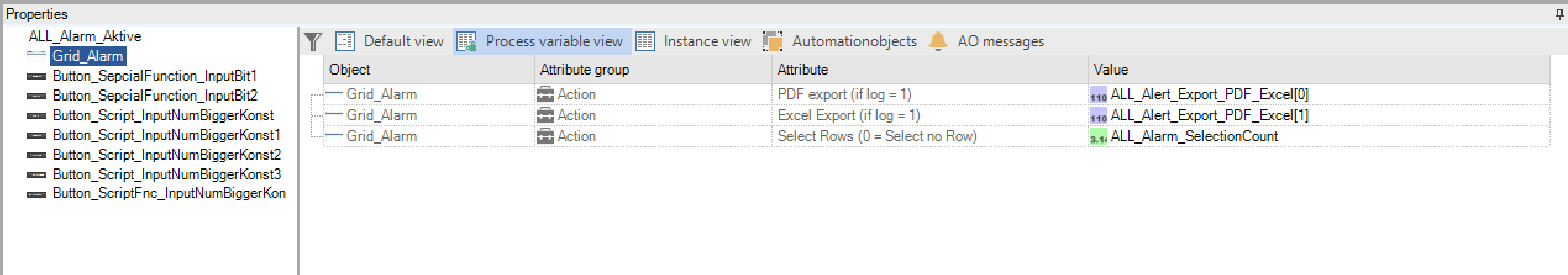
The “Standard”, “Process Variables”, “Instance Values” and “Automation Objects” views are available to the user for more efficient configuration.In the “Standard” view, all configuration parameters of the image or symbols are displayed.Under “Process variables” the view is pre-filtered by the system so that only properties are displayed whose parameters require process variable inputs.The “Instance Values” view shows all available properties just like the “Standard” view. The difference lies in the arrangement of the parameters. All properties are shown one below the other in the Instance Values view. Multiple changes are also possible in this view.In addition to the display of the instance values for the automation objects, an extended assignment is also offered under “Automation objects”. Further information can be found in the chapter on automation objects.
Note
The property window is only available in this way in the picture overlay. In this window script errors appear compile errors.
Filter and sort functions
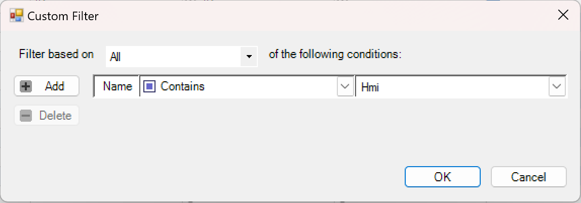
PROCON-WEB provides the user with filter options in order not to lose the overview, especially with large projects, and to quickly find the required data.

In addition to the general filter options, it is possible to set user-specific filters.
In addition to the filter functions, sorting can also be carried out by clicking on the column with the left mouse button. The system then sorts the columns in ascending or descending order. After the third click on the column, the sorting is automatically cancelled by the system.
Note
If you hold down the “SHIFT” key, you can sort by several columns.
The display can be changed from the list structure to a tree structure via the grouping field by dragging the columns according to which grouping is to be carried out into the grouping field.

Important
After the editor is closed, the grouping is discarded.
Note
The functions described are identical in the process coupling and data editors.
Repair function
The aim of this repair function is to repair defective projects that are faulty due to defective references in the image montage and can therefore no longer be opened or the runtime can no longer be generated. Under certain circumstances, this can occur during configuration. The repair function can be used to save the customer long waiting times for the project to be repaired by the development department.
How the repair function works
The function searches for defective references of picture elements. If a defective reference is located, it is deleted. With element instances the pre-set value from the class is assigned, with classes the default variable is assigned and image instances that are no longer used are also deleted. After the repair has been successfully completed, the project is saved in the working directory under a new name (“Project name + _REPAIRED”).
The function also creates a text file with the recorded reference defects. This file is named “Project name + _REP.txt”.
Note
If “only” picture element instances have been deleted in a project, there is no text file! The deletion of image element instances is not logged.
Important
The project must always be reviewed after performing the repair. During the repair, only defective references are corrected. The system cannot restore the previous assignments of the defective references. For this reason, the user must use the information from the log file to find the relevant references and reassign the desired variables so that the project can run correctly.
Use of the repair function
The repair function is carried out via File area -> “Repair project”. After selecting the entry, a selection dialog opens from which the defective project can be selected.

Important
The project to be repaired must not be loaded in the designer when the function is executed.
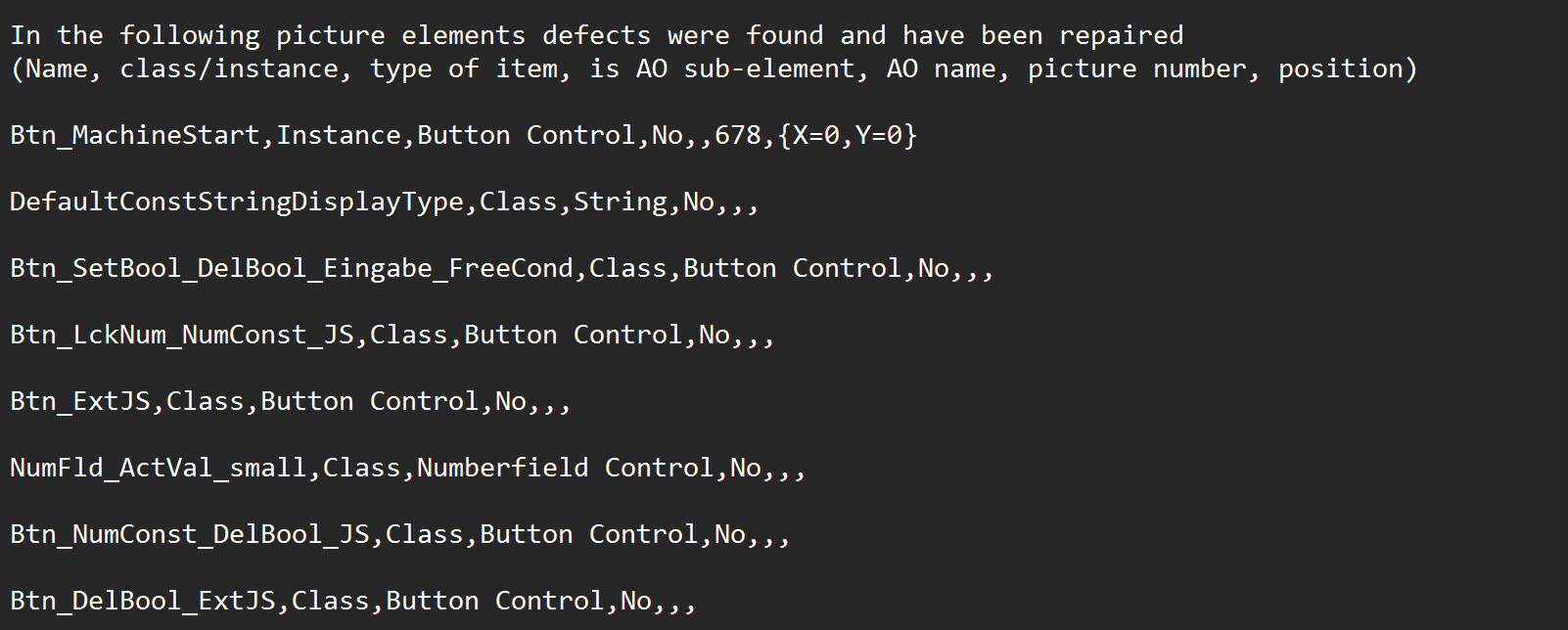
Contents of the log file
An entry is generated in the log file for each localized defect. The following entries are possible:
Name of the element
Type of element
is it an instance or class
In the case of instances, it is specified in which picture (picture number) it is used and in which position it can be found
is it an AO sub-element
Project backup
Previously, you had the option of creating a project backup using “Save As”, but the project was then reopened. This closed all open windows, and the work process was interrupted. The “backup” function has created a quick and easy way of backing up projects.
How project backup works
Saves the currently open project under a different name (automatically generated). The project is compressed and saved in the “backup directory” as a ZIP file. The backup directory is automatically created under the work folder (WorkData) of the designer.
Note
Format of the automatically generated name: project name_ddmmyy_hhmmss
Use project backup
In the “Project Environment” area, the safe button labelled “Backup” can be used to trigger the project backup. The name of the last backup can then be read in blue in the status line.

Important
If you press the button quickly, errors can occur because the SQL server is still busy with the previous backup.
Shortcuts
In PROCON-WEB, some functions can also be carried out with shortcuts. The following table gives an overview of the functions that can be performed with shortcuts.
Area |
Shortcut |
Function |
|---|---|---|
General |
F1 |
Help |
Strg+S |
Save project |
|
Strg+Shift+S |
Save project as |
|
Strg+Shift+F2 |
Create runtime environment |
|
F5 |
Go Online |
|
Strg+F2 |
Update |
|
Strg+F5 |
Start Viewer |
|
Strg+P |
||
Strg+Shift+P |
Print preview |
|
Strg+C |
Copy |
|
Strg+V |
Pase |
|
Strg+X |
Cut |
|
Strg+D |
Duplicate |
|
Strg+Z |
Undo |
|
Strg+Y |
Restore |
|
Strg+A |
Select all |
|
Strg+F |
Search |
|
Strg+H |
Search and replace |
|
Strg+F4 |
Close the current tab in the work area |
|
Entf |
Delete |
Area |
Shortcut |
Function |
|---|---|---|
Pictures |
Shift+ ↑ or ↓ or ← or → |
Moving picture elements pixel by pixel |
↑ or ↓ or ← or → |
Moving picture elements in a grid |
|
Strg+ ↑ or ↓ or ← or → |
Moving picture elements in a 10-fold grid |
|
Strg |
Multiple selection of picture elements |
|
W+ selectio |
Individual selection of grouped elements |
|
Strg+ W+ selection left mouse button |
Multiple selection of grouped elements |
|
Shift + selection left mouse button |
Assignment of process variables for AO instance values with structure assignment |
|
Shift + selection left mouse button |
Switching the selection for symbols that are on top of each other |
|
S |
Switching between scaling and sizing mode |
|
The “S” key can be used to switch between the Scaling and Sizing modes. The “S” key has a toggle function. The currently active mode is displayed in the status bar at the bottom of the work area |
||
A + selection left mouse button |
Selection of objects at the object edge through several levels |
|
If several symbols are on top of each other, the objects below the top level can be selected by holding the A key and the left mouse button |
Area |
Shortcut |
Function |
|---|---|---|
Tables |
“First cell” +Shift+ “Last cell” |
Selection of several consecutive cells or lines |
Strg |
Multiple selection of grouped elements |
|
Tab |
Jump to the next column |
|
F4 |
Open ComboBox |
Area |
Shortcut |
Function |
|---|---|---|
Script |
Strg+G |
Go to line |
Strg+ E |
New line |
|
Strg+Alt+ ® |
Indent |
|
Strg+Alt+ ¬ |
Moves out |
|
F2 |
Compile |
Overview of the editors
After creating a new project or loading an existing project, the various editors can be called via the project tree.These plug-ins are described in the following chapters in the manual.
Chapter in the manual |
Editors: |
|---|---|
Localization |
“Localization” (configuration of runtime languages and processing of system dialogs) |
Version management |
If project changes are logged, they can be viewed here. |
System structure |
“System structure” (creation of the required system structure in the designer for simplified configuration) |
Configuration |
“Configuration” (project, network) |
User administration |
“User administration” (structure of user administration for runtime) |
Process coupling |
“Process coupling” (process variables, system variables and structures) |
Message processing |
“Message processing” (processing of faults, system alarms and message views) |
Data |
Data” (data management, data recorder, ODBC connection, XY curves) |
Report |
Definition of the reports to be displayed in the report control |
System controls |
Definition of system control such as wizard and help |
Surface |
Creation of style guides, images and navigation |
Script |
Creating scripts and tasks |
Operating instructions for the editors
This chapter is intended to provide general operating instructions for the individual editors, which facilitate operation for the user.
Operating instructions images
In addition to the project tree, the “Images” editor is divided into three windows. The work area in which the symbols are arranged, the toolbox in which the classes of the objects are managed and the properties window in which picture properties or instance values can be changed. Operation of the editor is shown below.
Drawing symbols: To draw a symbol, you must switch with the button  in the function bar to drawing mode. Alternatively, the required drawing tool can also be selected directly. When the symbol is finished, the symbol is saved via the context menu with the options “Apply as”. With “Accept elements as”, individual elements can be selected in drawing mode and only these can be saved as symbols.
Alignment and resizing functions: For faster alignment and arrangement of symbols, PROCON-WEB provides various alignment functions, which are shown below
Symbol |
Function |
Description |
|---|---|---|
|
left-aligned |
Function to align multiple symbols to the left |
|
right-aligned |
Function to align multiple symbols to the right |
|
Align above |
Function to align multiple symbols upwards |
|
Align below |
Function to align multiple symbols downward |
|
Align horizontally |
Function for uniform horizontal alignment of several symbols (at least three) |
|
Align vertically |
Function for uniform vertically alignment of several symbols (at least three) |
Resizing functions can also be used.
Symbol |
Function |
Description |
|---|---|---|
|
Adjust width |
Function to adjust the width of different symbols |
|
Adjust height |
Function to adjust the height of different symbols |
|
Adjust size |
Function to adjust the width and height of different symbols |


These functions are based on the selection sequence. The element that was selected last is marked with an additional purple selection frame. The function is based on this symbol, i.e. if elements are to be aligned left, the X and Y position of the symbol is used. All other elements are based on this element.
Note
For more detailed information see also chapter Pictures
Operating instructions for all grid-based editors
In PROCON-WEB the editors are “Process Variables”, “Structures”, “Alarms and Messages” “Data Management”, “Data Recorder” and “Images” structured like a table. The operation of the grid editors is analogous to built.
Multiple selection of elements: On the one hand, multiple selections can be carried out by left clicking with the mouse and drawing an area. This will select all elements in this area.Individual elements can be selected one after the other using the “Ctrl” key and left clicking with the mouse. Multiple selection for the respective column is carried out by selecting the first and last element of the desired area while holding the Shift key. This operation is analogous to Microsoft’s Windows Explorer, for example.
Multiple changes of elements: If several elements are selected, multiple changes can be used for names or driver assignments, for example. There are two types of multiple changes possible.

As shown in the mapping, there is an input line next to the upper option “Multiple changes”. If an entry is made here, this entry is adopted for all selected objects. This type of multiple change is often used for driver changes, for example.The second option “Multiple changes …” opens a dialog in which three types of multiple changes can be selected.

Type |
Function |
|---|---|
x=x |
Changes all selected columns to the value below |
x+=x |
With this type, three parameters must be assigned. On the one hand, the so-called format string must be assigned. This format string is made up of a constant string and an index. The start value and the increment must be assigned for the index. If 5 elements (for example process variable names) are selected and the user selects “New_ {0}” for the format string, “1” for “Start” and step, he receives New_1 to New_5 |
x-=x |
Analogous to x + = x with the difference that beginning with the start value, it is decremented instead of incremented. |
Operating instructions script
IntelliSense function: The so-called IntelliSense function is available to the user in the script editor and is used to insert or complete the functions and keywords.
The function is called up with the key combination Ctrl + “Space”. For each function, a short help on the use of the function or the keyword is displayed when it is selected. The function is inserted with a double click.
**Functions for formatting and editing the scripts:**To achieve better readability and clarity, functions for indenting, indenting, line breaks etc. The following table shows the functions and the associated key combinations.
Shortcut |
Function |
|---|---|
Strg+ G |
Go to line |
Strg+Alt + Tab |
Indent |
Strg+Alt + Shift+Tab |
Moves out |
Special features of the project tree (Only SCADA)
Own folders in the project tree
In PROCON-WEBfor a better overview it is possible to create your own folders in the project tree in certain areas. Own folders are allowed in the following areas:
Image classes
Image instances (images)
Layout
Navigation
Script
Function description
The following functions are permitted in relation to the folders:
“New folder”: Creates a folder in the selected node (here “Pictures”)
New folder
“Delete folder”: Deletes the selected folder - and all subfolders, if any - and moves the content to the same level
Delete folder
“Rename folder”: Renames the folder
Rename folder
Correct operation of the folders
The following list shows correct operation of the folders:
Creation of a folder and selection of elements (multiple selection possible).
The selection can now be moved to the folder using drag & drop.
If the process is possible / not possible, the current cursor changes accordingly.
After the successful move, the selection of the elements remains.