Surface
Concept
In principle, PROCON-WEB follows a systemic structure. After the basic settings have been made, you can start designing. All the tools required for a smooth design are described in the surface section. The style guide allows you to create individual styles for the project.

Configuration
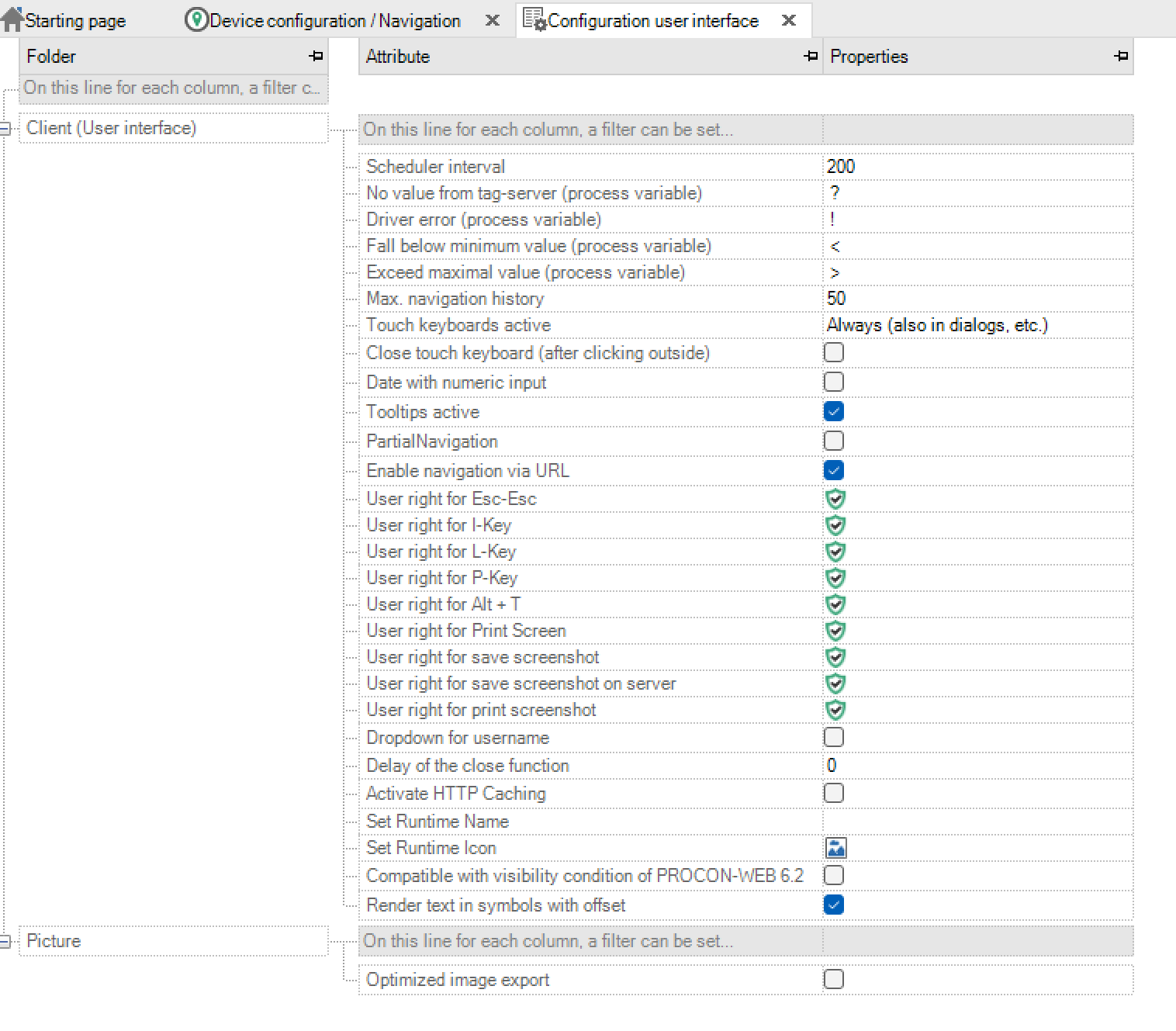
Essential parameters for the user interface can be set in the configuration. Each configuration option is described in the “HelpCenter”.
Client (User interface)
Parameter |
Description |
|---|---|
Scheduler interval |
This information is given in milliseconds. It can be configured between an interval of 100ms - 60,000ms. |
No value from TagServer (process variable) |
As soon as the TagServer does not provide a value, any value can be entered instead. If no value is specified, the default value of the corresponding process variable is displayed. |
Driver error (process variable) |
If a driver error occurs, this value can be influenced. If no entry is made, the current value of the process variable is displayed. |
Below minimum value (process variable) |
If the value falls below the minimum value of a process variable, the display in the user interface can be influenced. If no entry is made, the current value of the process variable is displayed. |
Maximum value exceeded (process variable) |
If the maximum value of a process variable is exceeded, the display in the user interface can be influenced. If no entry is made, the current value of the process variable is displayed. |
Max. navigation history |
You can run through the navigation views that are created by the history function (Chapter Y). |
Activation of the logbook history |
The logbook history can be activated with this checkbox. |
Activate touch keyboard |
A drop-down can be used to influence when a touch keyboard should appear during PROCON-WEB runtime. The choices are: |
process variables |
|
process variables |
|
|
|
Activate tooltips |
It can be decided whether tooltips should be used. |
Activate navigation via URL |
It is possible to change the view via the URL. However, this does not take any rights into account. |
User authorisation Esc-Esc |
Definition of which user authorisation is required to end the web runtime with Esc-Esc |
User permission for I key |
Definition of which user authorisation is required in order to open the info dialog with the I key in the web runtime |
User permission for L key |
Definition of which user authorisation is required in order to open the language selection dialog with the L key in the web runtime |
User permission for the P key |
Definition of which user authorisation is required to open the picture selection using the P key in the web runtime |
User authorisation for Alt + T key |
Definition of which user authorisation is required to display the test interface using the Alt + T key combination in the web runtime |
Image

Optimised image export: Specifies whether only the “bitmaps” referenced by an element are exported in the runtime directory.
Style guide
PROCON-WEB supports the central management of a style guide with global definitions of color values and various representations for all controls. Within the image montage, the controls can be provided with references to a style guide entry and thus adopt the appearance stored there. This enables the display of control and display elements to be adapted to your own corporate design or customer requirements at a central point. Several styles can be stored for a control type (such as a button) to distinguish buttons for an operator action on the machine from a navigation element. Styles can also be stored for system dialogs, such as user login, in order to adapt their appearance to the project color scheme.
The style guide can be divided into the following categories:
Project colours
Colour gradients
Simple controls
Complex controls
System dialogues
Project colours
The project colours are differentiated between System colours (System) and Project colours (Project).
System colours Standard colours for PROCON-WEB are defined in the system colours area. These colours cannot be changed or deleted.
Project colours In this area you can define and change your own colours for the project. In the case of a new project, this area is initially empty. New colours can be added via the context menu (right mouse button) created, clicked colours processed and or deleted will. The display or view of the colours can also be changed via the context menu. In the details display, you can see, for example, a preview of the colour, the name, the RGB value and the number of references to this colour immediately. The use of the colours can be determined by displaying the references. Referenced colours cannot be deleted! When creating or editing the colour, a preview display in the dialog shows the current changes and shows the difference to the original colour.


Note
Via the pipette symbol ( ) the colour value of any area or pixel can be copied, even outside the designer.
Colour gradients
The operation in colour gradients is like the operation in colours. There is no differentiation between system and project processes. In a new project, a few colour gradients have already been defined that are used in the style guide for the controls. New colour gradients can be created via the context menu (right mouse button) created, clicked gradients processed and or deleted will. The use of the colour gradients can be determined by displaying the references. Referenced colour gradients cannot be deleted! A colour gradient is first defined using the start and end colour and the type (linear, bilinear and radial) of the colour gradient. You can also specify a mode (vertical, horizontal, backward diagonal and forward diagonal) for non-radial colour gradients. The last parameter you can specify the relative start and end position (0 - 100) of the colour within the course. The changes are immediately visible in the preview window in the dialog.

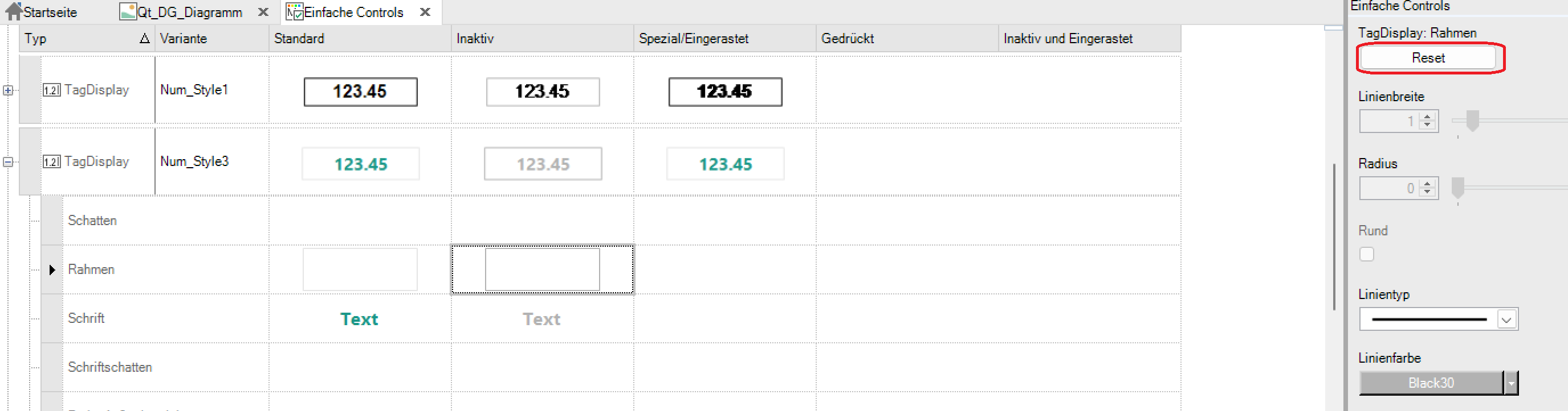
Simple controls
Simple controls are text and number fields (TagDisplay), buttons, combo boxes, checkboxes, bar graphs and sliders. In a new project, a default style has already been created for each type. This should serve as an example and can be changed as desired or used as a basis for your own style by copying it. You can also create your own style elements. This can be done either via the context menu or via the menu bar.

The first column shows the type of element as a symbol, the second column the variant name. The four other columns show the elements in the corresponding states that the element can assume. The preview shows the element in its overall view. These states are triggered by various conditions.
Status |
Condition |
|---|---|
Default |
When none of the following conditions are met. |
Inactive |
When the element’s “input” condition is not met. |
Special / locked |
When the “pressed” condition of the element is met. |
Pressed |
When this item is clicked and held down. |
An element consists of various attribute groups such as frames, shadows or text. The individual parameters such as colour or line thickness are edited within the attribute group.
Attribute group |
Description |
|---|---|
Shadow |
Defines the shadow of an element with horizontal and vertical displacement, soft focus, size and shadow colour. |
Frame |
Defines an element frame with a line width, frame, colour, type and radius. |
Font |
Defines the font of the element with font, style, size and colour. |
Font shadow |
Defines a shadow for the previously configured font. |
As with element shadows, horizontal and vertical displacement, as well as soft focus and shadow colour can be specified. |
|
Colour of the outside |
Describes the colour between the background and the frame |
Distance to the outside area |
Size of the outside area. This is the distance between the background and the frame. If the outer distance is 0, the outer area is not visible! |
Background colour |
Describes the background colour of the text up to the outside area |
Distance |
This is the space between the text and the outside area. The distance increases the background. |
By clicking on the line marker or on the plus symbol on the left, the attribute group of the corresponding element is opened. For a better overview, only the attribute groups of one element can be opened.
The names of the attribute groups are arranged on the right. The division is made in a table. The entire element is in the corresponding states in the first line. Depending on which selection of the attribute group (row) and the associated status (column) is made, the options are displayed on the right edge. The changes are immediately visible.
An attribute group shows a preview of the sub-element that can be changed by it.

When editing the attribute groups and their parameters, note the following:
The appearance of the element is primarily determined by the attribute groups in the standard column. To this end, attribute groups can sometimes be activated or deactivated.
Some attribute groups are fixed because they are absolutely necessary for the element, i.e., they can neither be activated nor deactivated.
Some attribute groups can be overwritten in other states such as inactive etc., whereby only parameters can be overwritten that do not change the overall size of the element.
If an attribute group has been overwritten, it is displayed in the preview in the line of the corresponding attribute group. If there is no symbol there, the attribute group has not been overwritten
The overwriting of the elements can be undone with the reset button.
The parameters of the individual attribute groups or of the entire element can be copied via the context menu. This can be a single attribute group of a certain state (cell), the complete attribute group of an element (row) or a complete state (cell of the state in the element).
The parameters can also be copied across different elements, for example to copy the frame from a TagDisplay into a button.
Complex controls
Complex controls are understood to be grids in the various forms (DataGrid, MessageGrid), chart, wizard, help control and report.
In a new project, a default style has already been created for each type. This should serve as an example and can be changed as desired or used as a basis for your own style by copying it. You can also create your own style elements. This can be done either via the context menu or via the menu bar. The operation and definition of the complex controls is like that of the simple controls, with the difference that complex controls only have the standard status.
For a better overview, the preview of the complex controls has moved to the middle.
In addition to the parameterisation of the attribute groups - as with the simple controls - complex controls can also reference on simple controls. If these are changed, the appearance of the complex controls also changes.
Complex controls also define the option to manage icons. These can be adjusted in the “Icons” attribute group. You can either choose a different icon or adjust the icon colour. The icon colour can only be changed for the icons defined by GTI.
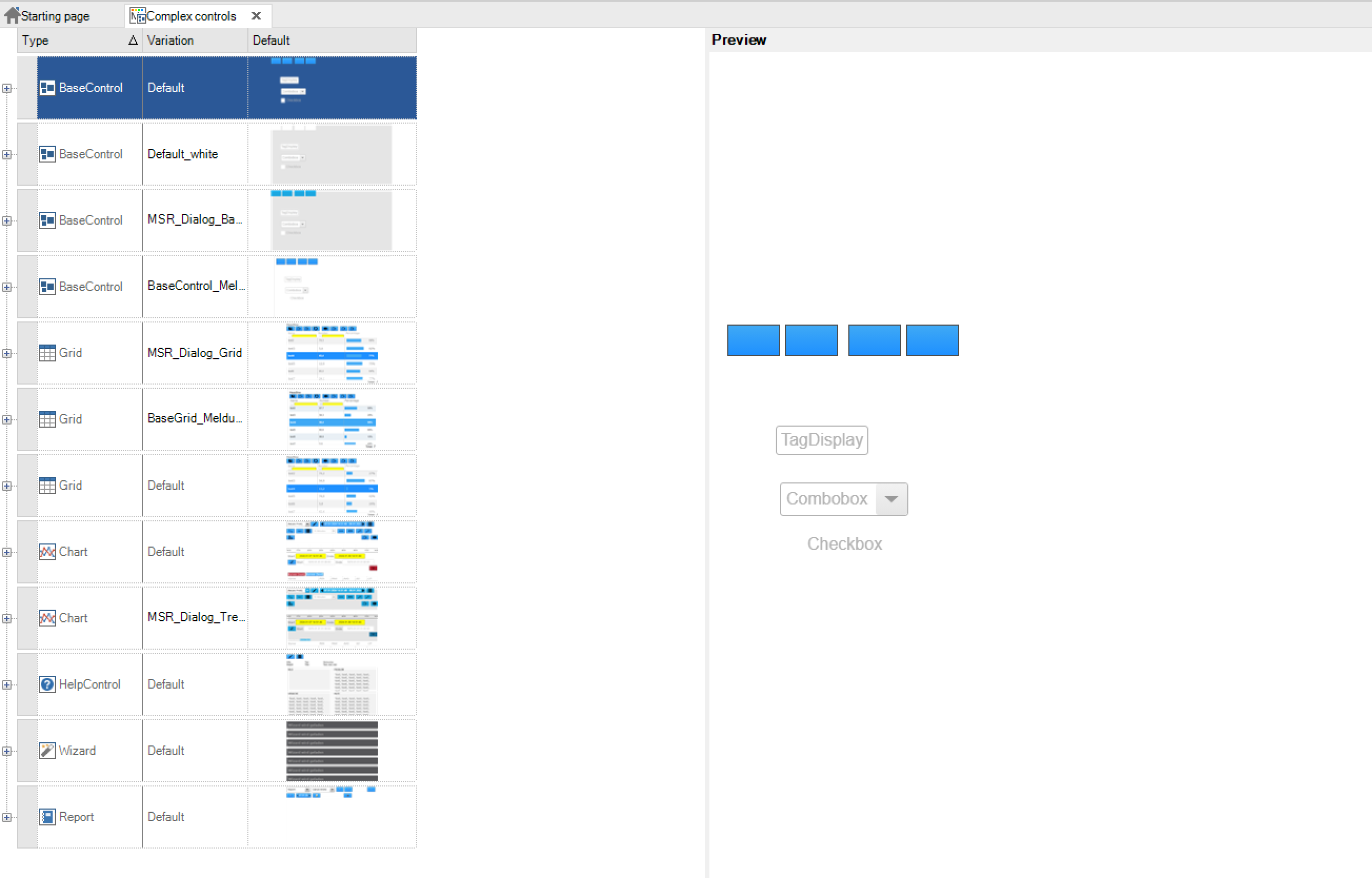
A base control is defined for better handling. This passes on its settings to child elements such as the grid or chart. In addition to the attribute groups already described for the simple controls, there are other groups in the base control.
Attribute group |
Description |
|---|---|
Button bar |
Defines the configured buttons via alignment, size and spacing. |
Dialog |
Defines the colour for the title line, info, errors and the close button and the scaling factor |
Button |
References the style for the buttons used |
Display element |
References the style for the TagDisplays used |
Checkbox |
References the style for the checkboxes used |
Grid: Defines the style for all characteristics of the grid control. The first three attribute groups “BaseControl”, “Combobox” and “Bar” reference settings from other styles. This is followed by the attribute groups for the configuration of the column header, standard line, alternating line, selected line, the display for “mouse over”, the time range selection. Various icons can also be customised.
The following lines are used to configure the lines under certain conditions. Each line configuration has the following attributes:
Attribute |
Description |
|---|---|
Font name |
Defines the font |
Font style |
You can choose between bold, italic, underlined and other styles |
Font size |
Defines the font size in px |
Font colour |
Defines the text colour |
Background colour |
Defines the background colour |
Line colour |
Defines the colour of the lines between the cells |
Line type |
Different structure lines can be added or removed here |
Line width |
Defines the line thickness |
Row height |
Defines the minimum height of a line entry |
Filter height |
Defines the height of the control of the filter line |
Chart: Defines the appearance of the chart control. The first two attributes reference the settings of other styles.
Attribute |
Description |
|---|---|
Chart colours |
Defines the background, grid and axis colours of the diagram |
Time range selection |
Defines the time range selection dialog. This can be configured similar to a TagDisplay. The font size only refers to the selection list, not the title line |
Legend |
Defines a legend field for each individual track. Font, line and background can be configured. |
Legend hidden |
This style defines the appearance of a legend that has been deactivated. To deactivate, click on the legend. |
Icons |
The icons for the buttons can be defined in the Icons area. |
Report: Defines the appearance of the report control. A BaseControl is referenced. As in the grid, the time range and icons can be configured for the report.
Wizard: Defines the appearance of the wizard. The first attribute references the settings of the BaseControl.
Attribute |
Description |
|---|---|
Background colour button bar |
Defines the background colour of the button bar. This can also be deactivated |
Button size (X) |
Defines the button width |
Button size (Y) |
Defines the button height |
Step active |
Defines settings for the font, background and frame for the active step |
Step completed in step group |
Defines settings for the completed step of the current step group |
Step completed |
Defines settings for the completed steps |
Step inactive |
Defines settings for an inactive step |
Icons |
The icons for the buttons can be defined in the Icons area. |
Accordion: Defines the appearance of the wizard. The first attribute references the settings of the BaseControl.
Attribute |
Description |
|---|---|
Background colour |
Defines the background colour. This can also be deactivated. |
Frame |
Settings for line width, radius, type and colour. This can also be deactivated |
Title line |
Defines settings for the font, background and frame for the title line |
Open entry |
Defines settings for the open entry of the accordion |
Closed entry |
Defines settings for the open entry of the accordion |
Icons |
The icons for the buttons can be defined in the Icons area. |
System dialogues
System dialogs are runtime dialogs such as login dialog or touch keyboard. In a new project, a default style has already been created for each type. This should serve as an example and can be changed as desired or used as a basis for your own style by copying it. The operation and definition of the system dialogs is like that of the complex controls. Here, too, only the standard status needs to be defined. The login dialog, the touch keyboard, the tooltip, and the message box exist exactly once and can therefore neither be deleted nor recreated.

Dialogue: The dialogue defines basic settings that can be passed on to other styles, similar to the BaseControl in the complex controls. The button, TagDisplay, ComboBox and Checkbox attribute groups can also be referenced by the simple controls in the “Dialog”.
Attribute |
Description |
|---|---|
Shadow |
Defines a dialog shadow with horizontal and vertical shift, soft focus, size and colour. |
Frame |
Defines a rectangular frame around the complete dialog. This is an additional frame, which is indicated next to the outdoor area. |
Font |
Defines the font, style, size and colour for standard texts |
Font shadow |
Defines font shadows with horizontal and vertical shift, soft focus, size and colour. |
Colour of the outside |
Defines a colour / gradient for the outside of the dialog |
Background colour |
Defines a colour / gradient for the background of the dialog |
Dialog |
Defines title, info, and error colours as well as settings for the close button and the scaling of the dialog. |
Touch input: The dialog for touch input inherits all of its basic settings from the dialog.
Attribute |
Description |
|---|---|
Frame input |
Settings via line width, radius, type and colour. |
Background colour input |
Defines the background colour of the input field |
Font colour input |
Defines the font colour of the input field |
Min-max box |
Shows the value range of the variable, font size and colour |
Display mode |
Defines the title of the dialog. You can choose between Empty, Tag Name, Display Name or Tag Name and Display or Empty |
Button bar |
The distance and size of the buttons is defined here |
Tooltip: The tooltip appears for every control that has assigned the tooltip attribute under “Display”.
Attribute |
Description |
|---|---|
Shadow |
Defines a tooltip shadow with horizontal and vertical shift, soft focus, size and colour. |
Frame |
Settings via line width, radius, type and colour. |
Font |
Defines the font, style, size and colour for standard texts |
Font shadow |
Defines font shadows with horizontal and vertical shift, soft focus, size and colour. |
Background colour |
Defines a colour / gradient for the background of the tooltip |
Distance |
Defines the distance between the frame and the text of the element. This enlarges the tooltip |
Row height |
Defines the minimum height of a line entry |
Message box: The message box appears as soon as an info, alarm or message is triggered.
Attribute |
Description |
|---|---|
Shadow |
efines a message box shadow with horizontal and vertical shift, soft focus, size, and colour. |
Frame |
Settings via line width, radius, type and colour. |
Font |
Defines the font, style, size and colour for standard texts |
Font shadow |
Defines font shadows with horizontal and vertical shift, soft focus, size and colour. |
Icons |
A close, acknowledge and acknowledge all button can be configured here. It can be selected via the size, the icon and its colour. |
Background colours |
Defines a colour for the background of the message box |
A different colour is configured here to match the message type. |
Scrollbar: The scroll bars can be configured across projects. Here you can only configure the colour, size and rounding.
The activity indicator: The activity display is shown if the project has not yet been completely loaded. The colour and background colour can be configured.
Touch input text: Touch input is the keyboard that opens when the user can enter text.
Attribute |
Description |
|---|---|
Frame input |
Settings for line width, radius, type, and colour of the input area |
Background colour input |
Defines a colour / gradient for the background of the input area |
Font colour input |
Defines the font, style, size, and colour for the entered text |
Min-max box |
Defines the font colour and size of the displayed min-max / values if these are stored with the variable to be recorded |
Display mode |
Defines whether the TagName or the display name is displayed |
Button bar |
Defines the size and the distance between the buttons |
Further system dialogs: System dialogs can also be configured that inherit from the base dialog. This includes the user administration, the language selection dialog, the image selection dialog and the system information dialog or the teach dialog. The dialog itself comes in different forms: Confirmation OK button, confirmation with yes / no buttons, input prompt with mandatory input field and OK button, comment with optional input field and OK button
Using the style guide
The elements of the style guide can be used in the image montage. If a style used is changed, all elements that reference this style are also changed. For more information on using styles, see Chapter Pictures.