Layouts, views, configuration, and navigation
In addition to the classic variant of building a surface from interlinked full images, PROCON-WEB supports a concept in which a generally applicable image structure is predefined in the form of a layout, the areas of which as containers accommodate the actual image content. The images are not individually defined and linked to one another, but rather image contents are created, and the desired image constellations are compiled using a navigation table.

The figure shows the concept of layout and container with configured navigation: One or more layouts are created for each device type (most of which can be recognised automatically). These organise the image structure, like what we know from a website.
The structure of the layout results from the containers introduced there, which either mark image or navigation areas and can later accommodate the appropriate elements.
In the layout picture also image elements, for example for a status line - which should be the same for all images - can be incorporated directly into the layout image.
The navigation table is used to define many images (views), each using one of the device-specific layouts, naming the navigation elements necessary for selecting the image and then defining the associated content for the navigation container.
What is the benefit of this procedure, which is more administratively complex than conventionally linked individual images?
A uniform image structure is used throughout the whole project
By separating image content and navigation, existing images can be used in different contexts and for different end devices (because containers scale)
The creation of a new machine variant with a few deviating images is much easier to carry out because only the entries in the navigation table must be adjusted and the entire navigation is updated
General information
The layouts, also called layout variants, are required for navigation. Together with the containers, they represent a basic structure for the views.
In the configuration of the views, it is defined how the subsequent overall picture will be constructed from the individual elements. The views in the runtime are selected by using the navigation.
Important
If a smartphone view has been configured in the project, it can also be checked on the PC without a smartphone. The smartphone view can be accessed via the following link: http: //localhost/index_smartphone.htm
Layouts and containers
Layouts represent the basis for the view and navigation concept. A layout defines, among other things, containers where the partial images are positioned in the overall image.
A layout picture can contain several layouts, a container can be assigned to several layouts. For example, you only must define a container for a status bar once and you can use it in several layouts.
Important
“As soon as a picture contains a container, it moves to the project tree under the Start / Layout pictures node.If a container is dragged into a picture, a layout variant is automatically created if one does not yet exist in the picture.If a container is dragged into an image, it is automatically assigned to the first layout.
Configuration & navigation
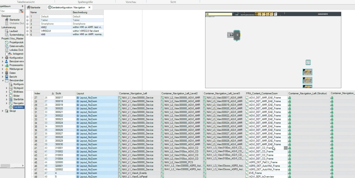
The navigation and thus also the configuration of the views of the project are specified under “Configuration & Navigation”.
The navigation can be created globally for all end devices or, if necessary, separately according to device class or for a specific device. Different views can also be created for a normal or rotated alignment of the device.
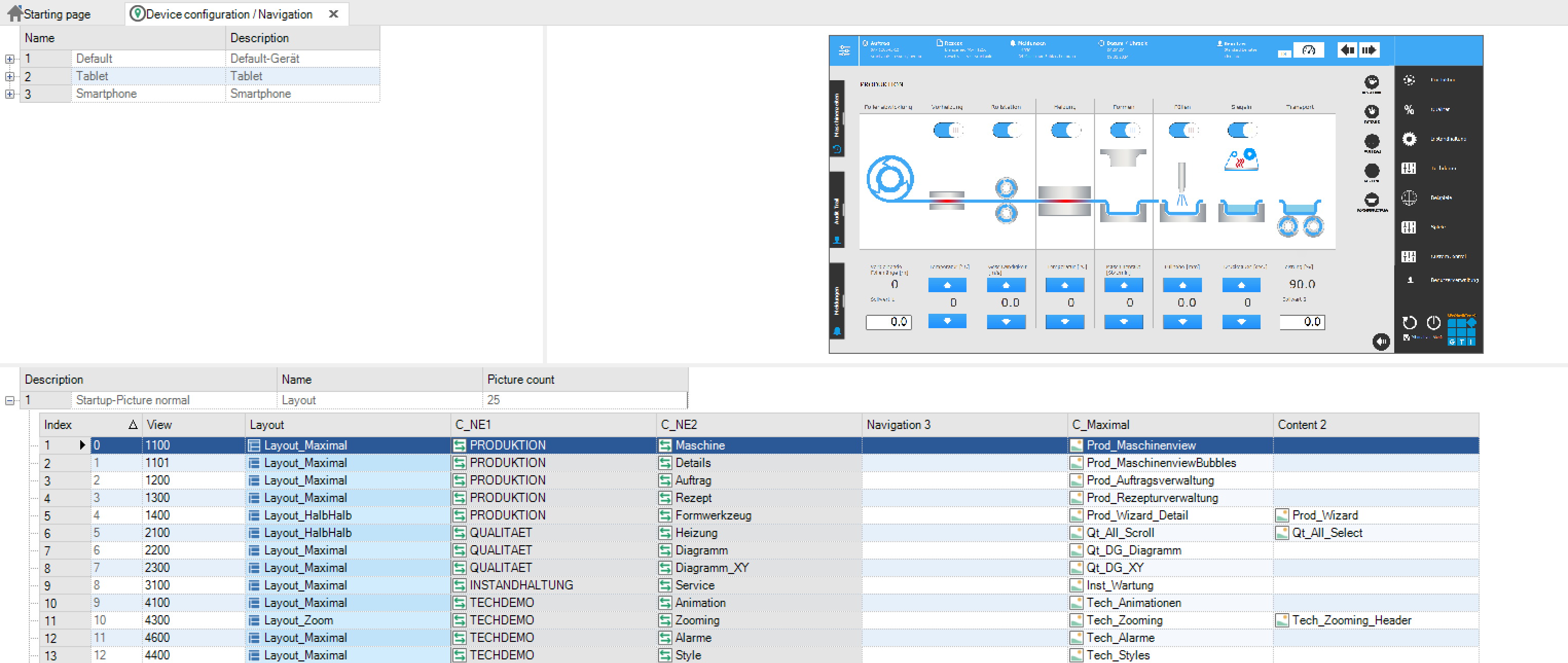
In addition to creating the views in the navigation grid (see Layout - project planning example), the preview at the right on the top also allows visual navigation through the project. I.e., by clicking on the navigation elements in the picture, the corresponding navigation is carried out and the view is switched. When you click into the picture, the corresponding container is also marked in the grid.
A double-click on a spot in the preview opens the image below in the image montage. If the “Highlight Container” option is activated, the container currently selected in the grid is highlighted in colour in the preview.
Layout - example of a project planning
Creation of containers
A container is created via the ribbon tab “Image processing”.

For example, the first container should be a vertical navigation container. The container will now be named accordingly and dragged to the left. It should represent the first navigation level, that is, it is the main navigation.

In the class dialog, the container type is changed to “Navigation” and a “1” is entered in the navigation level.
The distance between the navigation elements in the container can be determined via the distance. Now a second container with the container type “Navigation” is created and arranged as a second navigation level in the horizontal area at the right on the top next to the vertical navigation. This second navigation will be able to change its displayed content depending on the selection in the 1st navigation level.
Finally, a picture container is created, which can change its content depending on the selection in the navigations. This fills the area below the horizontal navigation. To do this, select “Image” in the container type. “Arrangement” an then “filled” is selected for the image container, since the image should be visible in its full size in the container.
The picture with the containers and possibly a logo in the upper left corner could then look like this:

Creation of a new layout
It can often be necessary to subdivide the content displayed on the screen differently for different views. To accomplish this, you can define further layout variants.
For this purpose, further image containers are defined as described in the previous chapter. In our example, two additional image containers are created that are next to each other and each half as wide as the first image container.
The creation, deletion or copying of layout variants is done via the context menu on the picture.

When this is done, the layout can be given a different name via the properties window.
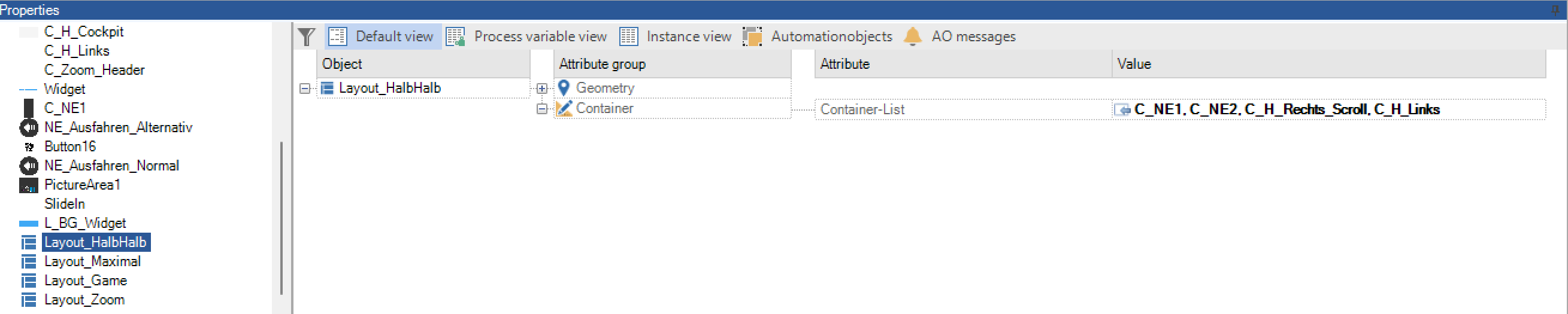
The containers can now be selected and added to the layout using the “Instance value” field dialog.

On the right side in the toolbox, you can set up the individual layouts via the tab layouts and switch from visible and invisible so that they can be checked more easily.

Creation of images
Before you can finally start defining the navigation, a few images must be created that will later fill the container.
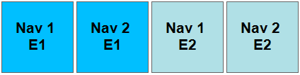
In the example, the simplest possible images are created to illustrate the principle of navigation. First, two navigation elements (images) are created for the main navigation and two navigation elements for the subnavigation. These each have the size 100x100 with a static text in the middle.
Then the images for the image container are created in the appropriate size.
Creating a navigation
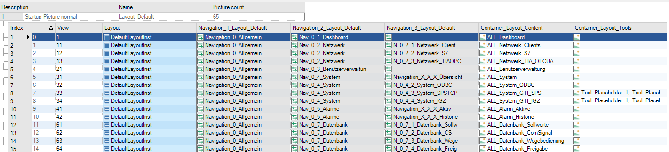
To be able to create a new navigation, you must first open „Configuration & Navigation” in the project tree. This area is divided in such a way that you can create your own navigation for different device types (standard, tablet, smartphone, …), which is adapted for this device. Only for the standard device type you can configure touch input. In addition, the layouts can be defined separately for “normal” and “rotated”.

The different device types can be defined and adapted in the upper left area.
The preview of the selected navigation view is displayed on the upper right side.
The actual navigation is defined in the table below.
A new navigation can be created using the context menu in the first line in the lower area

If a layout has been defined for the device type in the selected start screen, a layout is selected in the next step.

Then the lower grid is built using the information and containers found in the layout. Among other things, the names of the containers are entered as column headings.
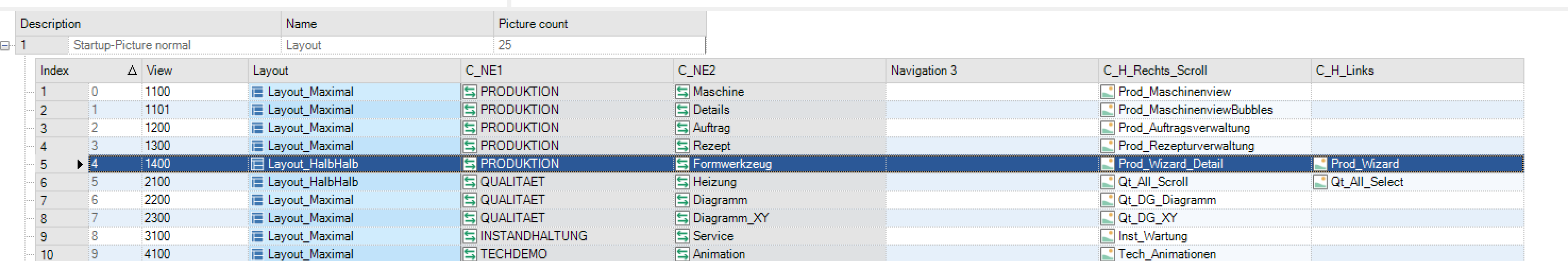
In the next step, the “C_NE” and “C_Content” containers are filled with the corresponding images. A separate line is defined for each view via “New Navigation”.
The preview at the right on the top is updated according to the selected view and filled containers. In our example, three views with the different layouts are now defined and filled. The result could then look like this:
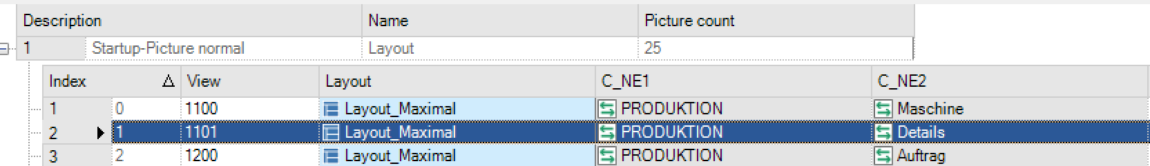
The order is determined by the index of the navigation elements and thus also the appearance of the views. Changes to the order can be made by moving the context menu or by moving the entire line in the table.
Note
Wichtig bei der Verwendung von verschiedenen Navigationen für spezielle Gerätetypen ist, dass das jeweilige Gerät auch als solches erkannt wird. Beispielsweise beim Typ “Tablet”, muss das Endgerät auch als Tablet identifiziert werden können und nich als Standardbrowser. Dies ist in den jeweiligen Einstellungen des Gerätes dzu prüfen.
Create a new device class
To be able to assign device-specific layouts, a separate device class must be defined for this, which can then be used to identify the devices that should receive this layout.
For clear identification, the “Device-specific text” field must be filled in such a way that a corresponding assignment can be made. This can be done via the so-called UserAgent of the browser. Accordingly, layouts can be selected depending on a browser.
For this, the browser name must be entered as a device-specific text.

Your own UserAgent can be read out on various websites. Here are some examples:
Firefox: Mozilla / 5.0 (Windows NT 10.0; Win64; x64; rv:81.0) Gecko / 20100101 Firefox / 81.0
Chrome: Mozilla / 5.0 (Windows NT 10.0; Win64; x64) AppleWebKit / 537.36 (KHTML, like Gecko) Chrome / 85.0.4183.121 Safari / 537.36
Edge: Mozilla / 5.0 (Windows NT 10.0; Win64; x64) AppleWebKit / 537.36 (KHTML, like Gecko) Chrome / 86.0.4240.75 Safari / 537.36 Edg / 86.0.622.38
Since both the Chrome and the Edge browser contain the term “Chrome”, this assigned layout is used in both browsers. The default class would be used with Firefox or Opera. If only for Chrome and not for Edge, the Edge must be excluded using a so-called regular expression: “(Chrome) (?! * (Edge))”
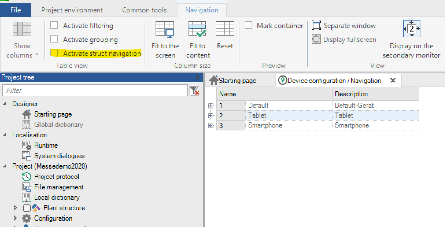
Navigation with structures
In the designer, structures can also be specified during navigation. By default, the structure columns are not displayed in the navigation, unless navigations with structures already exist in the project. The structure navigation can be activated or deactivated in the table view.
Note: Activating or disabling the tree navigation only affects whether the columns are displayed in the designer or not. Nothing changes t runtime.
One instance can be specified for each structure per navigation level. The designated instances are inherited to the underlying navigation levels. If different instances are assigned at different levels for the same structure, only the lower instance is considered
You also have to consider, that it is possible to use the same picture for the whole navigation, but the combination of structure and instance has to be unique. Because of that, it is sensible to use one picture for each navigation container. This one you can use in the container itself multiple times.
Instances can also be assigned directly on the content pages. These automatically identify the instances of navigation. If a structure has both one instance in the navigation and another instance specified in the content, only the instance on the content page is considered.
The instances are then sent to the AOs on the navigation or navigation screens. Content pages when an AO dynamic instance assignment is enabled in the The specified structures can also be used in image or event scripts on images or AOs with dynamic assignment.
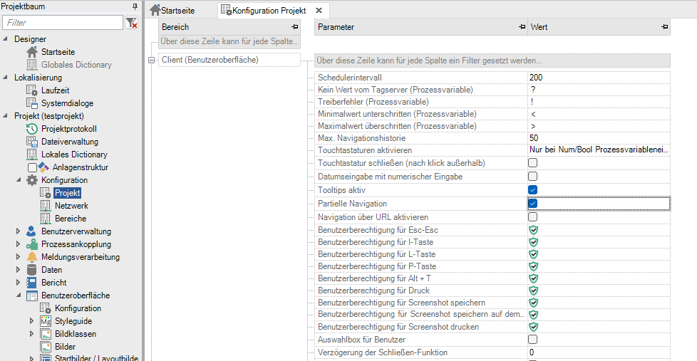
Partial navigation
Partial navigation is displayed under Configuration -> Project -> Client(User Interface) -> Partial navigation (global) enabled. Also then the corresponding system variable is __Navigation_Partial set to “true” set.
This makes it possible to use the multi-level navigation to get to to the desired last navigation level and then open them after selecting the choice of these.For this purpose, in the configuration has to be no content at the top. Has a header in the Navigation stores a content, it will be displayed and the appropriate sight number.
Here is an example of a configuration in the designer:
Also, when using the back function, the actual displayed image and not the image of the parentNavigation point.